Future London Academy. London-Refracted Design
Future London Academy creates an immersive learning experiences for like-minded professionals and innovators from around the world. Our team has designed a visual language for this amazing project. Michael Wolff, a legendary person in the branding world, founder of Wolff Olins, has been our consultant on this project. Another consultant who helped this project to grow, was Oliver St John – designer from NB studio. We’ve got the professional jackpot any design agency dreams about: a) an international project, b) communication with the legends of branding and c) an understanding client, who is ready for any experiments.
The typography gets refracted by objects from London architecture. We took models of the main architectural and cultural symbols of the city which echo the idea of Future London Academy – knowledge through the lens of London. In terms of the technical side: a 3D model of a building is layered on to an image or a text to get a refraction. It can be interacted with by turning the model right and left. The library of 3D objects can always be extended – this gives the brand an unlimited way to experiment and express itself.
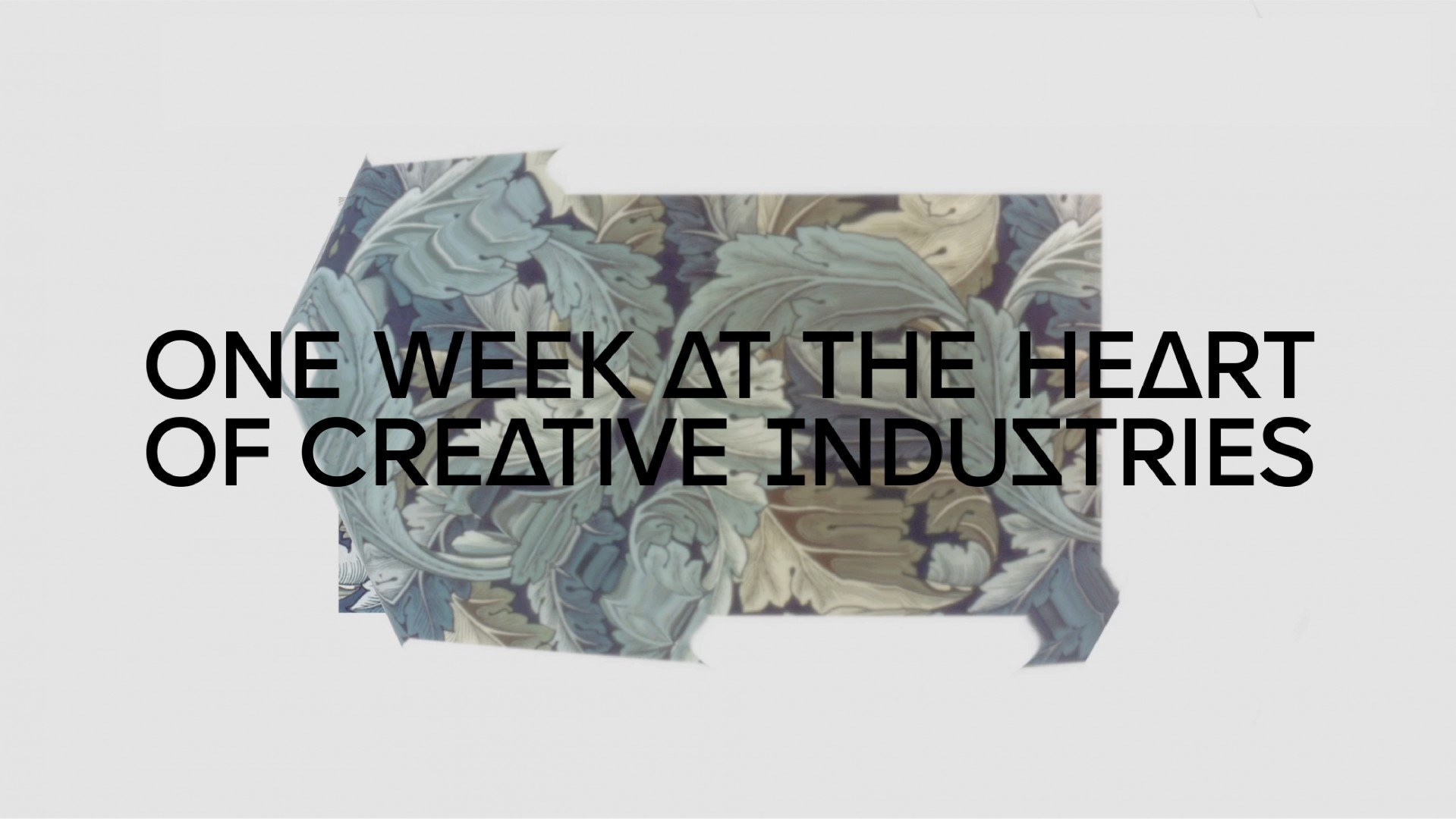
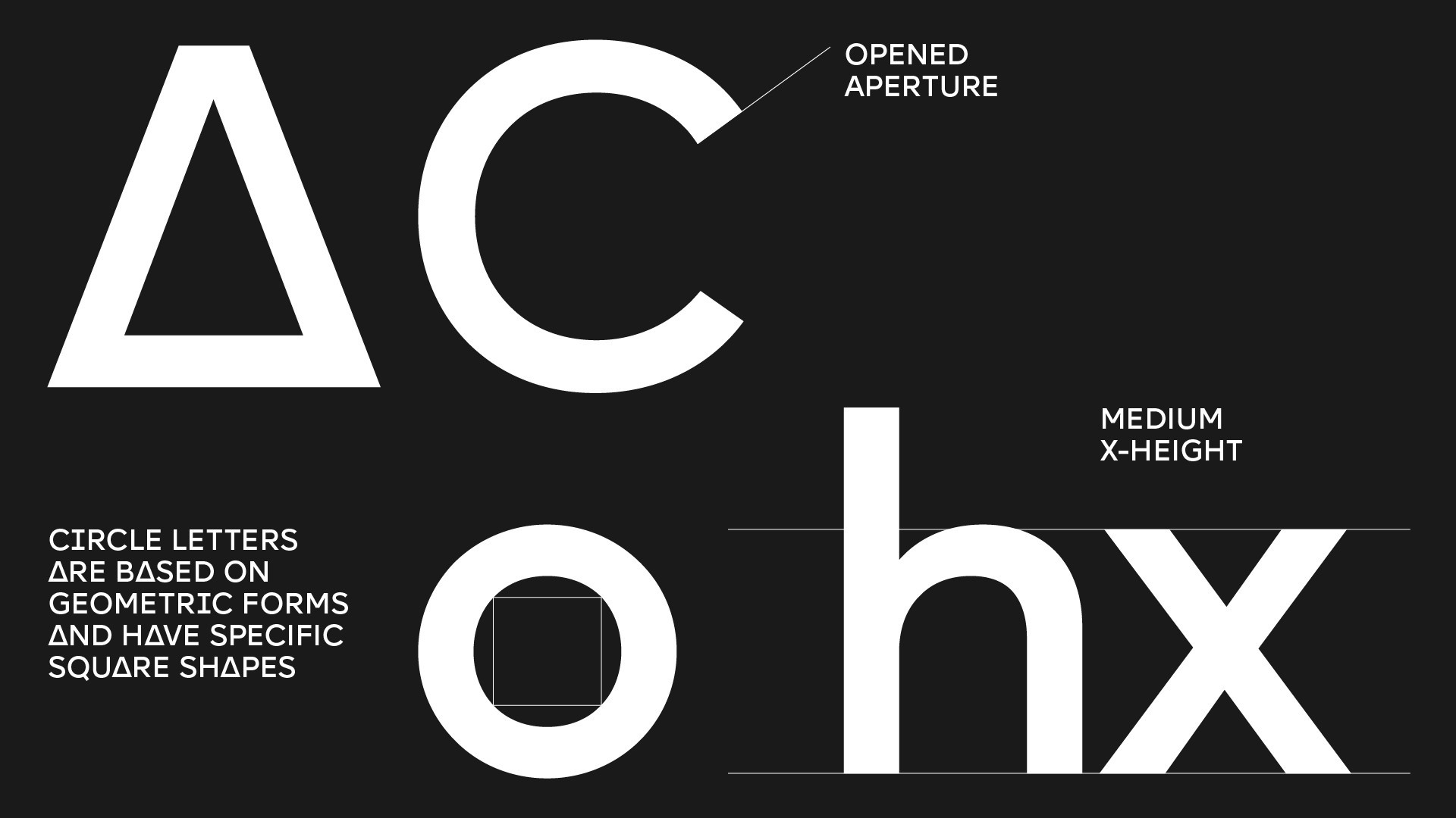
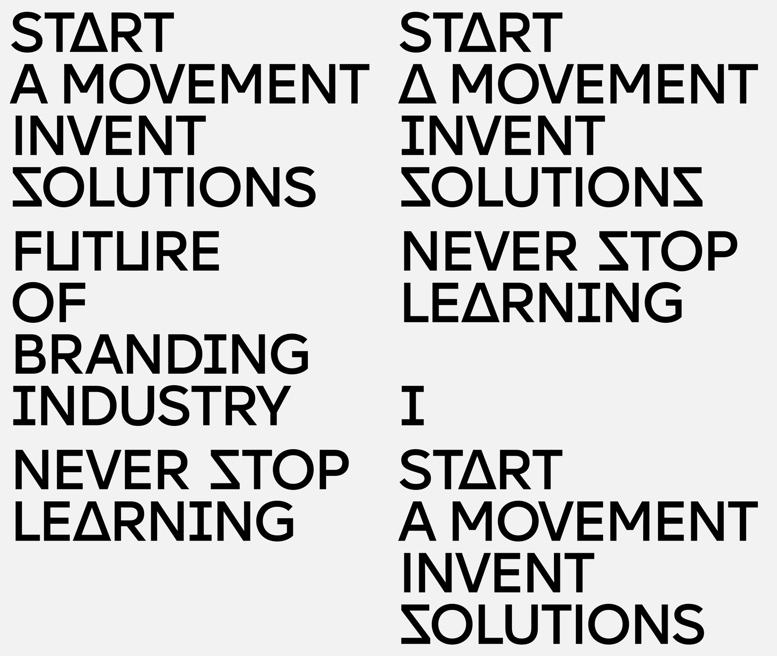
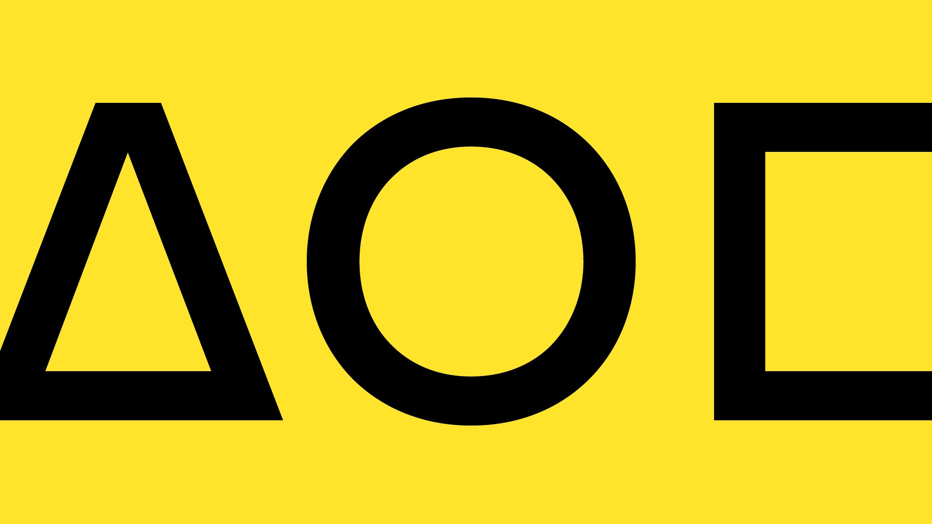
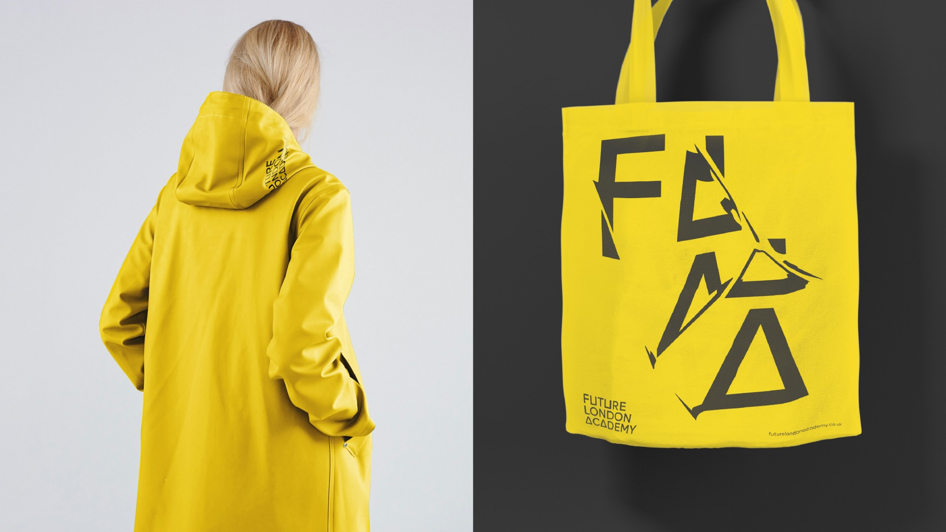
One interesting rhythmic feature that appealed to our attention was a triangle, that appears in the architecture of the city. Mostly, it is a module structure, as seen with London’s «Gherkin» building. Connecting geometry of the city with the plastics of the font, the triangle became the first origin of the visual decision. The second element became refraction, that was inspired by geometry of the London’s architecture and Harry Potter's mystical impression of London. As a result, abstract visuals took shape involving brave and bold solution.
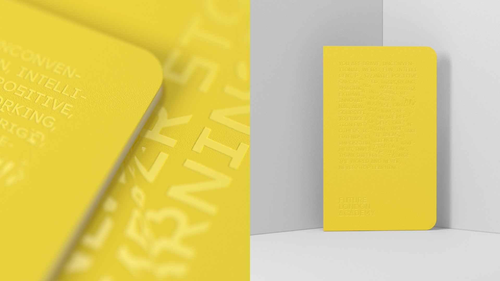
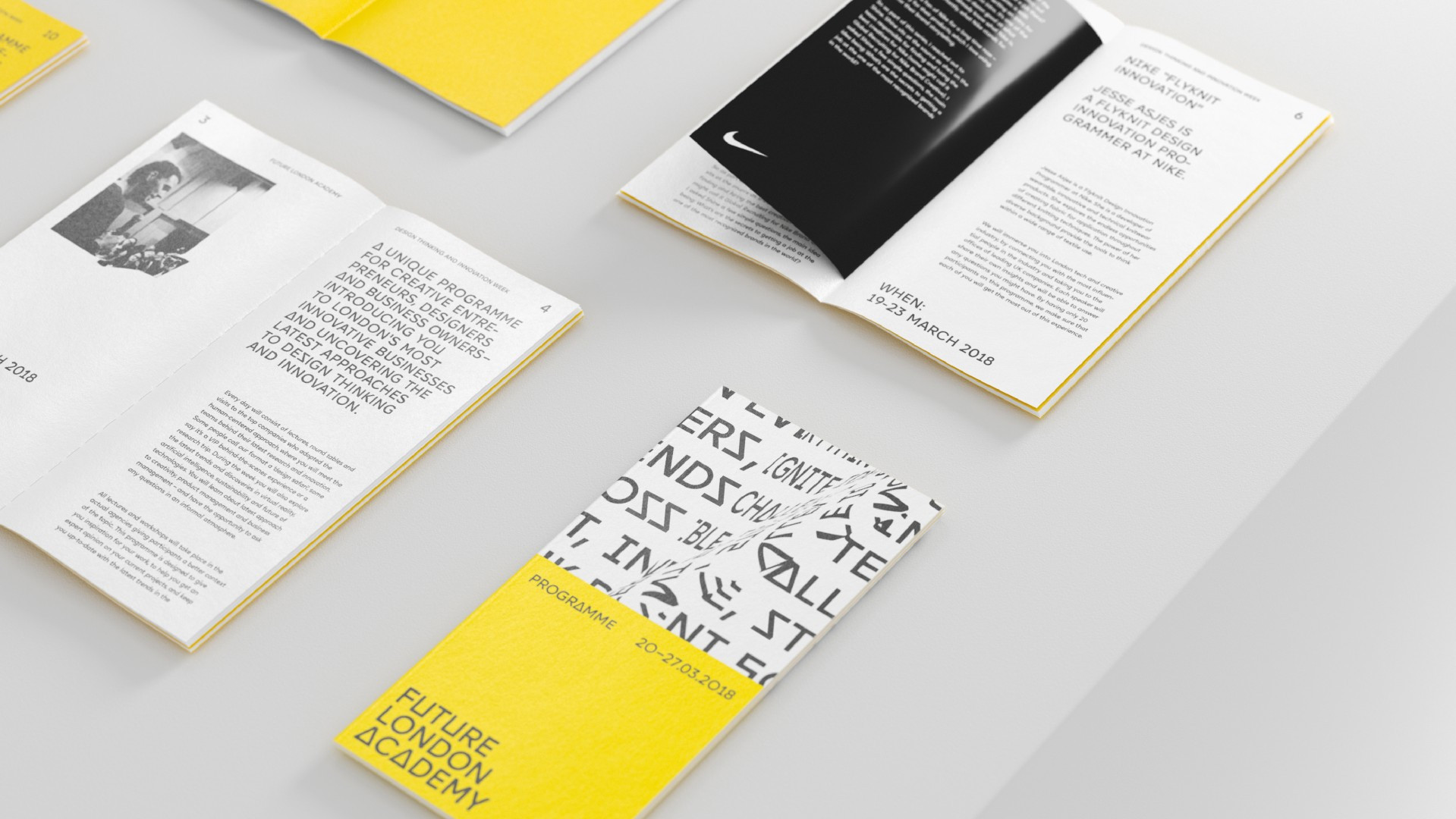
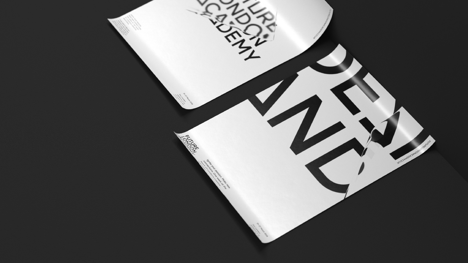
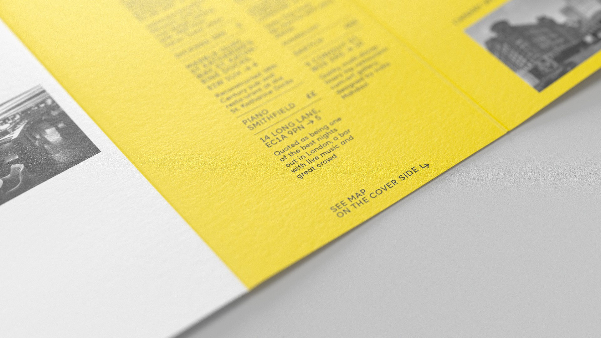
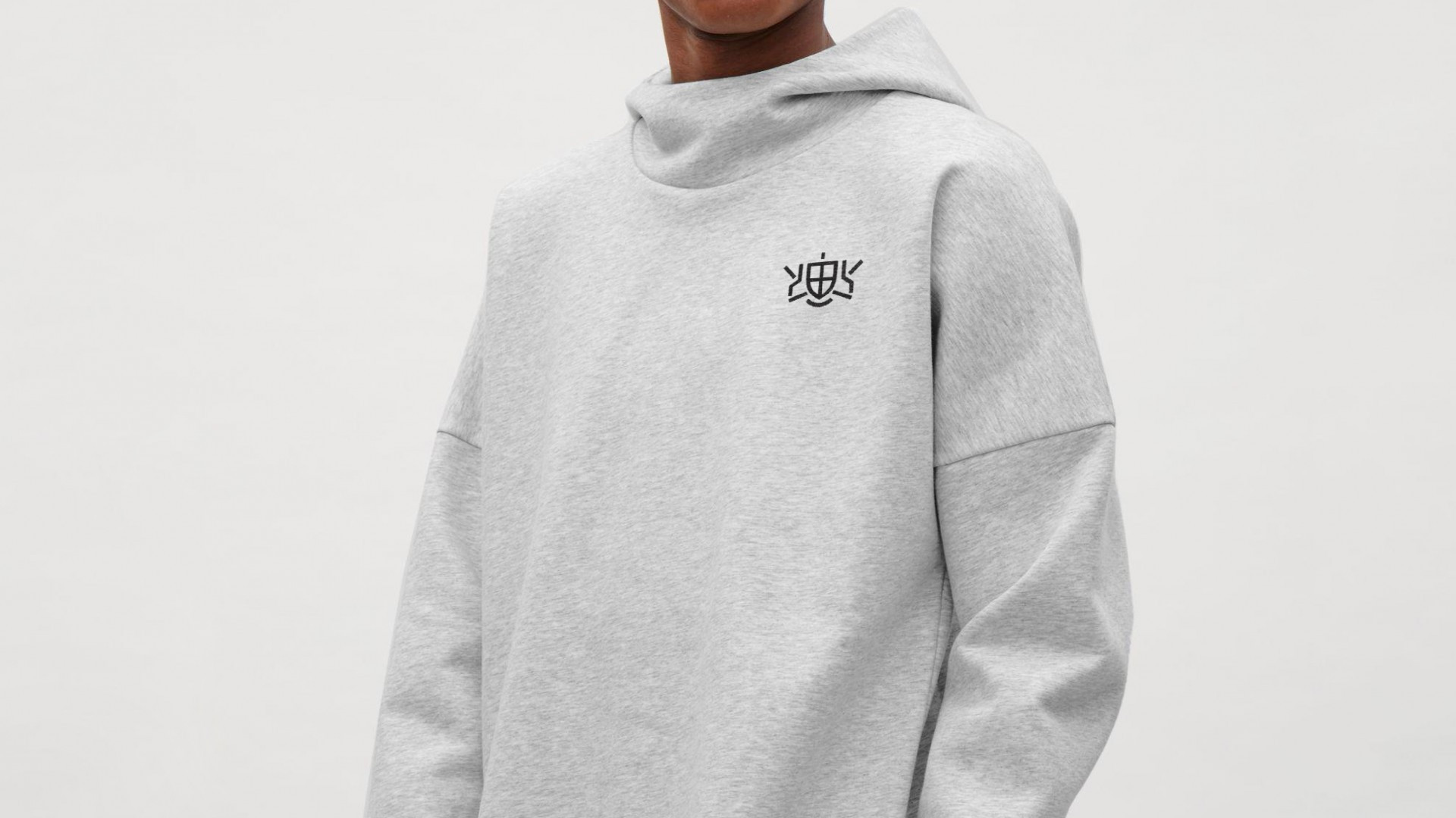
We created a minimalist version of coat of arms which kept the original structure but completely lost the visual redundancy that is irrelevant nowadays (you won’t see the Gryphons in the picture although they are there). The inquisitive reader can recognize the shape of gryphon wings at the top corners of the picture – they are encrypted in the diagonal lines. Also there is a high-minded bending of the back of a mythical animal.

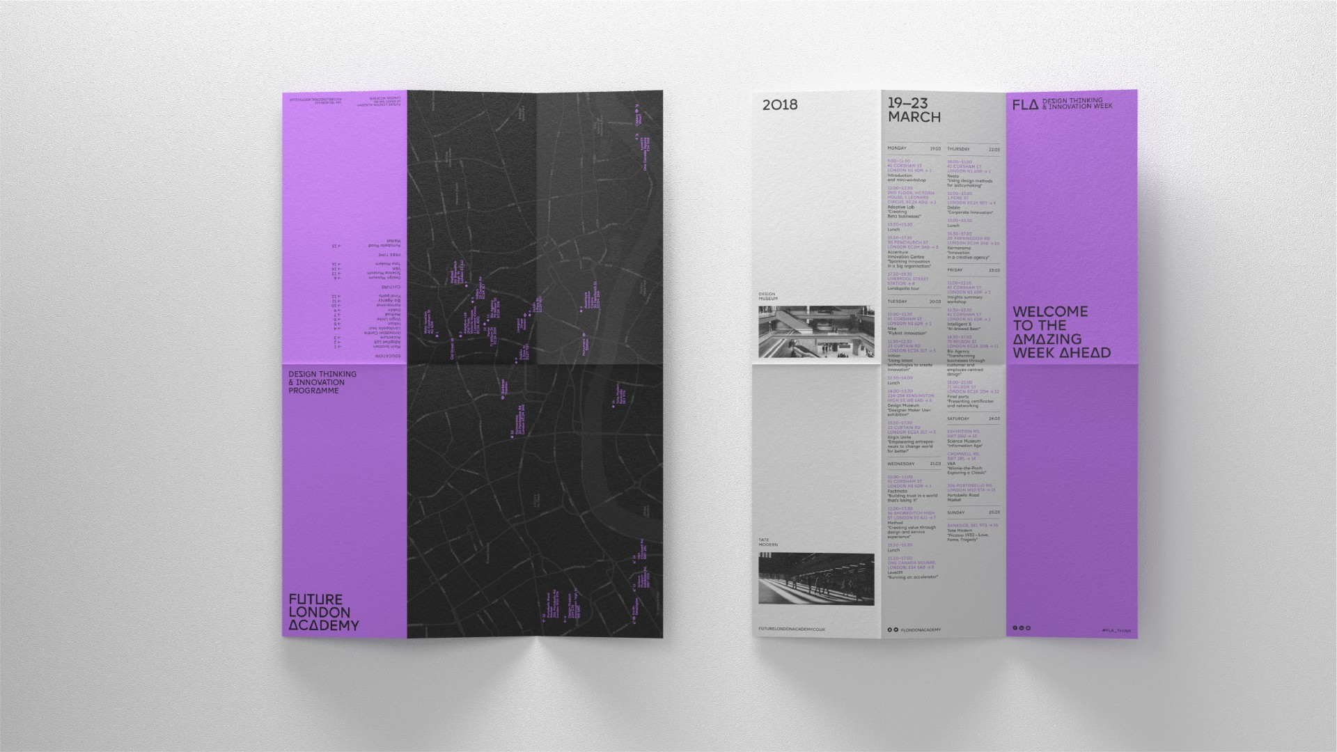
Besides the main brand that is Future London Academy, there are also various programmes Academy runs that needed a sub-branding. The task was to find an easy way to show every programme in a unique way while visually keeping them consistent. The solution was to create a secondary colour palette, that could work with the main yellow colour without overpowering it.
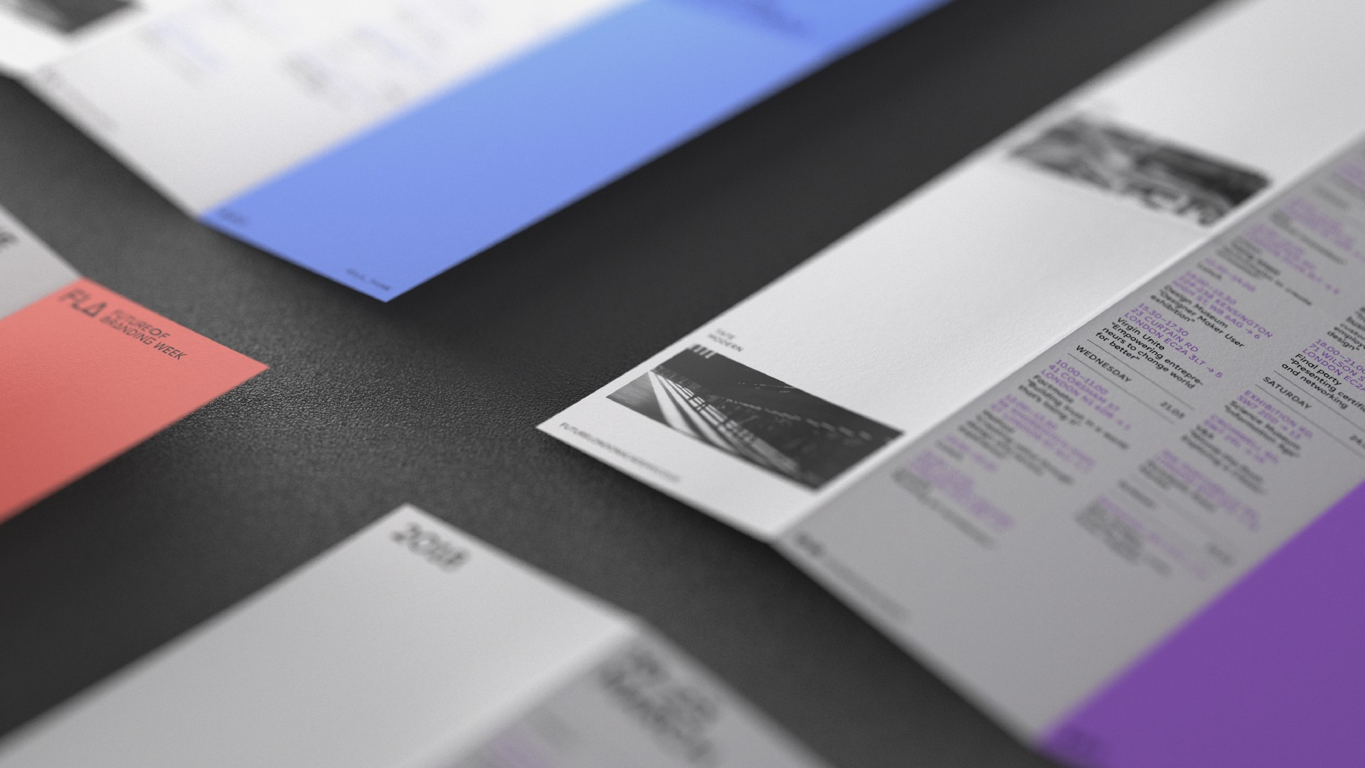
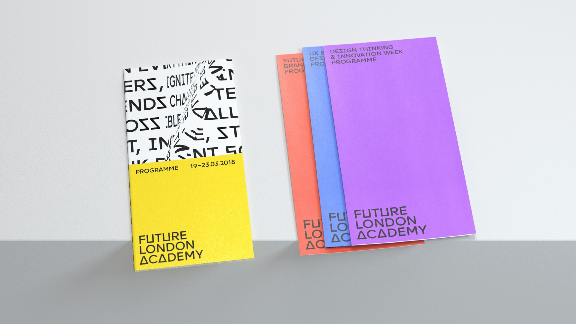
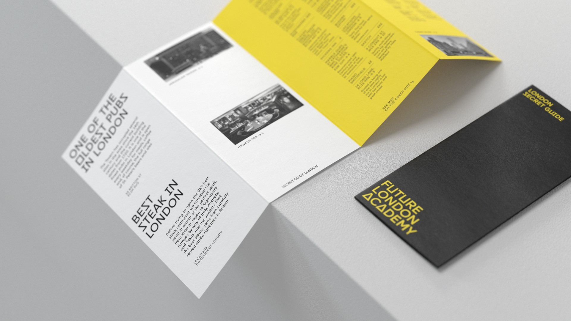
The Academy dedicates a lot of time to real case studies which include showreels, agency portfolios and other content that showcases the design world. Our team created a visual language for the materials, they all become a part of one system. This allows Future London Academy to incorporate additional content, keeping the visual presence consistent within the brand.