Mango. Everything is so easy
Russians are used to insurance being complicated, exhausting and unpredictable. Mango Insurance is a next-generation digital insurance company, ready to protect your apartments without any extra papers, agents or offices. The company is planning to introduce new insurance products, like pet and accident insurance. Mango’s approach is reflected by their slogan: «Simple. Fast. Lots of it!». Insurance is easy to get, and payouts are often bigger and come faster than customers expect.
ONY’s global task was to develop a brand platform and identity for a startup with no clear competitors in the Russian market. In close collaboration with the Signal by ONY research laboratory, we studied the insights and demands of the target audience in this service sector and formulated both a brand position — «the first insurance company to work in your interests» and a mission «We want everyone to feel protected and know that no matter what, they won’t be left alone to deal with their problems».
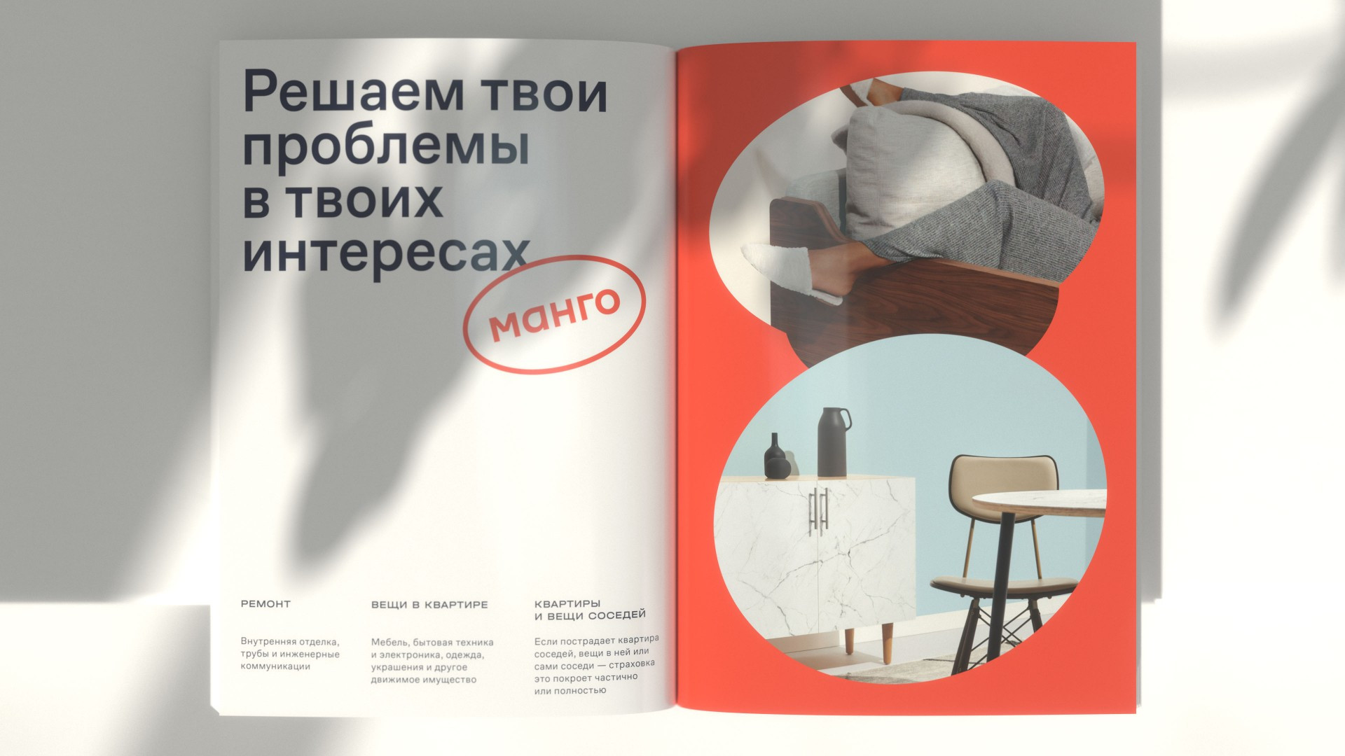
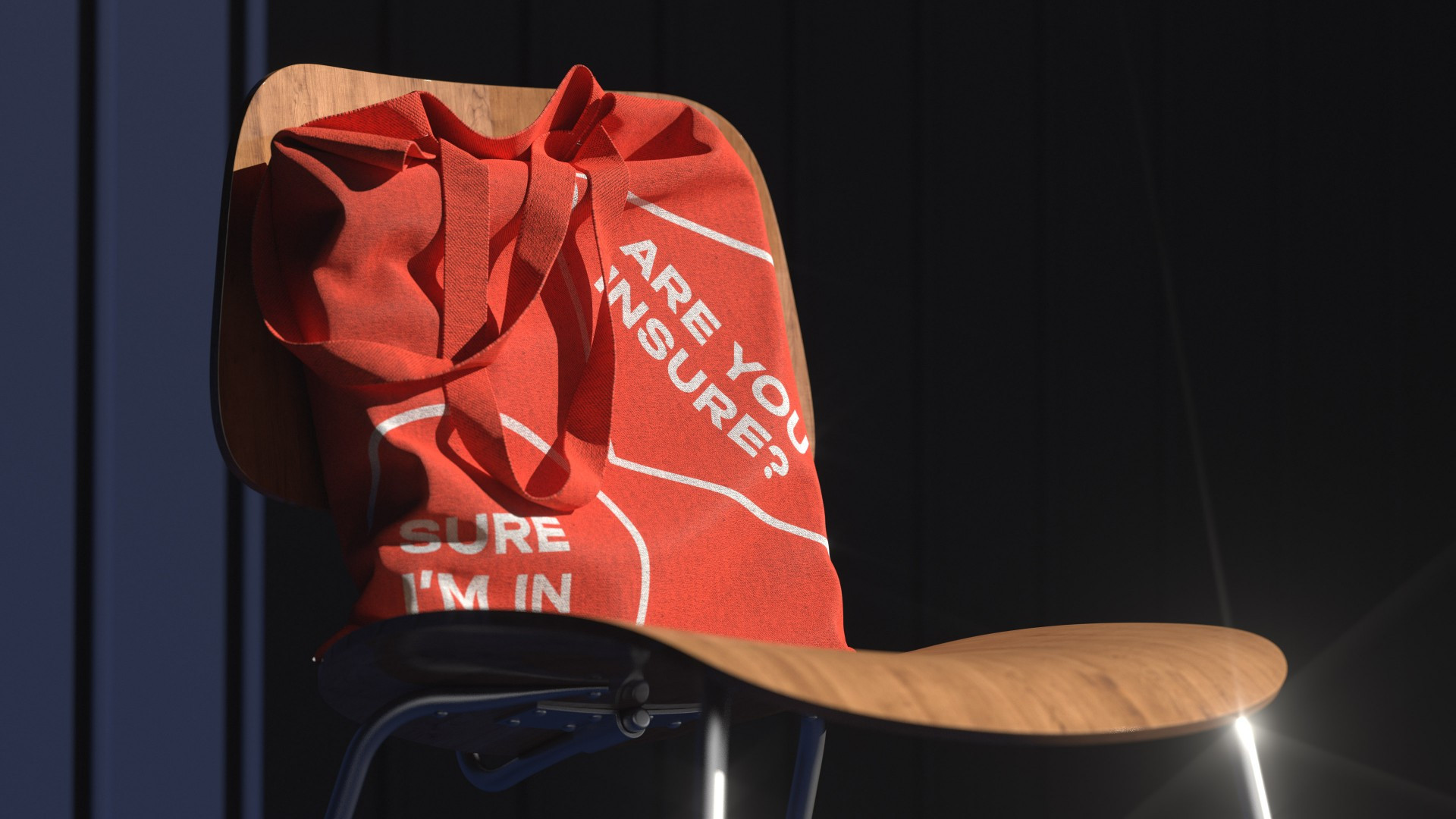
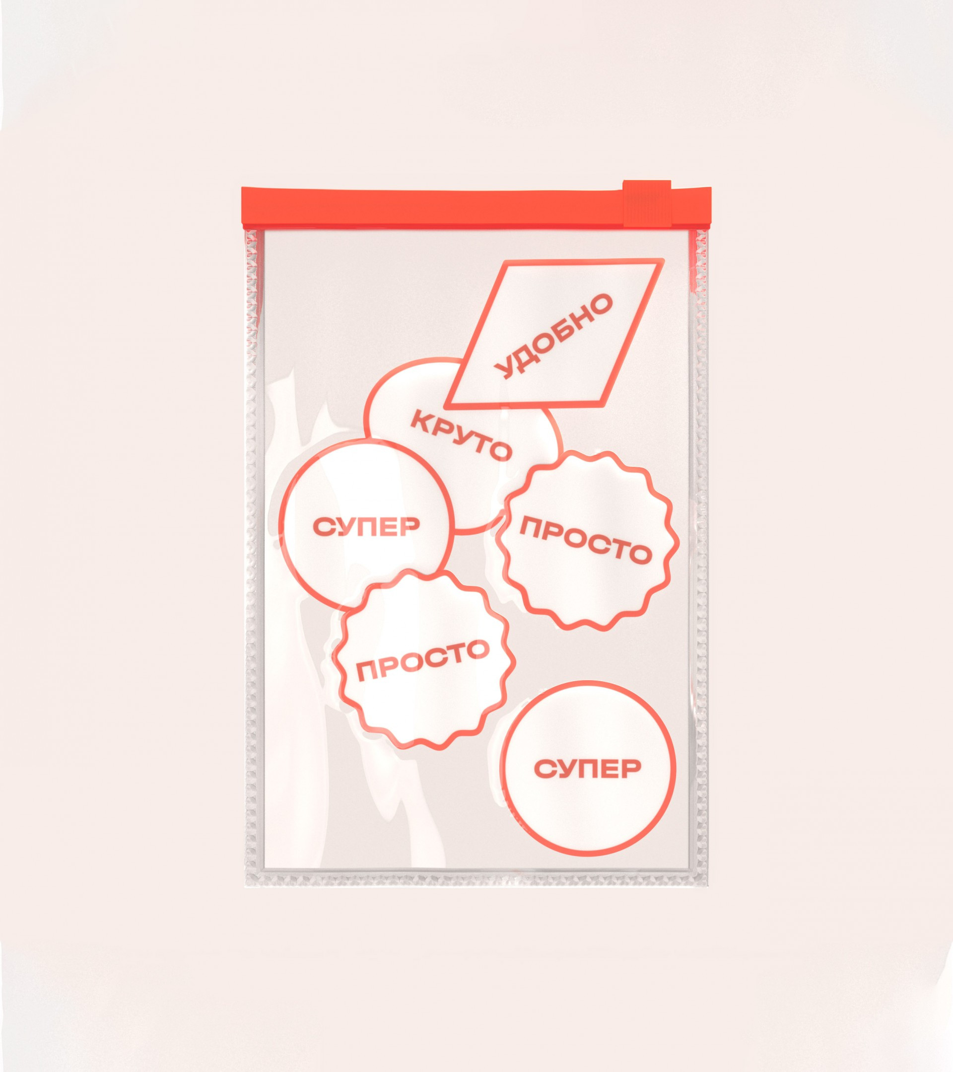
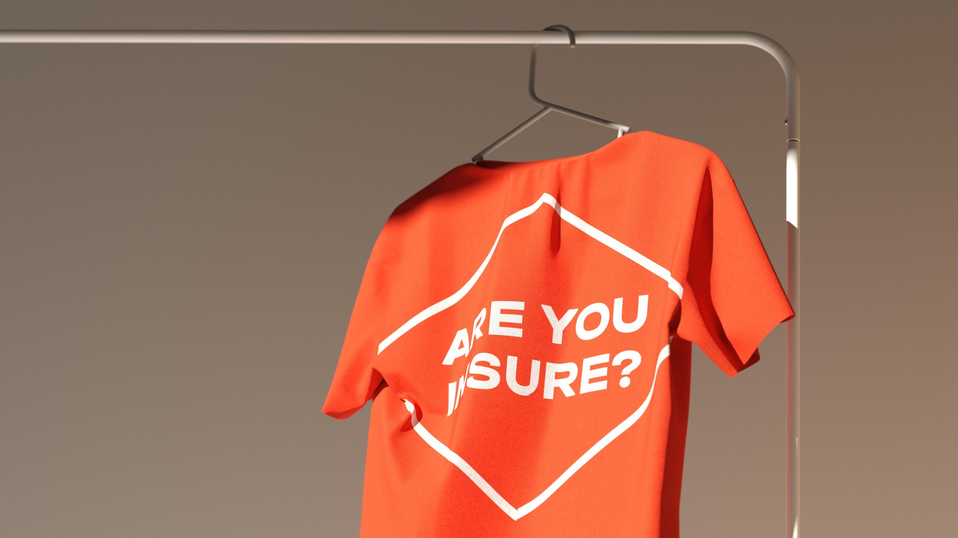
In accounting for all of its strategic circumstances, Mango’s future identity had to inspire its target audience’s trust in a new product while increasing the simplicity and transparency of interactions with the service. The main idea for the company’s style was the use of stickers, similar to the kind that we see on fruit in supermarkets. They help users find out more about the company and deliver the right messages about transparency and trust, while also communicating the company’s care for its clients and showing its attention to detail. In terms of design, these stickers had to be lively, with a lot of graphic potential. They can be manipulated and posted outside of the design framework, taking on any form necessary and adding short keyword tags.
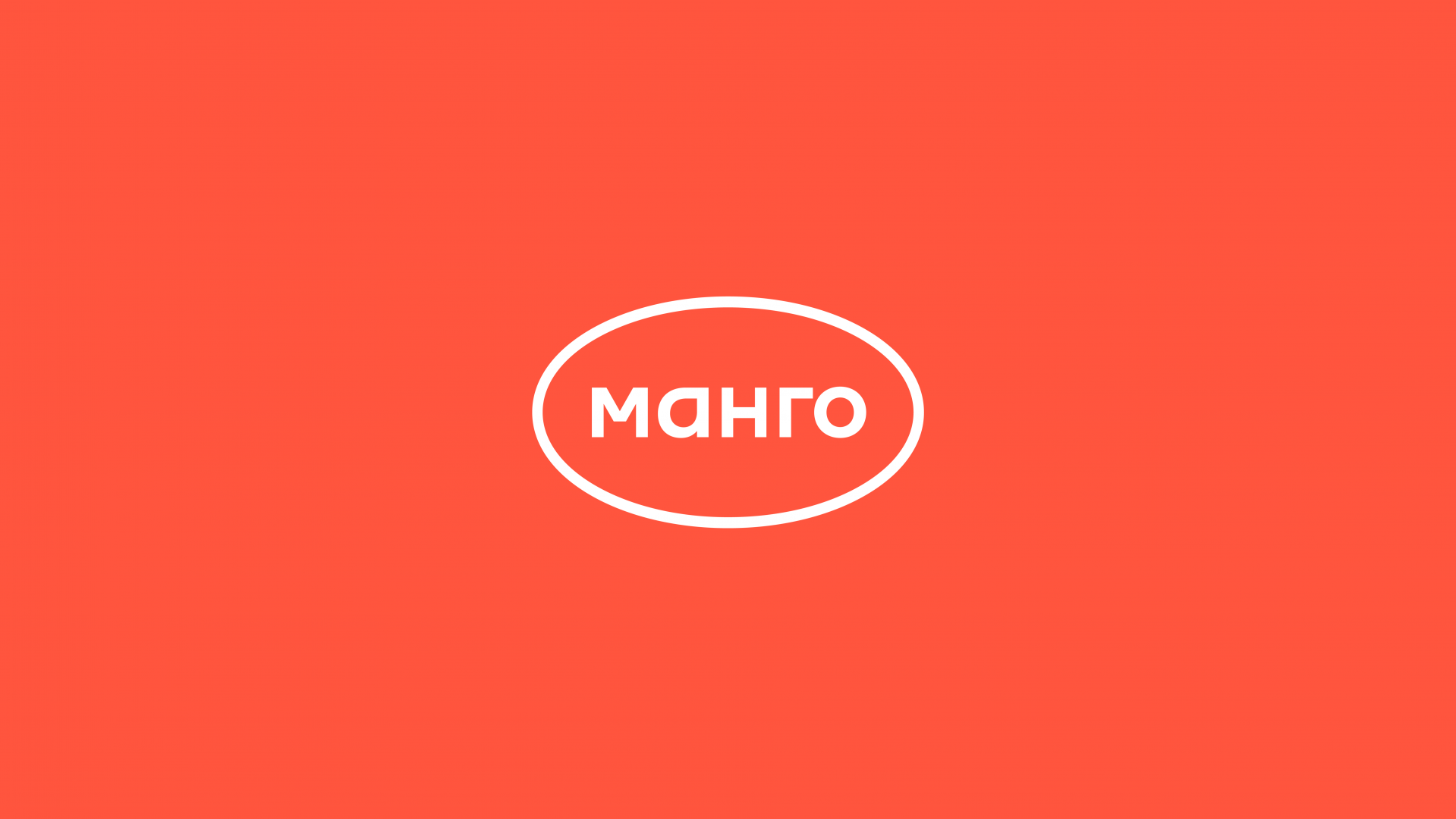
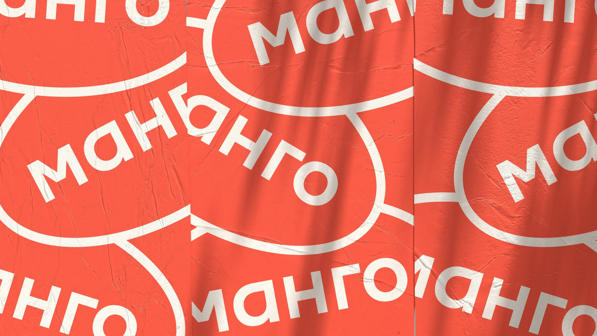
As part of the concept, we developed a minimalist logo: the outline of a sticker and lettering with the company’s name. The shape of the letter “a” in the logo is reminiscent of the shape of a mango. This helps to make the text more accidental in the context of other stickers in the same style. The logo has two versions: first, the primary outline version, followed by an inversion, which is a bright coral-colored spot that draws attention to where it is needed.
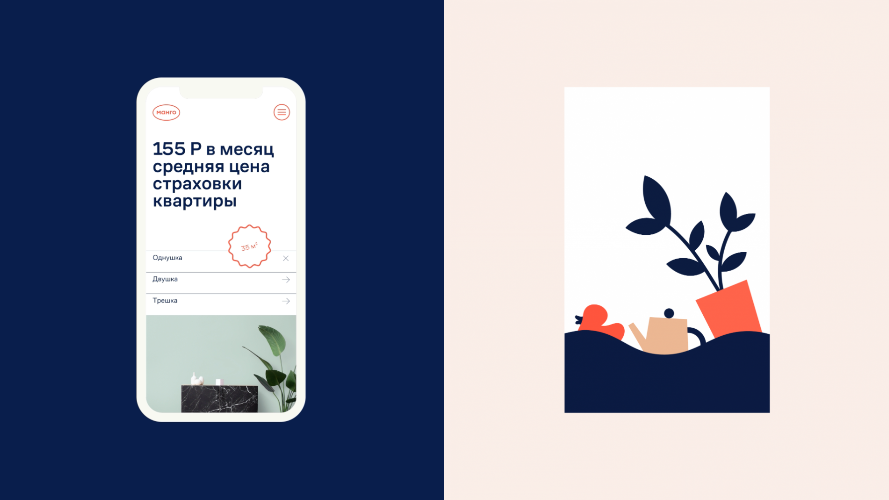
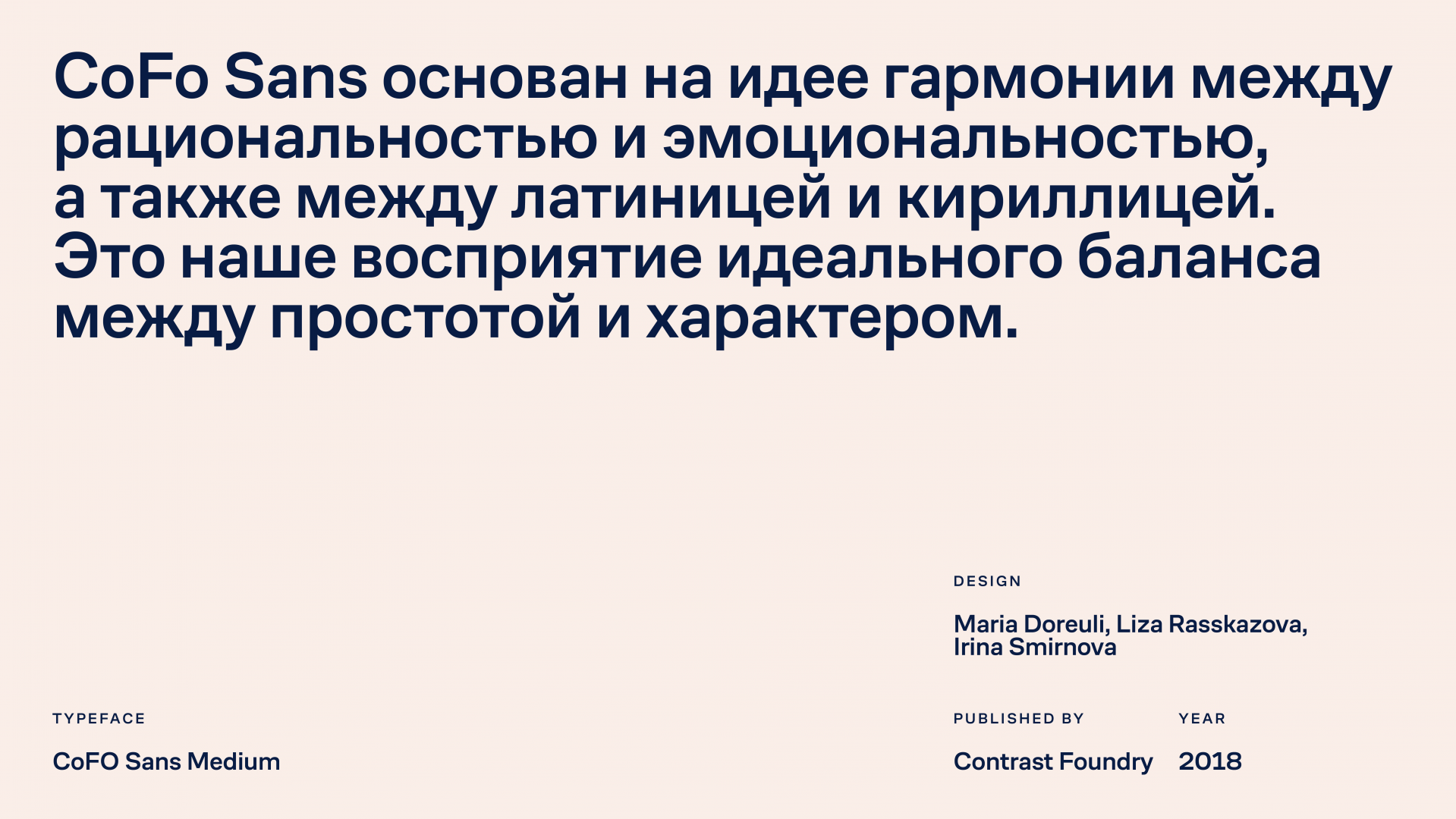
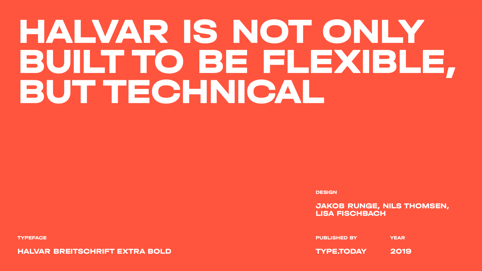
For communication within the other stickers, we used a wide font, Halvar, which works well for a selection of short words. Alongside it, we selected the more relaxed CoFo Sans, with more classical proportions that work better for large text blocks. At first glance, CoFo doesn’t stand out, but its neutrality creates the necessary contrast within the font pairing.
The dynamics of fruit stickers was echoed in the development of the style. We can see the same rounded, wavy and zig-zag lines with minimal details and easily tie them it with the product’s general style. Illustrations, on the other hand, work as color splashes and offer a pleasant counterpoint to the linear graphics of the fundamental elements of the style.


The sticker approach allowed us to organically brand any content whatsoever —even photographs of flooded apartments, devoid of aesthetics and made especially for an insurance company. In this way, Mango can use just one or two stickers to put up an Instagram story or make a Facebook post. For the digital environment, stickers animate and layer easily, while in the physical world, they can be printed out and pasted on top of each other.
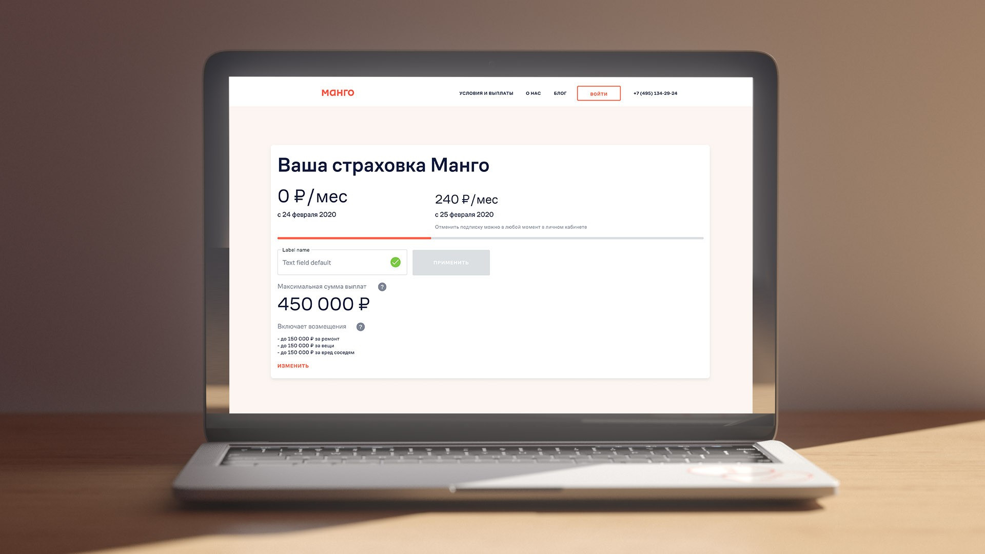
We ended up with a company branding that is easily recognizable on the one hand, encouraging the right attitude among users, while integrating easily and directly into all of Mango’s visual materials on the other, from their website to advertising banners. But the most important thing is that this style gave the service the right tools to differentiate itself from enormous, cumbersome insurance companies: on the visual level, it’s clear how easy and modern it will be for customers to work with Mango.
