igooods. Helping you manage your home
igooods is a major grocery delivery service that helps thousands of people save time. After its beginnings in Saint Petersburg, the project is currently taking on the Moscow market. A convenient site and quick delivery staff are the rule for this market, so igooods tries to think about the human factor of its mission. When you place an order, the company’s purchasers always stay in touch with the customer in order to suggest an alternative, for example, if a particular product is out of stock. In order to underline their competitive advantages over other delivery services, the company decided to develop a new brand platform and visual style.
Our insights consulting firm, Signal by ONY, worked on the strategy. The team analyzed each competitor’s business model, and determined that they all focus specifically on the delivery functionality without offering any additional value to the customer—all while consumer demands are growing wider and including such factors as purchase budgets, shopping lists, recipe searches and cooking. This is how we found a new positioning: now igoods isn’t merely a delivery service, but a real home management service that helps you save money and find recommendations for cooking and managing your everyday life.
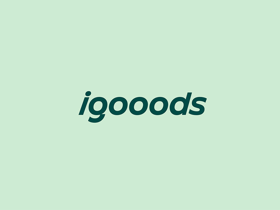
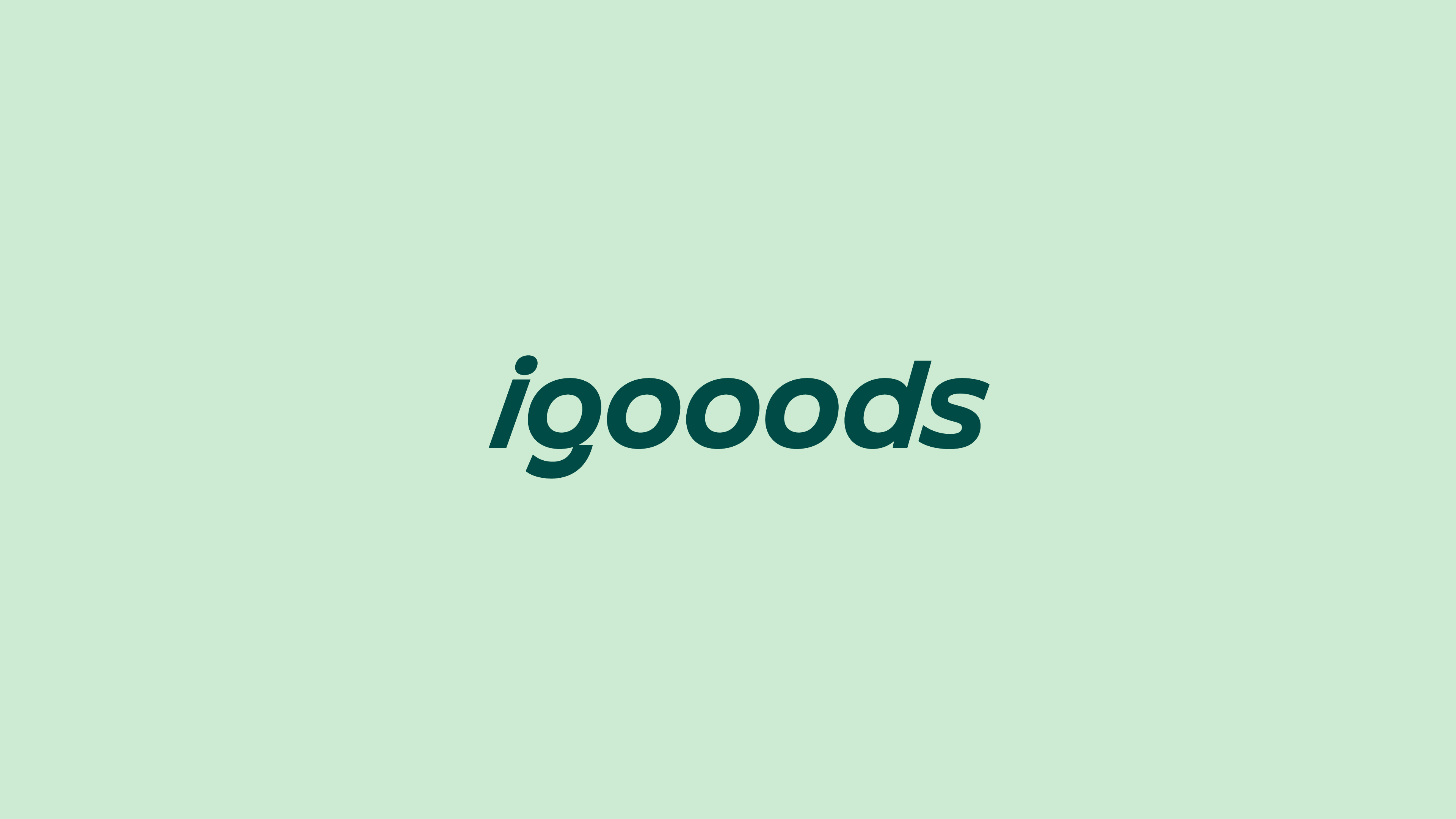
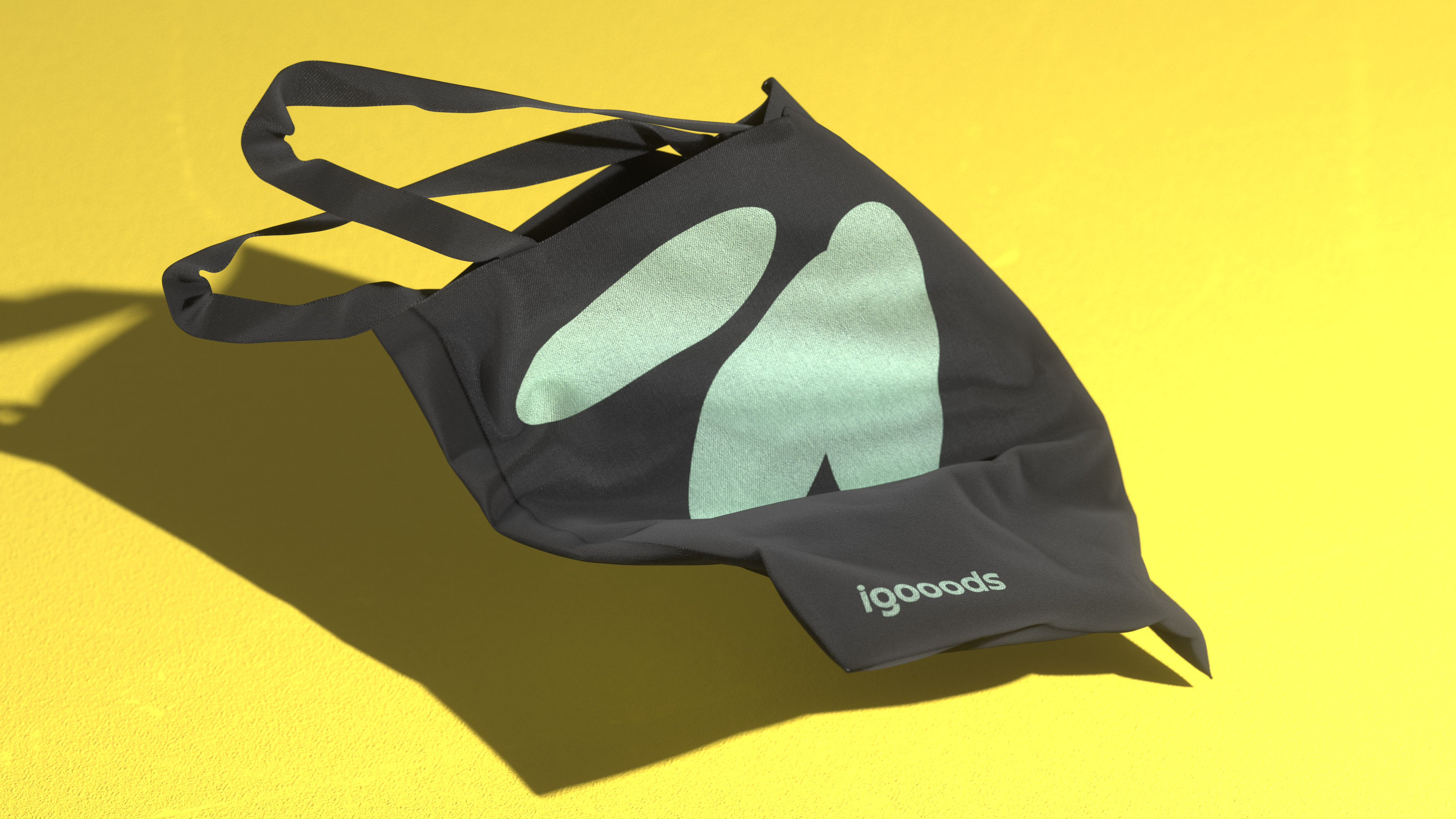
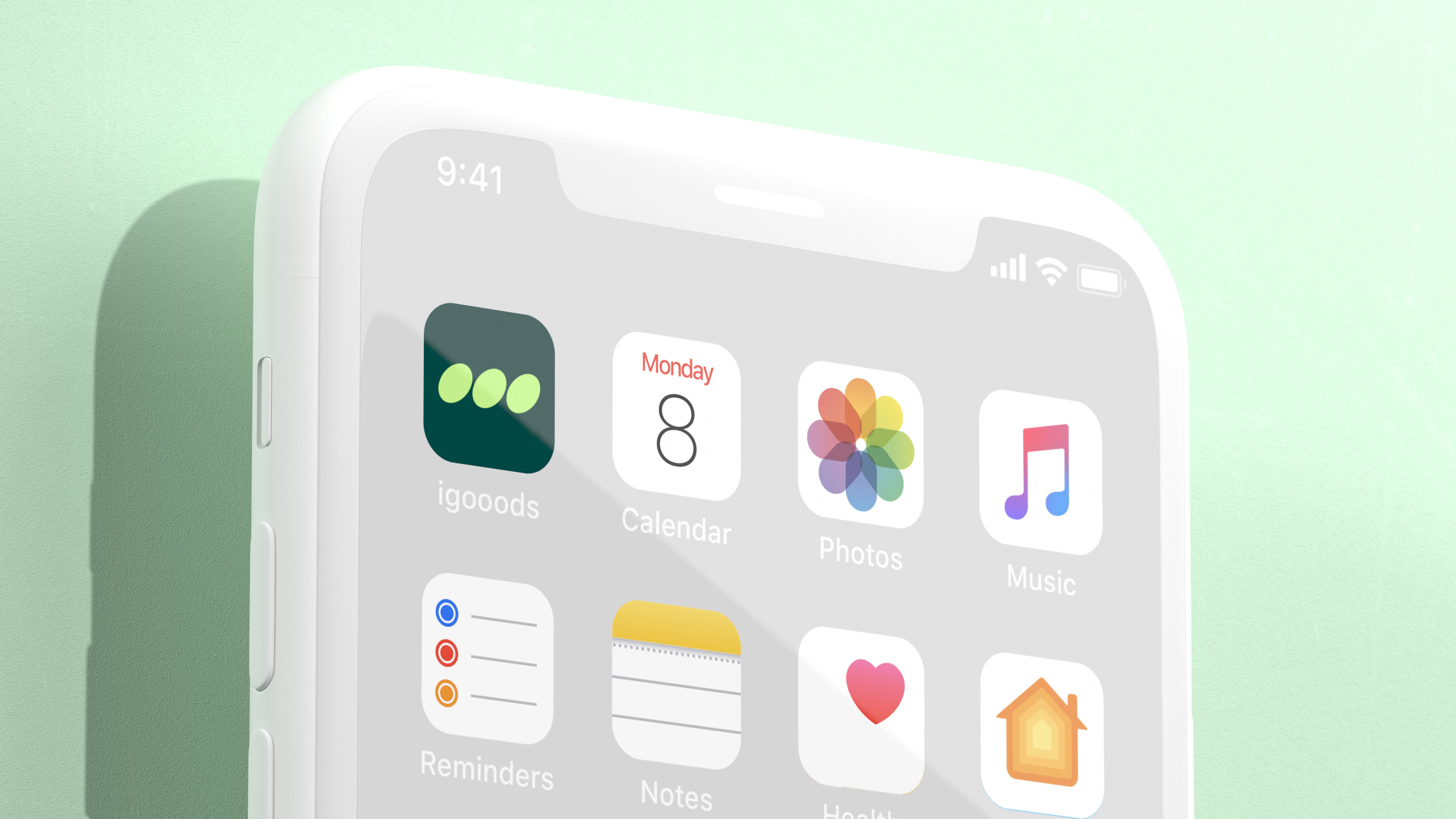
Based on these strategic parameters, we began developing the brand’s future identity. It was very important to understand how visual language would help the company stand out from its competitors, all while staying squarely in its category. Of course, we couldn’t ignore an important nuance of the name: the extra «о». In the logo’s new lettering, they turn into angled ovals, symbolizing the speed and reaction time of the delivery service, while simultaneously resembling the ellipsis that appears when you’re typing in a messenger application—a reminder that the company is always ready to get involved and help.
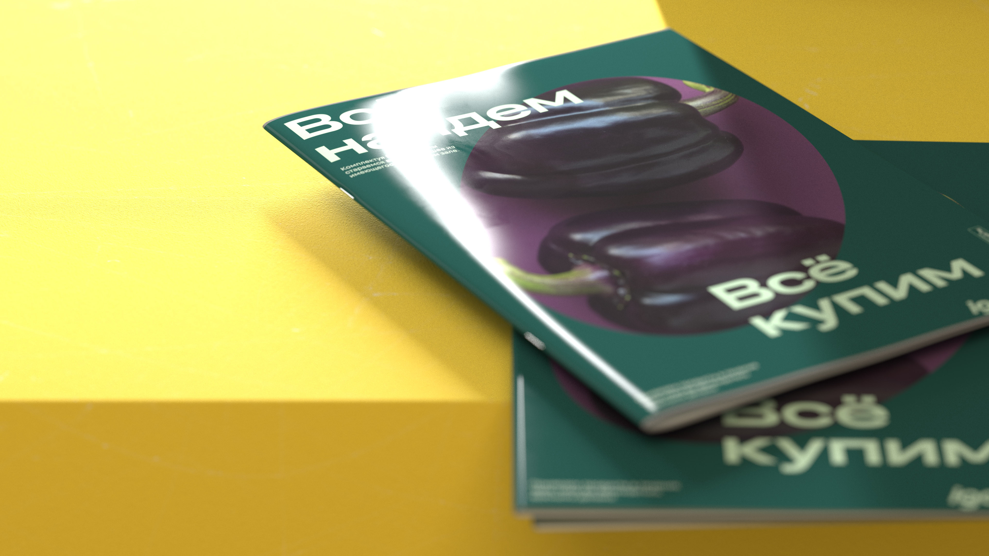
For text communications, we chose two grotesques from one font family: Grtsk tera and Grtsk peta from Black [Foundry]. In headings, we use the wide typeface that communicates movement and holds the layout together. The second typeface, with its calmer proportions, is suitable for large blocks of text.
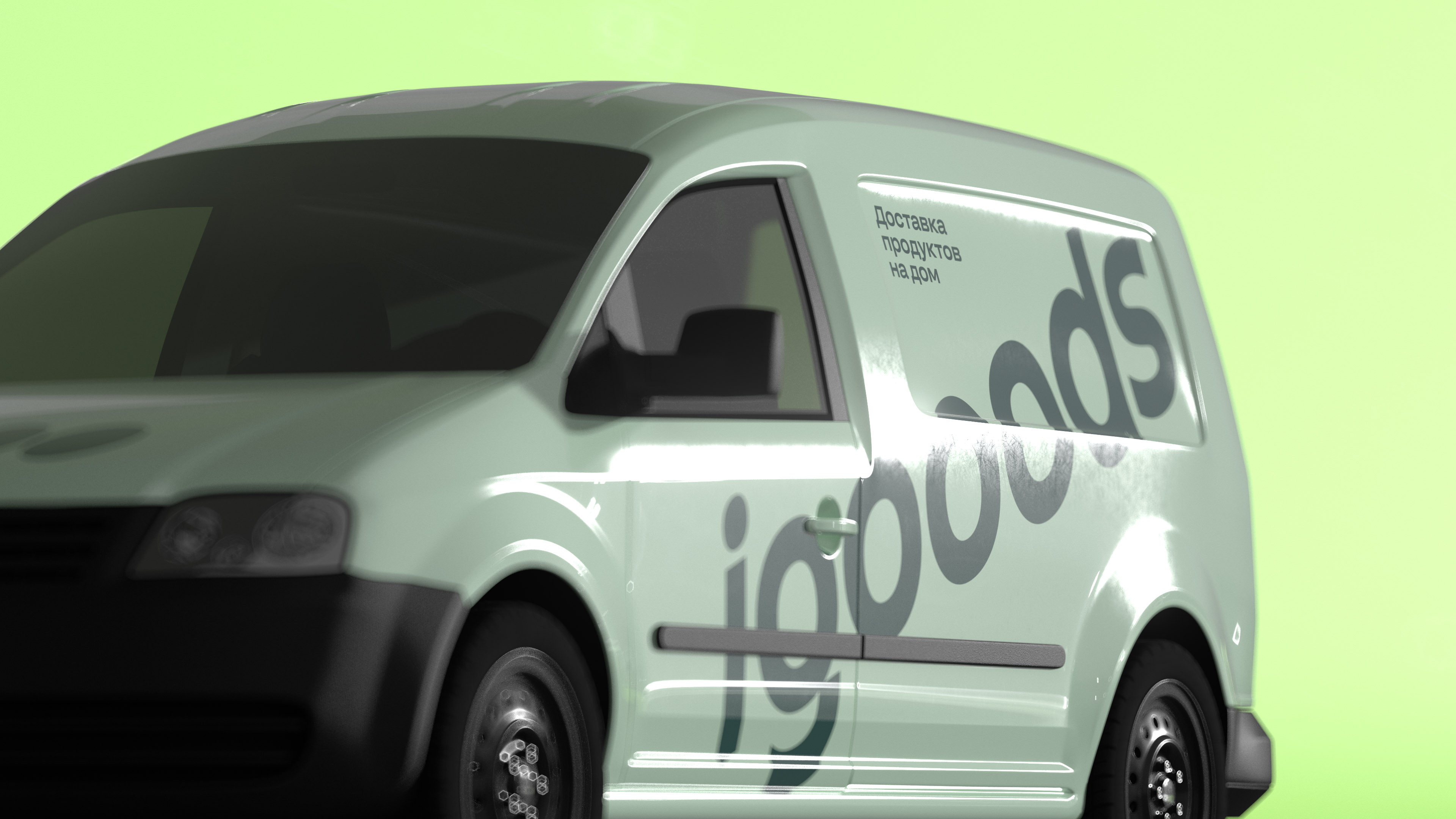
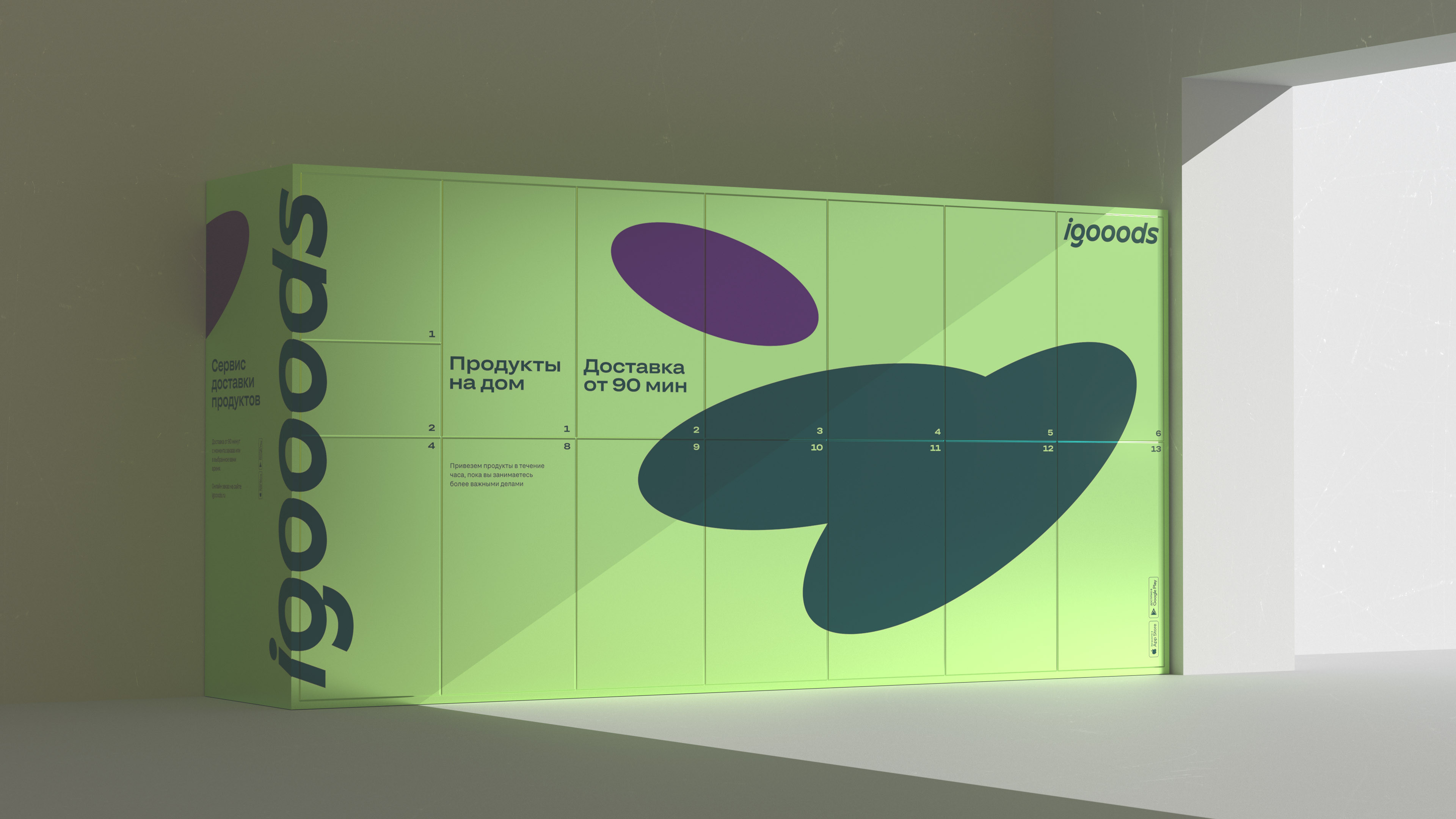
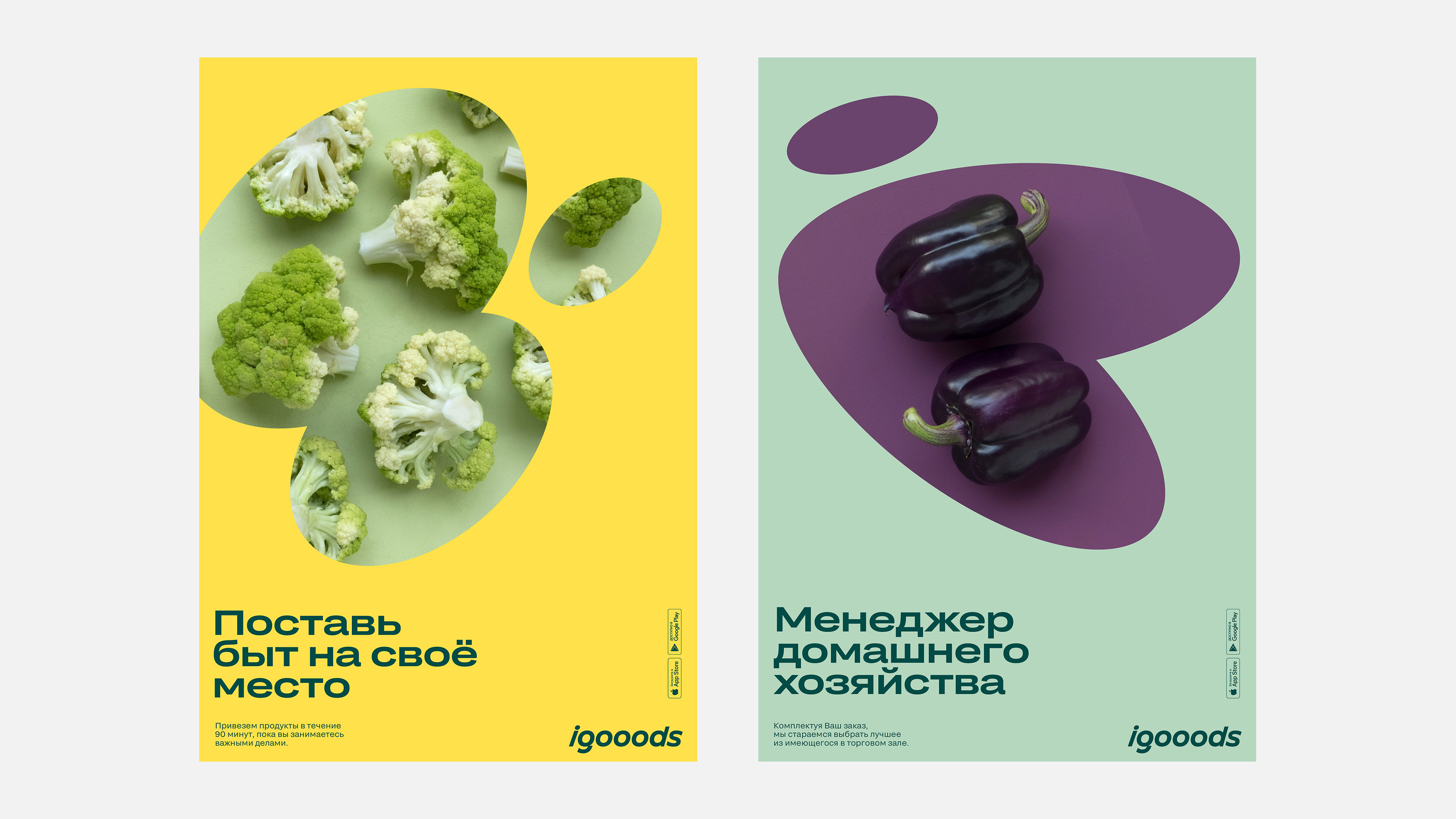
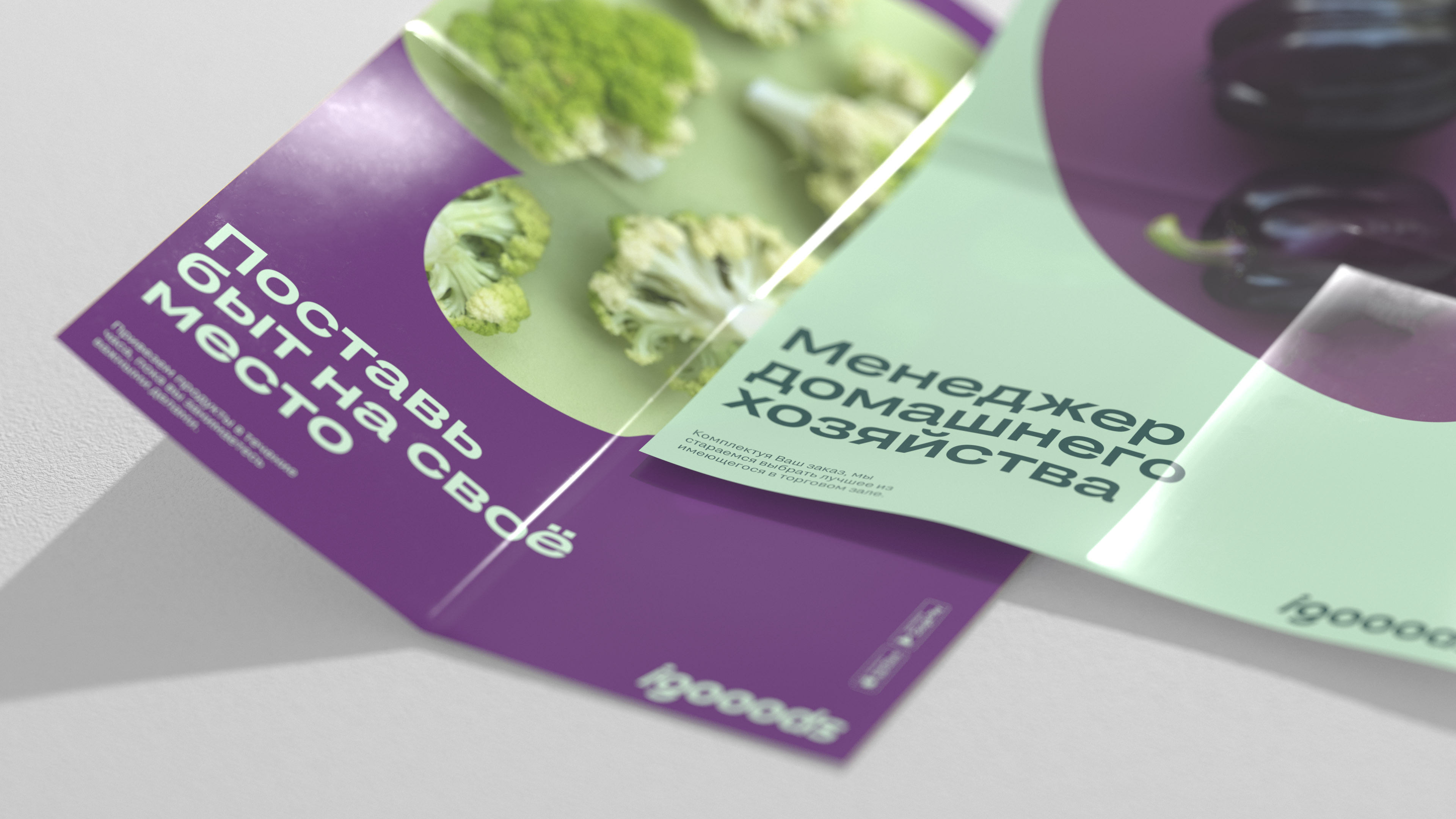
In developing the brand’s color palette, we stuck to natural colors: natural plum, mint and banana. This unusual combination distinguishes igooods from the ostentatiously bright and synthetic colors used by many other delivery services. In our opinion, this demonstrates the company’s deeper and more intelligent approach to its service.
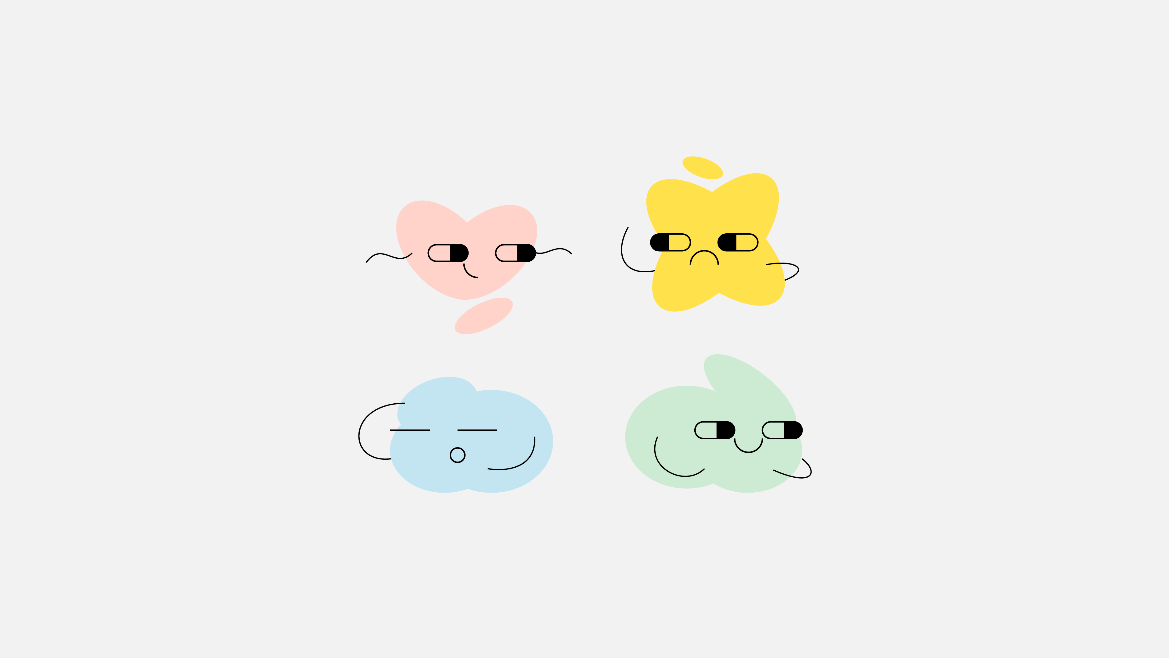
In advertising and branding, the logo’s ovals become the main style element: they can change size, group together, layer on top of each other, or become a big color spot in a composition that can hold text or photographs. We also use the ovals to create small, friendly illustrations in the app. This tool works well with co-branding, as well: igooods doesn’t just offer delivery services, but the chance to entrust the ordering process itself to the service and then pick up your order later. igooods lockers are located in major supermarkets, and now their visual style can always «make friends» with that of the partner store.
We think we were able to find an unusual interpretation of classic visual codes for the delivery market, allowing the product to stay in a clear and comfortable positioning for its segment while noticeably standing out from its competitors. The fundamentally simple visual style communicates the brand’s positioning and gives the company’s designers a lot of opportunities and freedom to work.
