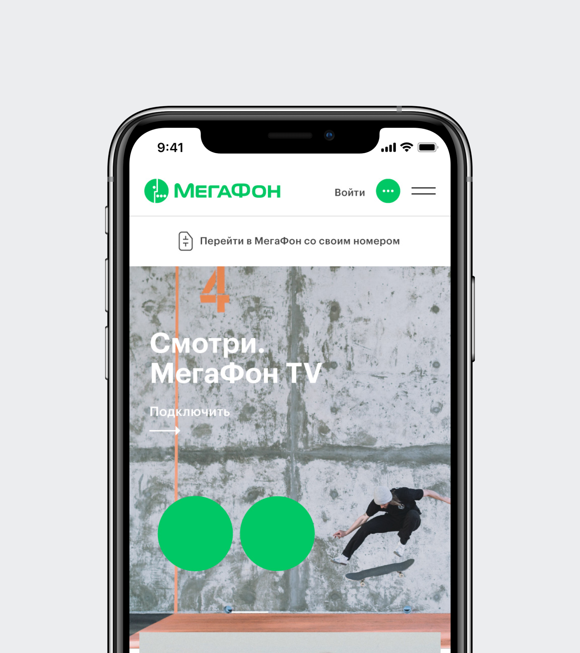
MegaFon. Green in digital

In 2017 MegaFon announced a company-wide rebranding. The task was to update its corporate identity and logo, and the project was taken over by the Interbrand team. Within its new strategy, MegaFon focuses on the digital environment, and to adapt their new brand identity to digital, they turned to ONY.
We have also presented our concept for their site, where we showed our vision of MegaFon’s development and how they could look up-to-date online now and in three years.
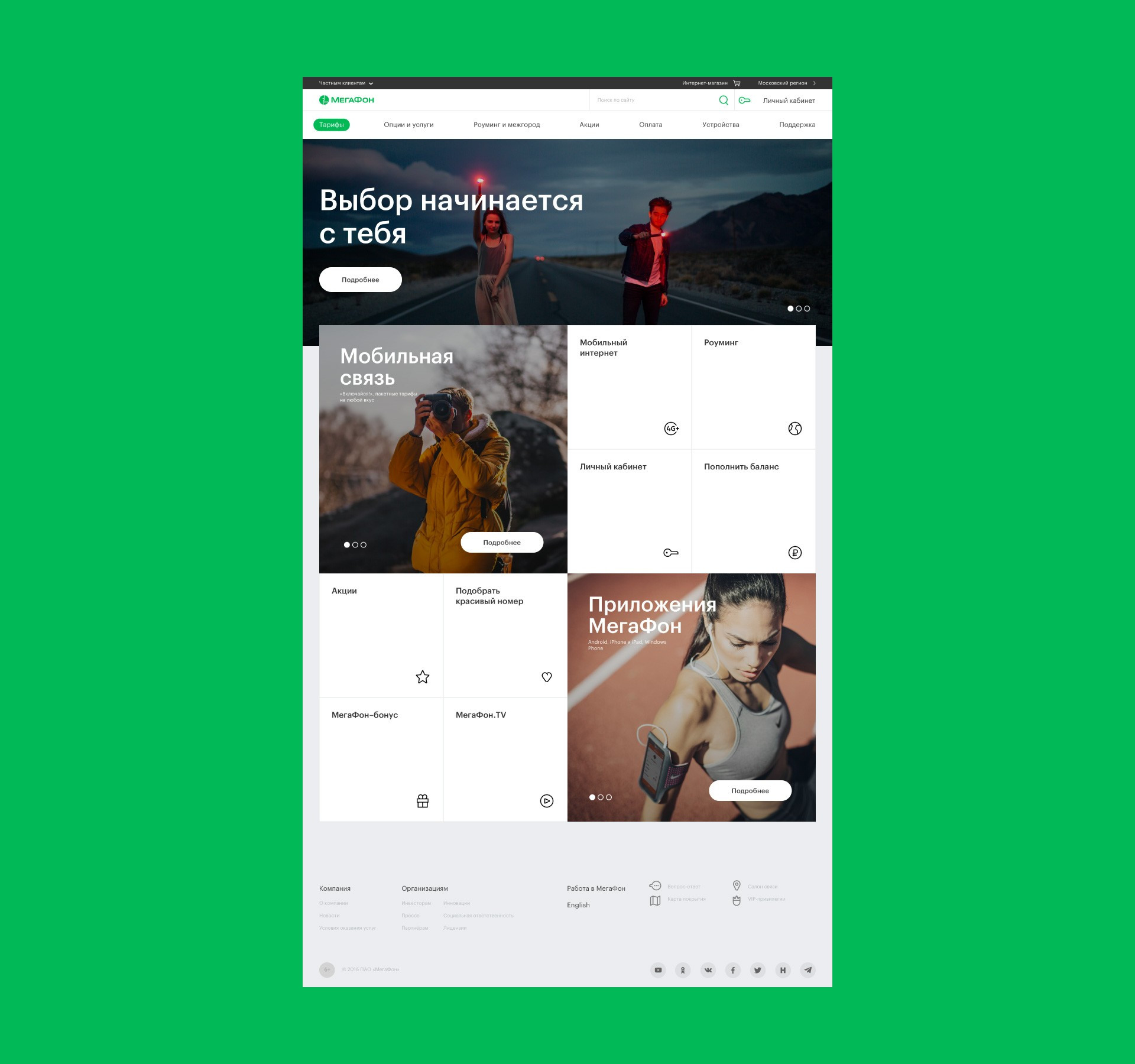
We adapted the guidebook’s «corporate» green color to digital. In outdoor advertising and printed materials it looked noticeable and rich, but in digital communications, it popped too much, almost like a traffic signal. Because of this brightness, white text became illegible, and viewers were left with a disturbing impression overall.
We finally found the «right» green. On the one hand, it is similar to the Pantone shade which MegaFon uses in their outdoor advertising and printing, while simultaneously giving a sense of reliability and comfort over the course of long-term interactions.
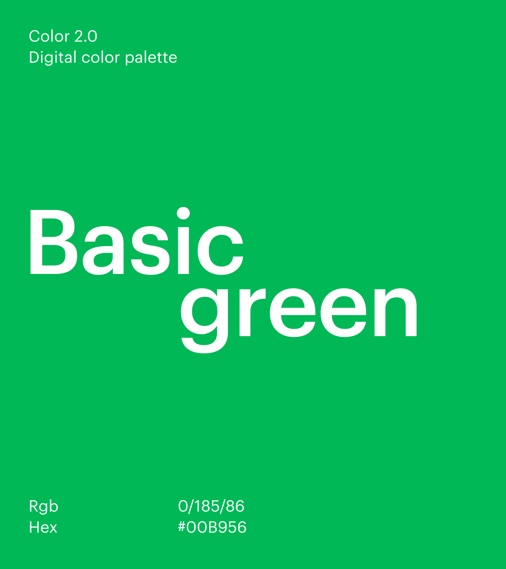
The Interbrand team preferred the incidental GT Walsheim font with a few modifications. In the Latin version, it fitt the brand’s style, but it was noticeably different in the Cyrillic version, and many forms were harsh on the eyes. For example, the Russian «у» no longer echoed a geometric grotesque, but instead harkened back to the spirit of the 80s and the Olympics.
After a complete analysis of these and other nuances, we made the case for another typeface that was more functional for digital media: Graphik. This would allow the user to interact with the product as easily as possible.
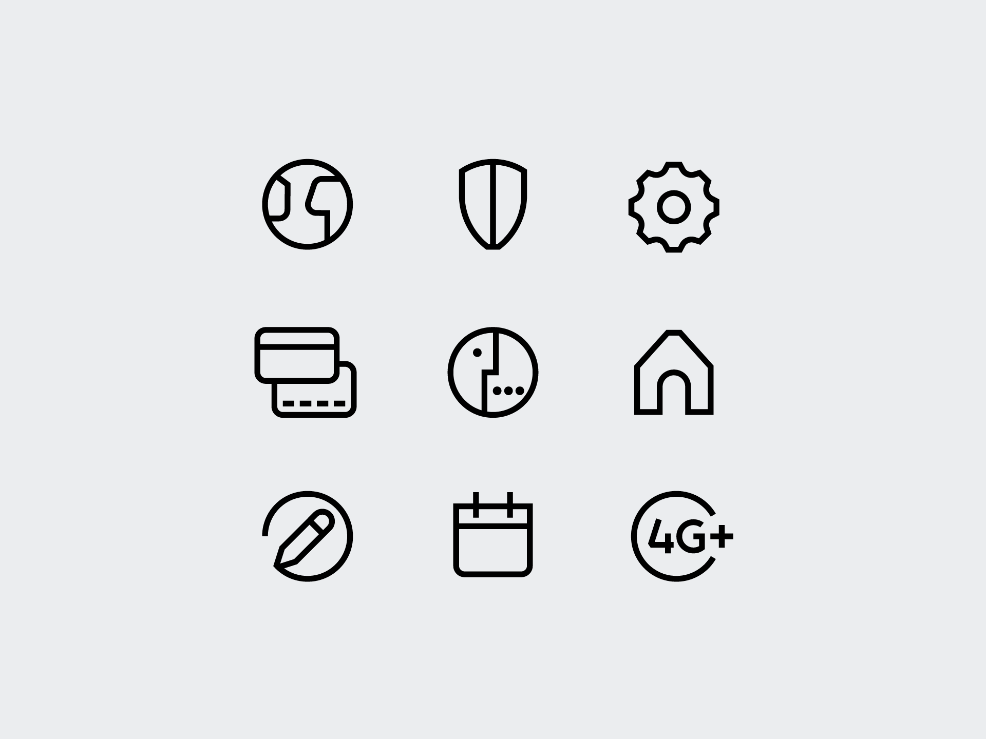
Taking into consideration the new brand identity, we worked out a set of icons that accompany the user throughout the site. MegaFon is as particular about its icons as type designers are about typography. That‘s why we, along with the brand, painstakingly calculated the balance of each individual component like jewelers, branding rounded shapes and accenting "chopped" elements with our trademark thoroughness and diligence. So now we have about 100 icons for a holistic and balanced set, which, if necessary, we can continue to expand.
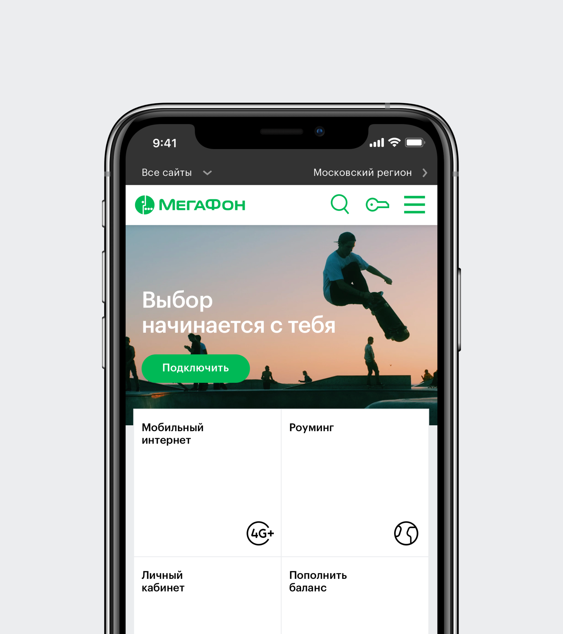
The main page of the MegaFon website can do more than merely inform: for example, by adding service elements. This gives the user instant access to the most necessary services: topping up their balance, finding the nearest phone store, changing their rate plan, turning on roaming and much more.
It is very important for the brand to be felt not only in its identifiers, color and logo, but also in the interface’s behavior. Therefore, the alternative concept of the site features variability of motion graphics and techniques that look logical in common structures while broadcasting humanity and warmth in communication. This way, typical user actions such as scrolling or flipping through a gallery give rise to pleasant emotions.
Together with the MegaFon design team, we developed a toolset to construct the website and landing pages. The basic components such as menus, footer, layouts, form elements and buttons can be used in almost all projects, while other unique ones can be used only within specific services.
We did a huge comprehensive project to adapt MegaFon’s new identity to digital, while also developing an alternative concept of brand presence online — which, if implemented, will continue to be relevant in the future.
