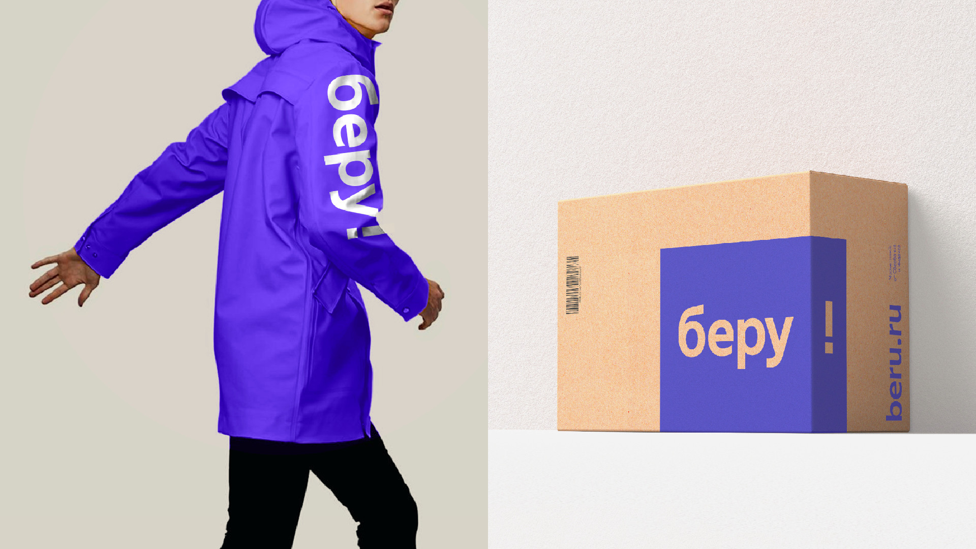
Beru. Inside the box
At the end of 2017 we were approached by Yandex with a global task for one of its new products, a joint marketplace with Sberbank, “Beru”. With the help of this service any brand can quickly sell their products while the customer can either get it by delivery, by mail or pick up. So we had to create an identity for the marketplace.
The most pleasant thing about online shopping is that moment when the parcel falls into your hands as well as the process of unpacking, which has already turned into a blogging trend. You feel childish when you have something new, very desirable and you literally dive head first into the box. And “Beru”, in turn, puts in this box what the buyer expects to receive. These feelings inspired us to the concept of branding.
So the box itself gives cool emotions and it is more exciting what inside of it. But how to show the box? We graphically facilitated this rather bulky object, leaving only the symbol of space in the form of faces. Having got rid of perspective distortions, we got a rectangle in which the face is conventionally indicated by a darker tone of the main color. This lead us to a logo.
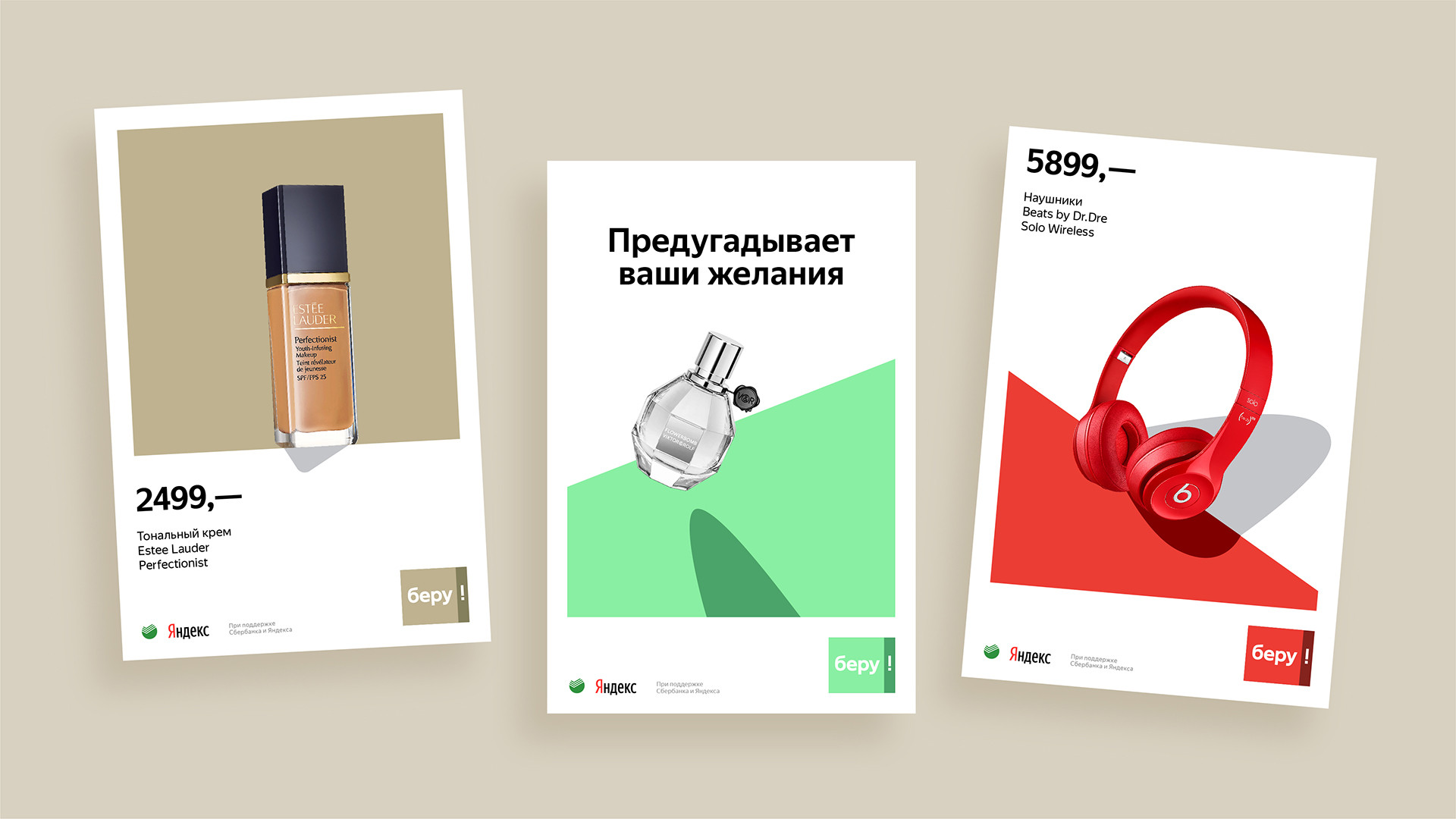
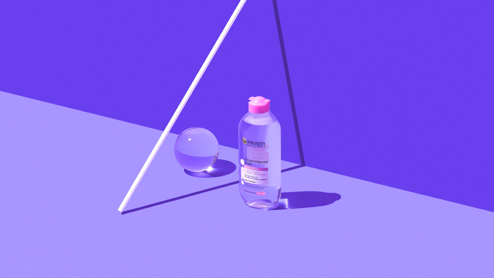
The style of presentation of products in the store, a kind of digital showcase, was the next stage had to be done. As a solution we tried to transfer the process of unpacking in statics. Realizing that any kind of an object inscribed into the space of the conditional box, whether it is a flying out, incoming or a lying one, becomes more desirable, we made one of the faces of the box transparent. We showed the secret inside of it as if saying «if you want this item in the box just take it». It can be almost anything: a levitating perfume bottle, a static kettle or headphones flying out.
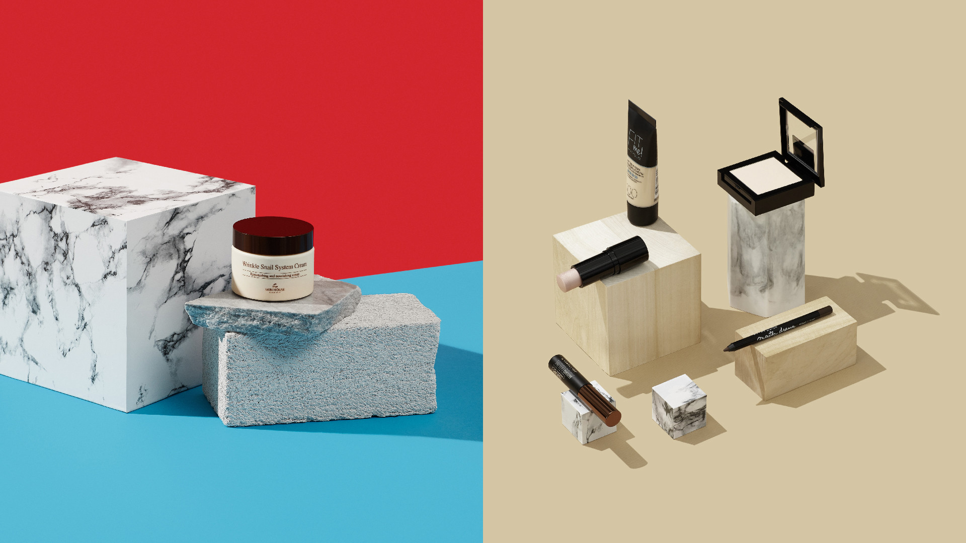
The style is well decomposed into product communication channels including Instagram and Facebook. The visuals with simple objects, inscribed in a conditional box, began to look very daintily in social media. At the same time, it is very easy to make a grocery shoot in this style.
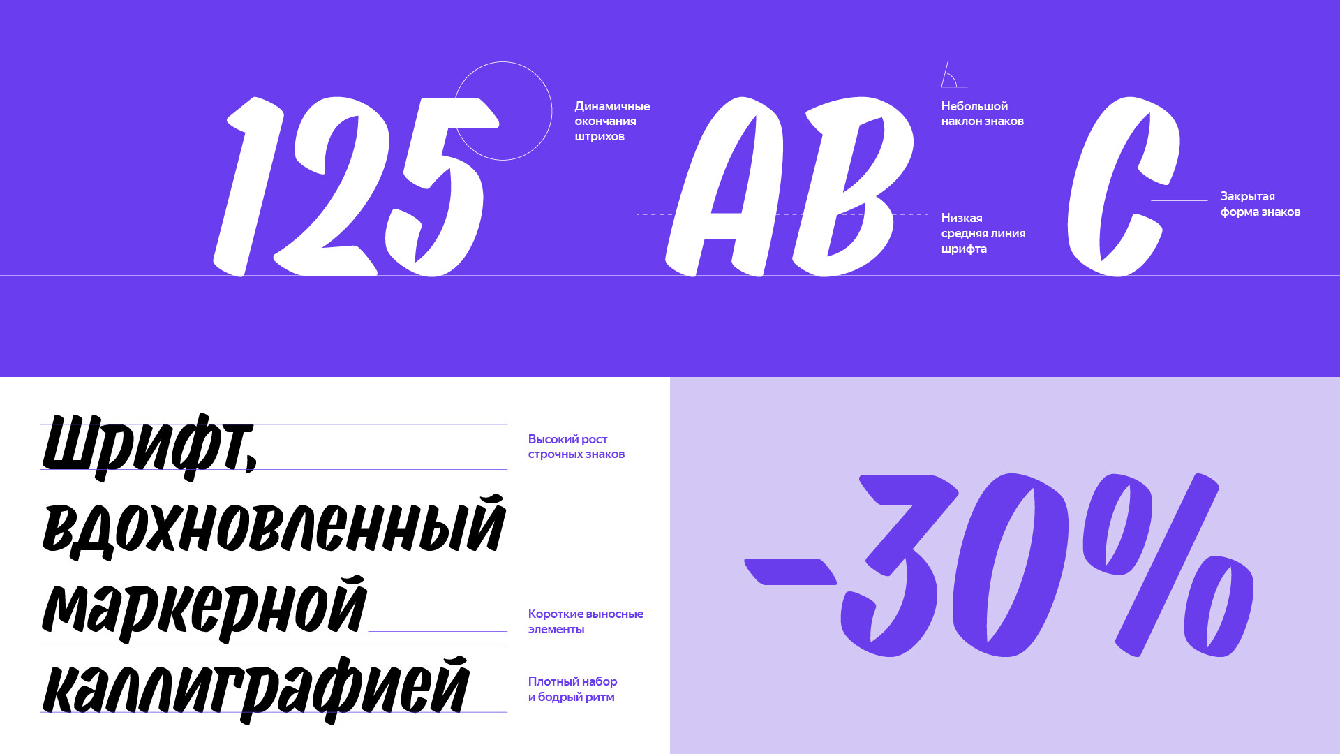
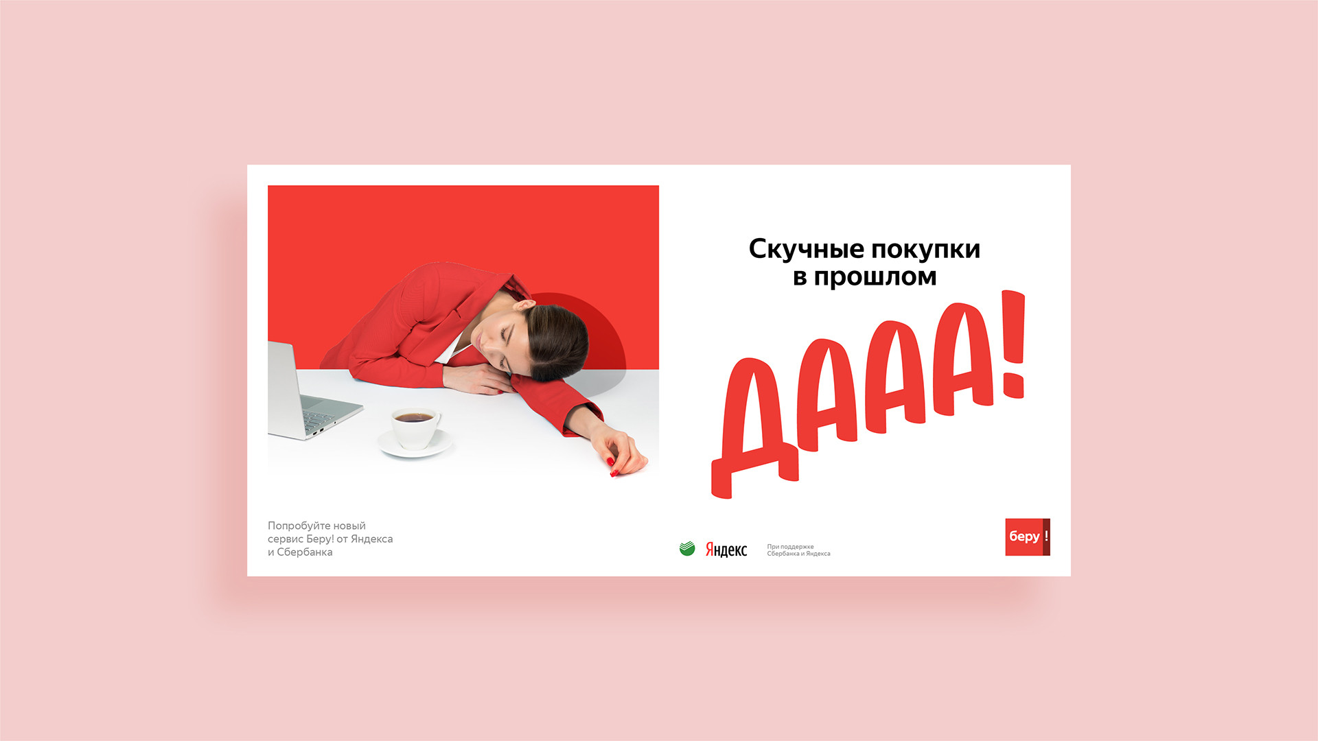
Is there any shopping without promotions and special offers? There is no better cool toaster in a box than a cool toaster in a box with a 50% discount. So another task for us was to create an accidental font, exclamation and suitable for the application of actions and competitions. None of the existing fonts suited us and we have developed a new special one for «Beru». It is based on marker calligraphy. Handwritten text on bright plates attracts attention and highlights special offers against the background of pure geometric images.
That's how we went against the cliché "think outside the box". We climbed into the box and created a bright and clean identity based on shadows and simple geometry.
