Youla. Whirls for you
In the autumn of 2018 we took part in a Youla team’s tender for new corporate identity creation and won it among five agencies. Youla is a service where anyone can buy and sell anything but unlike similar projects this brand has a powerful digital platform.
The brief for the development was clear: the whirligig should become more aesthetic and modern. After all the service of the product takes shape fast and branding must keep up with it. For three years Youla has grown strongly both in the audience and in positioning. There are new sections with electronics, furniture, services, real estate and cars. The old design severely limited development. We wanted to emphasize the technology, ease of use of the service and its playful nature.
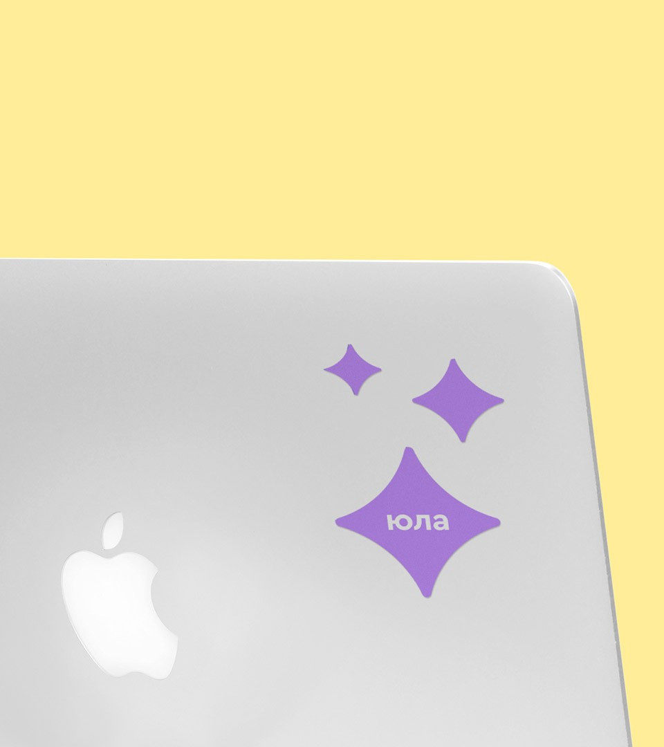
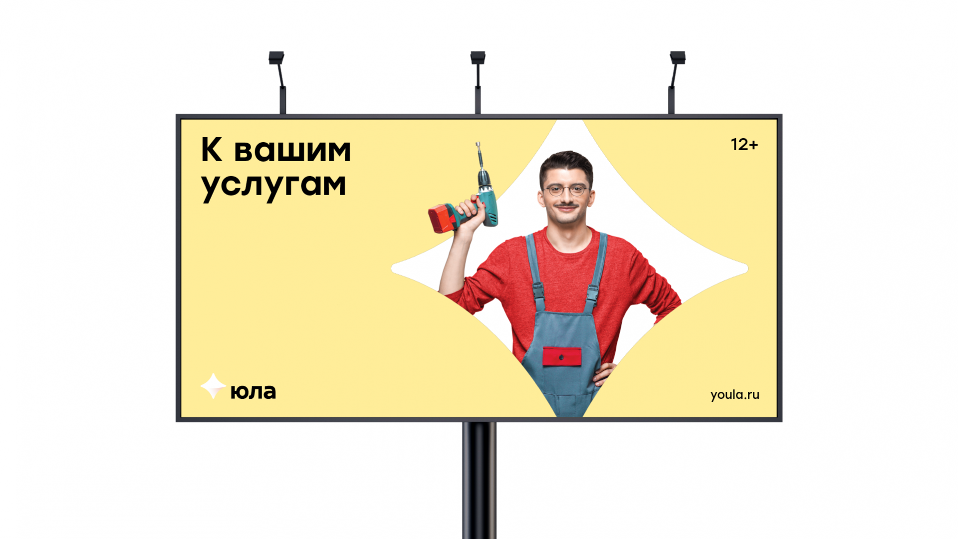
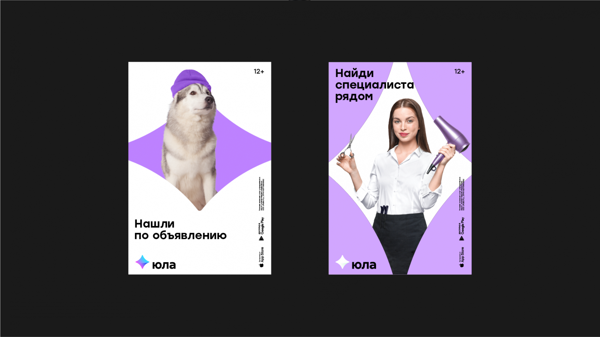
We were inspired by the shape and physics of the rotation of the whirligig itself and rethought the image in a more abstract symmetrical top. This simple geometric shape has become the main design system and can be scaled to any material: it can become a container for photos and illustrations, a background or simply used as a marker.
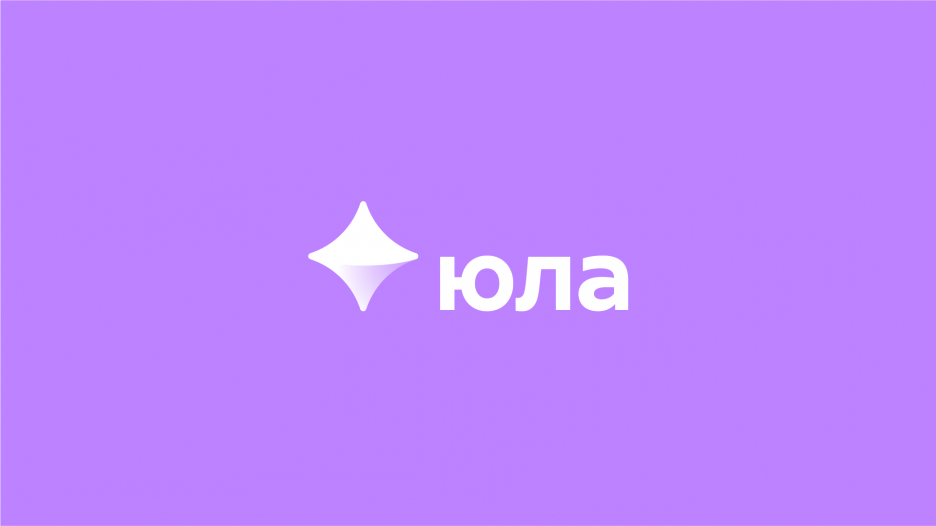
The rainbow riot of color of the old logo turned into a gradient in the new one. The color of the logo was especially chosen so that it worked harmoniously with the expanded palette, creating a light mood and evoked positive emotions. The text part has also been changed. We redraw the letters and now you can see that the inscription became more balanced in mass and saturation that allows the logo to work better with the icon and sets a friendlier tone in communication in addition.
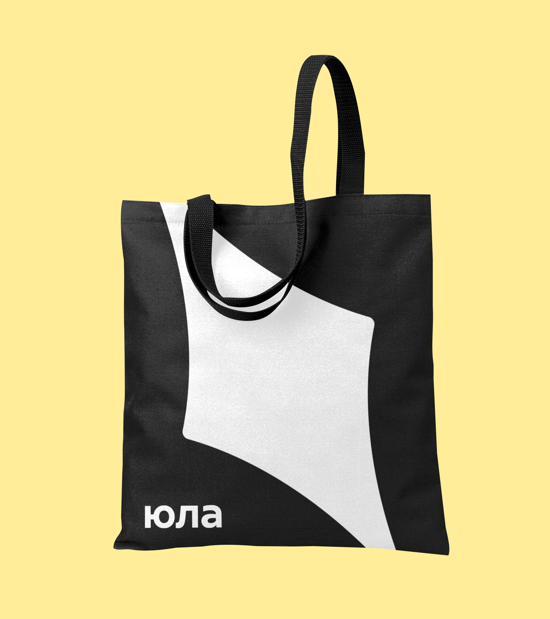
As a result, by changing the logo there was created the whole recognizable design system of the brand. It looks great everywhere: on a business card, letterhead, sign and also in the changing digital space of different apps and the site. Therefore, it should be equally easy to read it both in statics and in motion.
It's cool when the product begins to speak to the audience in its unique graphic language: so its image is remembered and at best becomes a cult. It’s what shows up on the surface that counts that’s how we can describe the graphic language of the brand and that’s how people remember the product. It should be bright, fashionable and with a bunch of catchy functional shticks.