Ozon.travel. Road Expert
In 2017 an airline and railway tickets online service Ozon.travel took thought about new positioning and corporate identity. This important update was entrusted to ONY. In cooperation with the brand team Ozon.travel we groped a few, in our opinion, strategically brilliant moments. There is a very powerful support about the Ozon.travel that can easily resolve the most complex issues arising in the journey whether it is a transportation of dogs or «how to find an exit from the airport». This approach was pretty cool and we helped to formulate the positioning: if there is anything that can spoil the whole impression of travel or trip, here comes Ozon.travel that turns the road into a series of pleasant memories from the road back and forth.
The final point of the way is the world through the eyes of a classic travel operator: for example, tanned legs of a woman against the sea and a palm tree on the left. In order to avoid some standard stereotypes, we carefully rummaged in the head of a traveller and decided to look at the world through his eyes.
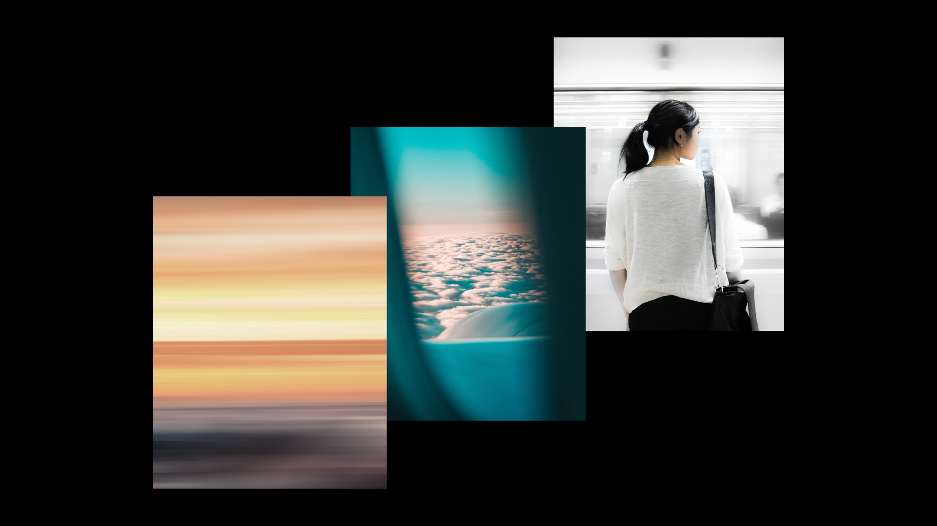
What do we see looking through the window of a train, car, bus or other vehicle? Right, everything in motion. That’s why the use of motion images was the main visual solution. Now any image blurred horizontally can be used for Ozon.travel communication. There is no need to spend hours searching for stock photos or forced to use the notorious corporate pattern as now we always have different but recognizable graphics at hand. In the case when we need to show a person or something specific there is a photo style with a pronounced depth. In this way we keep blurring effect but at a different level.
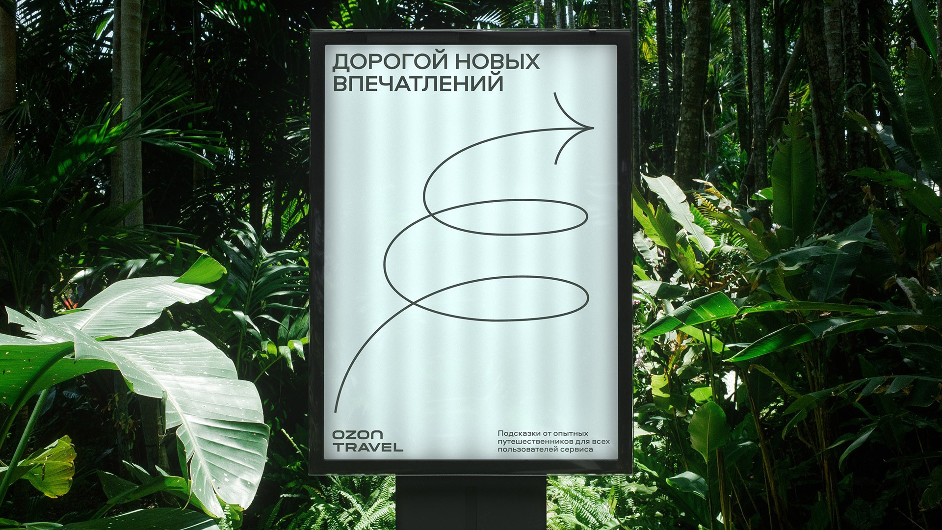
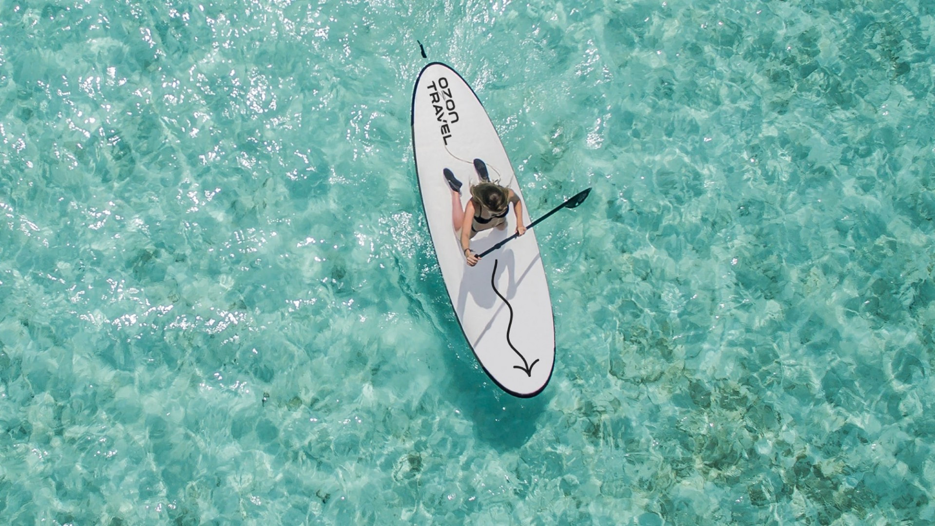
An additional element of Ozon.travel new design system has become an arrow as an integral part of the navigation at the airport, train station and in the city. It guides and gives the cue. By intervolving it into photo scenes we could show various modes of transport. With the help of a light and almost lacy plastic of the arrow itself there was born the plastic of additional graphics, icons and illustrations.
As we went along we naturally decided to «fix up» the company logo a little. As the previous logo had a very recognizable character we did not make global changes. So we typed the text in one block, slightly adjusting the inscription, but without changing the character of the font of the parent brand. Previously in the letters of the bottom line there was used a fine print with wide line-spacing. And now the inscription has become a single solid block. In the general concept a wide block of the logo began to look more harmonious and fashionable.
Due to the global Ozon company rebranding the client is now using a new version of the company's logo which was redesigned independently.
The Ozon.travel team was one of the most advanced that we were lucky to work with. The client surprised us at every stage from the first research to the final workshop: the team made decisions by a closed vote, guided by common sense, cast doubt on the conclusions of focus groups, withdrew the paper brand book in favour of full-time training to work with style. This useful collaboration has helped us to implement a bold visual language in its category. As a result, we were able to formulate a set of principles by which the brand will be able to independently develop products without losing its identity.