2х2 Channel. The new grown-ups
2х2 is a legendary Russian adult animation channel. Today it encompasses a whole universe of different media, ranging from its original television format to digital, podcasts and its own animation studio. Over the 14 years of its existence, the surrounding cultural context has changed drastically, along with the leading content consumption formats and the target audience’s lifestyle. As a result, the time has come for 2x2 to change as well: the team developed a new broadcast concept, while we took on the brand itself—from positioning to identity and broadcast design.
We had an extremely high-stakes challenge ahead of us: updating a cultural brand with care, preserving 2x2’s DNA and unique personality. In the past, it was the punk of Russian TV, the «rebel without a cause» who openly resisted the mainstream and societal stereotypes to provide a space for those who didn’t want to “grow up” the way they were told. Therefore, when working on the channel’s positioning, our insights agency Signal (part of ONY) studied today’s attitudes toward growing up in contemporary culture and developed key hypotheses about the phenomenon of the «new adult».
In the 2000s, escaping adulthood was the primary way for 2x2’s audience to maintain their easy, enjoyable lifestyle. Today, however, millennials choose to grow up and develop intellectually, but on their own time and trajectory: without losing contact with their inner child and preserving their inner freedom, creativity and open-mindedness. This especially influences their media consumption habits: in searching for a balance between pleasure and utility, the audience seeks out meaningful content within the entertainment format. Adult animation is one response to this demand, offering an ideal combination of light-hearted form and deep meaning. A close and critical look at the world takes the place of blind rebellion.
2х2 is turning into a whole constellation of different channels, providing a road map of contemporary pop culture. Airtime is devoted to themed blocks with bloggers and curators that help audiences get their bearings in the overwhelming world of content. The updated 2х2 brand is a window into the adult animation world for these “new adults,” who can choose just how deeply they want to engage with content and find their own balance between entertainment and deeper dives. This metaphor served as the foundation for 2x2’s new on-air image while still maintaining its trademark spirit of innovation.
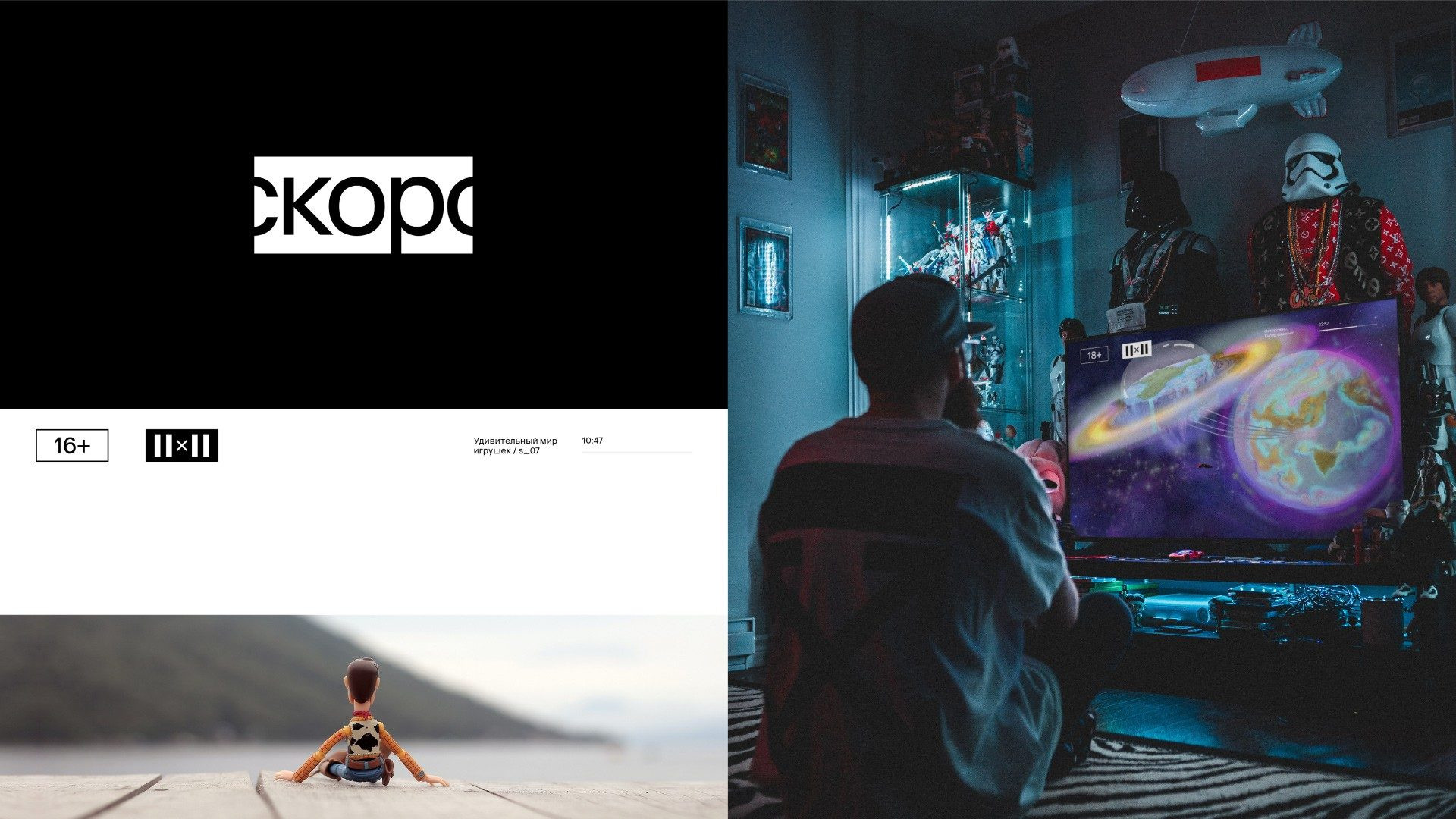
This led us to an ideal of turning airtime into a feed that will scroll like a site or app, blurring the boundaries between television and media platforms. Screenlife, hover effects, pop-up notifications and smooth, seamless transitions between programs and title sequences—all replacements for traditional television cuts. We turned TV broadcast into digital content surfing and the broadcast schedule into a feed, with content that changes as you scroll. We still had to account for TV’s restrictions, with the variety of screens forcing a certain set of rules screens; therefore, we kept all the brand elements in the «blue zone». This limitation created the wide margins in our design that are atypical for digital formats, but we’re certain that we can bring the style even closer to the design language of the internet with time.
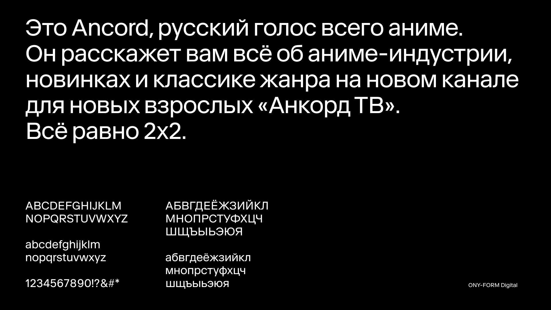
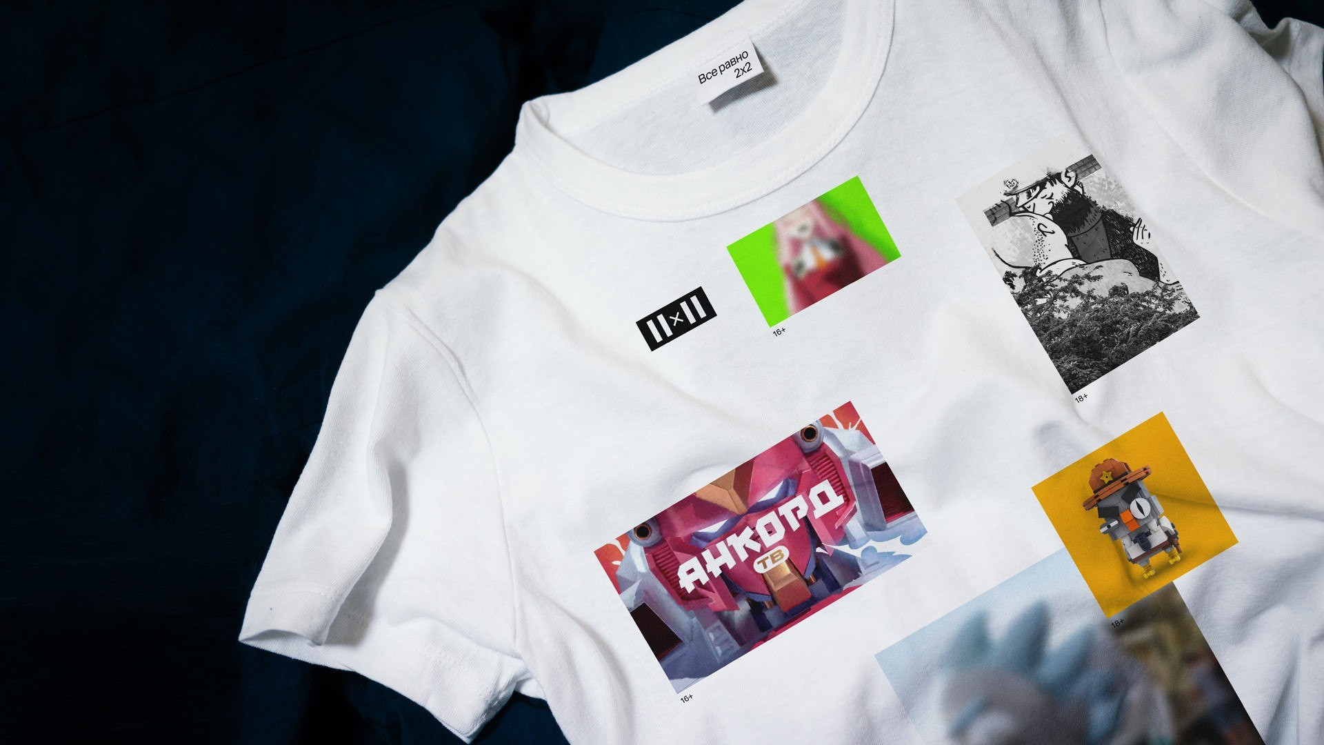
Since the style was built around an internet aesthetic, where typography plays an enormous role, we chose a web-specific font, Ony Form Digital. This is a universal grotesque that stands out both in large titles and with minimal spacing on lower resolutions. This size contrast is used extensively in the brand identity. One quirk of the font is that the horizontal crossbars of each line allow it to hint well (changing the contours of the font when resized), which is an important feature of any web font and doubly underscores the channel’s website-esque aesthetic, making the font work even on low-resolution screens.
We paid a lot of attention to layouts. Whereas design elements used to be fairly chaotically spread out around the different corners of the frame, we chose to concentrate them in the upper block, echoing a website navigation bar. Information overlays were relegated to the bottom of the screen, resembling push notifications. The channel has a relatively small broadcast production team, so it was important to create easy-to-use templates that can be easily altered and added to broadcast.
Alongside the work on the broadcast design, the channel launched a competition for its viewers to create a new logo. The 2х2 team really liked the concept proposed by Ivan from Saratov, which we polished and fit seamlessly into our style. The channel won’t incorporate our style into their broadcasts right away, so we developed a gradual integration plan as well. The new 2х2 design will stand out from everything else on the television market.