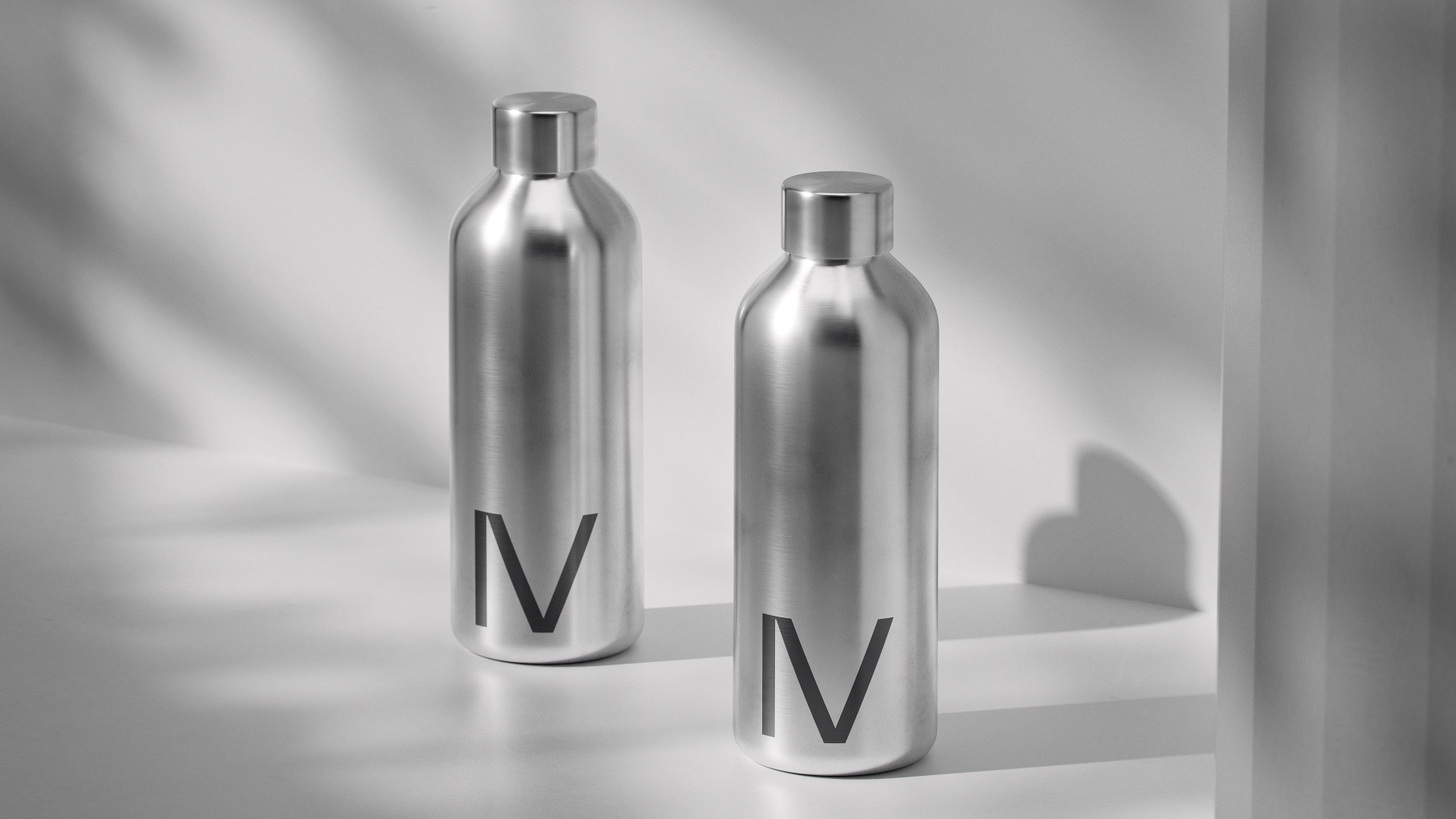
Museum Quartet. The New Moscow
The Museum Quartet is an alliance of four museum institutions: the State Tretyakov Gallery, the State Pushkin Fine Arts Museum, the Garage Museum of Contemporary Art and the GES-2 House of Culture. For this grandiose new project, we developed positioning, naming and a visual identity.
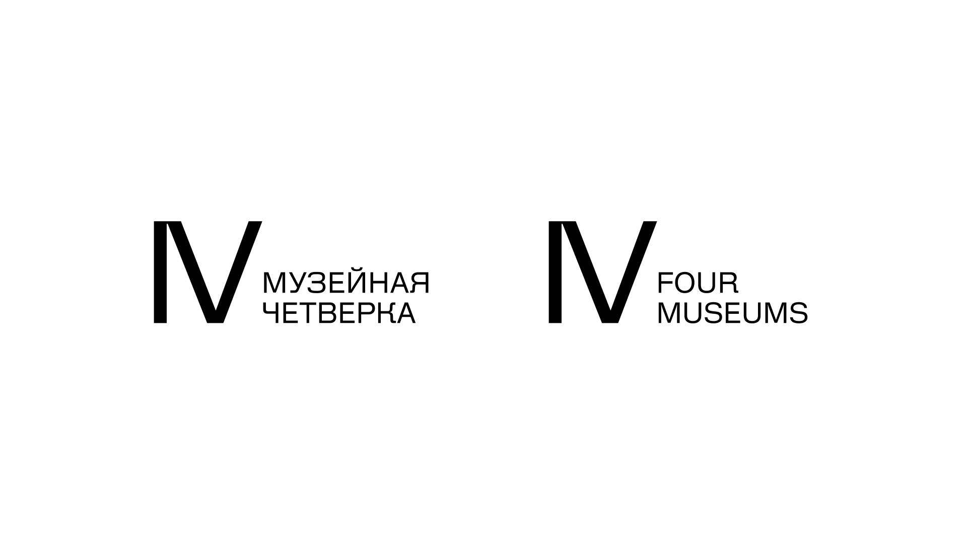
These four museum institutions remain independent, but now create original collaborative tours that include unique urban locations, museum collections and temporary exhibitions, and musical and performance events in the center of Moscow. Joining without mixing is the principle at the core of the new branding we developed.
Moscow’s cultural narrative is changing drastically: it’s no longer just the Kremlin, churches and samovars. It’s also contemporary architecture, international collaborations and world-class masterpieces. The Museum Quartet proclaims this new identity to the world and represents the city’s cultural life to both international tourists and local residents.
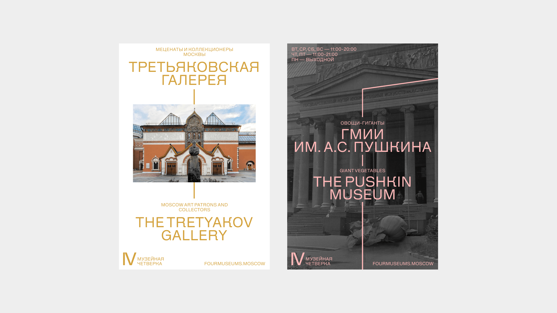
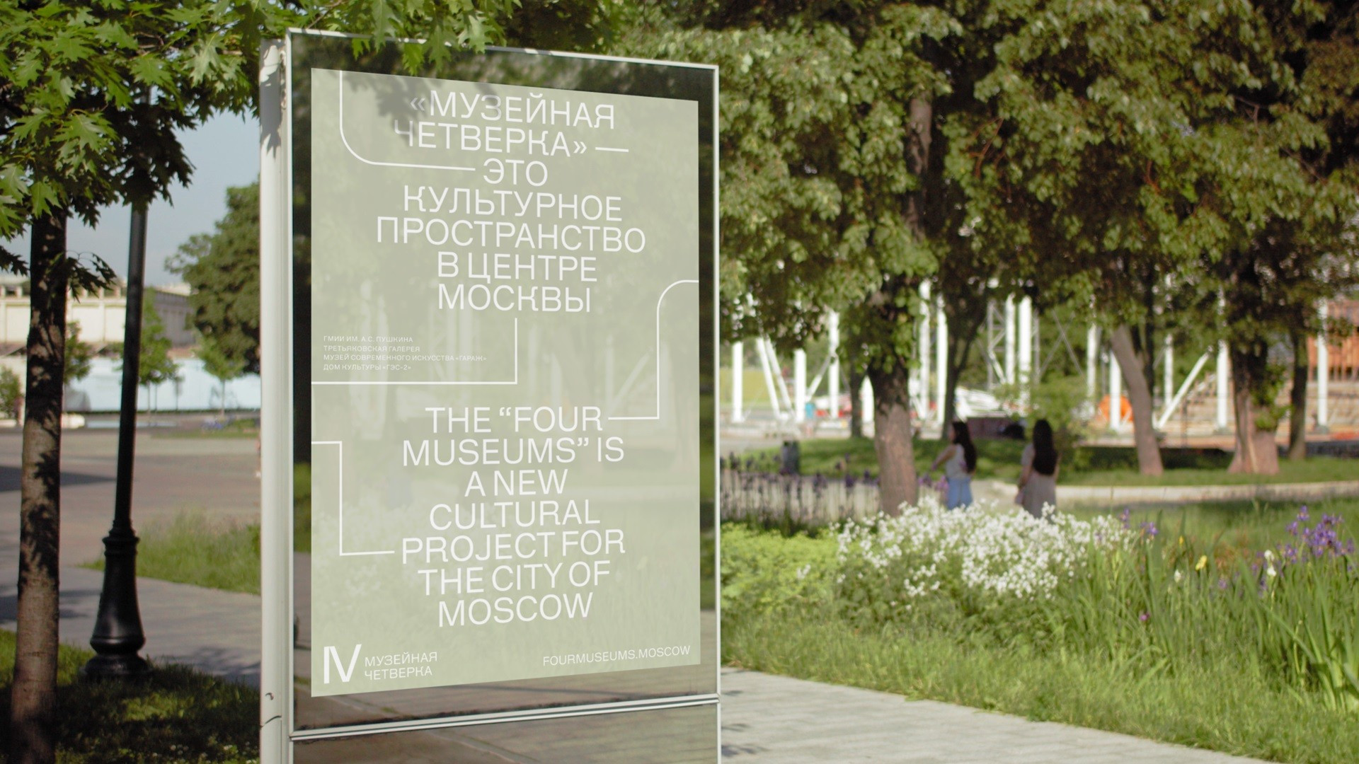
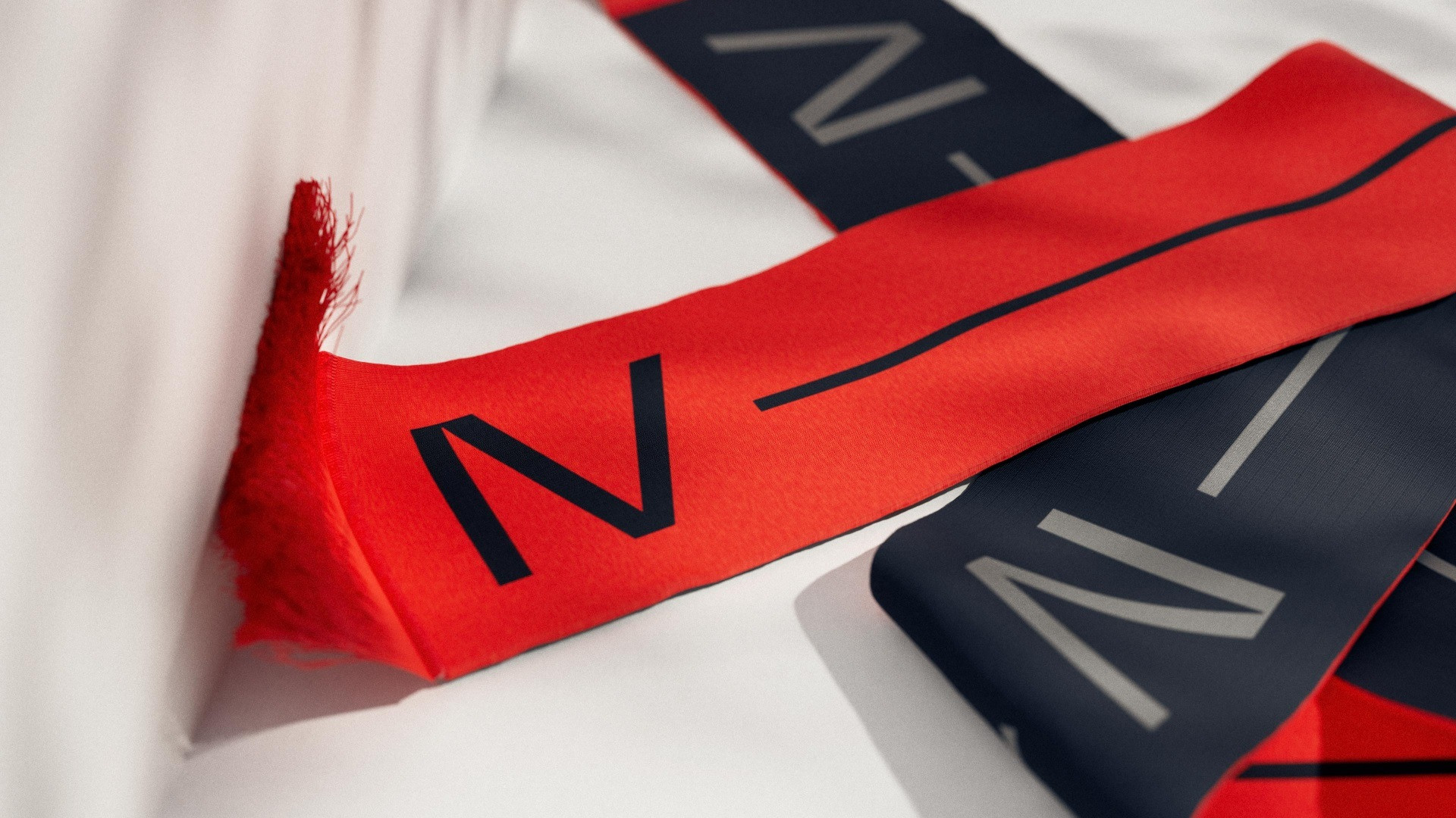
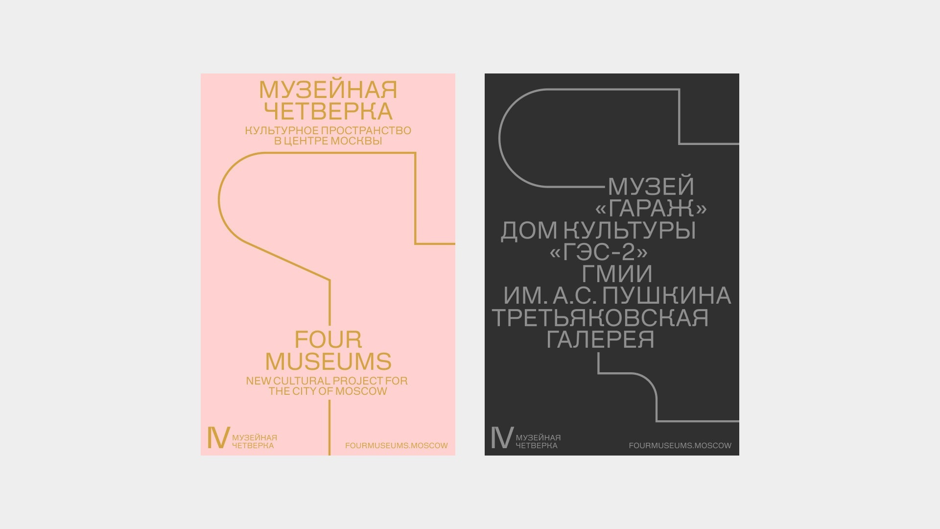
We tried to present the complex system by which these institutions interact, with intersecting exhibit calendars, general museum policy and cross-institutional projects, as simply as possible. The main tool of this visual language is a line: the symbol of the path that connects museum spaces and events. The line became a simple and efficient method for creating layouts: it can combine text blocks and photographs, integrate into a photo gallery or live in augmented reality, giving hints on how to move along this new cultural journey.
The second important stylistic tool is an original font for the Museum Quartet. We wanted the project to look «Russian» (especially for foreign audiences) without using visual cliches like avant-garde art, khokhloma and balalaikas, so we decided to reference this “Russianness” using a font. That’s where the idea of layering the typographic heritage of Cyrillic grotesques onto a facade of Latin letters appeared: typical letterforms for the Cyrillic alphabet (like К and Л) dictated the form of Latin letters (R and k), intertwining the visual codes of two languages but foregrounding the Cyrillic.
Harmonizing two languages is both an aesthetic challenge and a functional one: the communication formats are designed for both Russians and foreign tourists, so they are often in two or more languages at once. We were able to portray the music of both the Cyrillic and Latin alphabets in our layouts as though in unison, while the atypical font package looks undeniably Russian.
The Museum Quartet unites Moscow’s past and present, underscoring its rich history and dynamic growth. The entire visual identity was created in the museum tradition, to be seen by a wider audience as something related to culture and art. Exquisitely simple elements for layout creation and a contemporary understanding of Russianness helped us design an open, friendly communication language which insists that Moscow is an extraordinary cultural center on par with the greatest cities in the world.
