Gulliver Market. A store for children and their parents
Gulliver is a famous chain of stores with clothing, footwear and accessories for children, as well as one of the largest toy distributors in Russia. The chain's product range has its own brands, as well as lots of toys from third-party suppliers that have passed through a rigorous selection process for quality. The company turned to ONY for a comprehensive design in order to launch a unified e-commerce platform. First, we conducted research and developed a brand platform and identity, which later helped us find a format for their exclusive, online storeGulliver Market, combining three previously existing online stores: Gulliver, Button Blue and Gulliver Toys.
Our study of the market category and the semiotics of children's culture showed that in recent years, the role of the child in culture has changed: children are increasingly perceived as independent individuals, capable of thinking about their feelings and comfort. At the same time, most children's brands continue to use outmoded cultural and visual codes in their communication. We offered Gulliver the chance to become platform for building harmonious and respectful relationships within the family and formulated a new positioning: «An online store for children and their parents».
We will tell you more about the branding that our design team and insights agency Signal (part of ONY) developed for in this case. The main challenge for ONY's digital division was to find a solution for the nascent online store that would logically combine all Gulliver's storefronts and third-party products, all while maintaining a focus on the company's own brands.
In most cases, a user visits the site in order to find and buy a certain type of product, rather than a specific brand. We designed a deep architecture of dividing products into categories and the functionality of quick switching between them: the entire range of the network is collected in a convenient matrix that features both own-brand products and those from other manufacturers exist on an equal footing. For Gulliver's own brands, we have developed separate landing pages, thereby establishing the company's «authorship» of their online store and giving them the opportunity to focus on them when releasing new collections or special promotions.
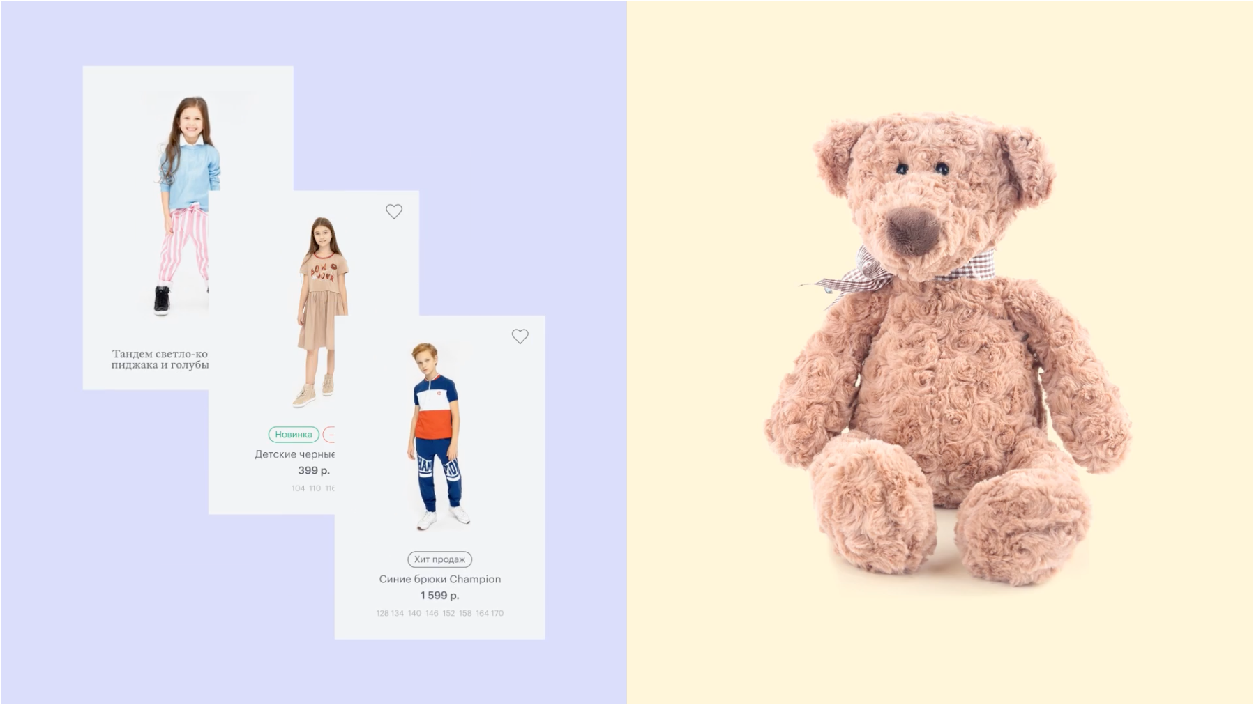
The new positioning as an «online store for children and their parents» was reflected in the site and its interface solutions. For example, a child can independently create a wishlist, from which an adult will see their preferences and requests. We made the «add to favorites» button just as noticeable and placed it on equal footing with the «buy» button. In order to help young customers discover their identity and develop their tastes from an early age, we came up with the «Image of the Day», category, which advertises a wide variety of stylish looks, rather than psychedelic, childish images.
In the design, it was important for us to find a balance between demonstrating the brand's visual identity and the product function of a large online store. On the one hand, the site features many banners that use coloring as a branding concept, while the central layout, animation and asymmetrical layout allow us to set a visual rhythm and show the brand's character. On the other hand, we created a fairly dense distribution of products on the main page, using the familiar sliding «stories» format familiar to children and collected informative previews with a full list of sizes. We also took into account that most children will access the site from a tablet or phone, so we used large interface elements and typography.

By and large, children's products are colorful and very bright, so we recommended that the client shoot them on a simple background with prominent shadows to add materiality to the photos. When shooting live models, we also advised choosing a more natural environment, natural poses and non-professional models.
The result is a simple and clean site, relatively grown-up and serious for its category, which lets Gulliver talk to children on an equal footing and act as a medium for them to communicate with their parents. In 2021, the company plans to increase their customer base by three times through an omni-channel loyalty program and launching a mobile application, all while increasing the share of its own online channel to 10% of its total revenue.
In the demonstration of this case, we used reference images, but the current catalog of Gulliver Market's products in its online store can be found at gulliver.ru.