Media1. Ideas Make Business
Media1 independent group was formed in 2018, uniting the MUZ-TV and Yu channels into a developing ecosystem, as well as the Gallery digital network and Vyberi Radio, traditional but widely known assets. Now, what needs to be done is to launch representation in the B2B segment among investors, advertisers, and industry experts. This objective was the main incentive to renew the Media1 corporate brand we engaged in.
The brand platform was developed based on the context categories and company culture that were investigated by the team of our insights agency, Signal. We noticed that the pattern behavior of major media players, along with their inaccessibility and bureaucracy, often cast a shadow on the prospects of the entire media business, devaluing it in the investors' eyes.
Media1 is different. The company has high performance indicators and preserves the spirit of a startup despite its scale. The creative and result-oriented approach to business development can be compared to modern art when new bold ideas turn into a commercially successful product. This approach allowed us to formulate the brand's essence and come up with the «Ideas make business» slogan.
Media1 is different. The company has high performance indicators and preserves the spirit of a startup despite its scale. The creative and result-oriented approach to business development can be compared to modern art when new bold ideas turn into a commercially successful product. This approach allowed us to formulate the brand's essence and come up with the «Ideas make business» slogan.
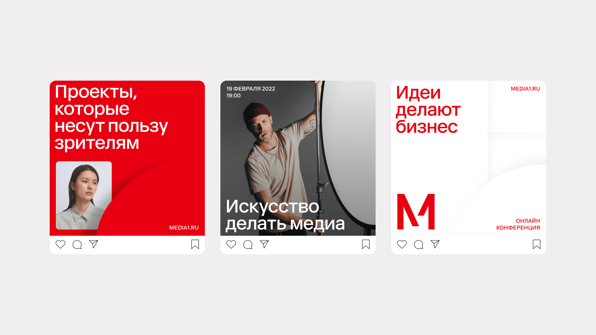
The accent red in the palette is an ambitious way to highlight how the company differs from its competitors. Most Russian media holdings usually have a blue-gray color scheme making the business look unimpressive and conservative among other images. We have successfully chosen the proper saturation and depth of red to reflect the brand's courage, expertise, ideas, and ambition.
Media1 new identity uses two logo options: a full version and a symbol. Both incarnations are concise and sharp, they reflect modern museum aesthetics. We recommend the client to use both versions for now to reinforce the association that Media1 equals M1. Further, the symbol will work independently as it also represents the synergy of elements and movement.
We developed a style that communicates the structure of the group and emphasizes its internal togetherness. The new image takes time to get used to. However, it opens up many possibilities for the brand and its development.
