Stepping outside the box. MTS
MTS has grown from a mobile operator into an ecosystem of digital services in the course of time. Since the old identity could no longer convey the right messages and encompass all the visual styles, the company has decided to carry out a rebranding. Its main goal was the development of a flexible identity that would unite all the communications of the ecosystem while leaving space for each sub-brand to express itself. The philosophy of the MTS ecosystem is to step outside the box and transform everyday life. Two agencies have collaborated to reflect the philosophy in brand communications: Signal (part of ONY) and BBDO. We have employed the brand platform developed by Signal: while maintaining the brand's energy, charisma and emotionality, showing empathy and intelligence of the brand.
The team from UtterDesign has developed the concept of the new identity. It is based on a dynamic square logo, which accommodates all digital services, the brand's signature red colour, and the brand font. In the meantime, we were responsible for the development and refinement of the ecosystem's identity, the development of sub-brand styles, the creation of 3D styling for the entire ecosystem, photo styling, additional graphics, its motion behaviour, splash pages and the implementation of the style in the digital environment.
The graphics have acquired an expressive character: CG objects and shapes with tactile textures interact with each other, thus combining different ecosystem products and creating space for metaphor. Besides, new shades, complimentary to the logo's red frame, were introduced into the colour palette.
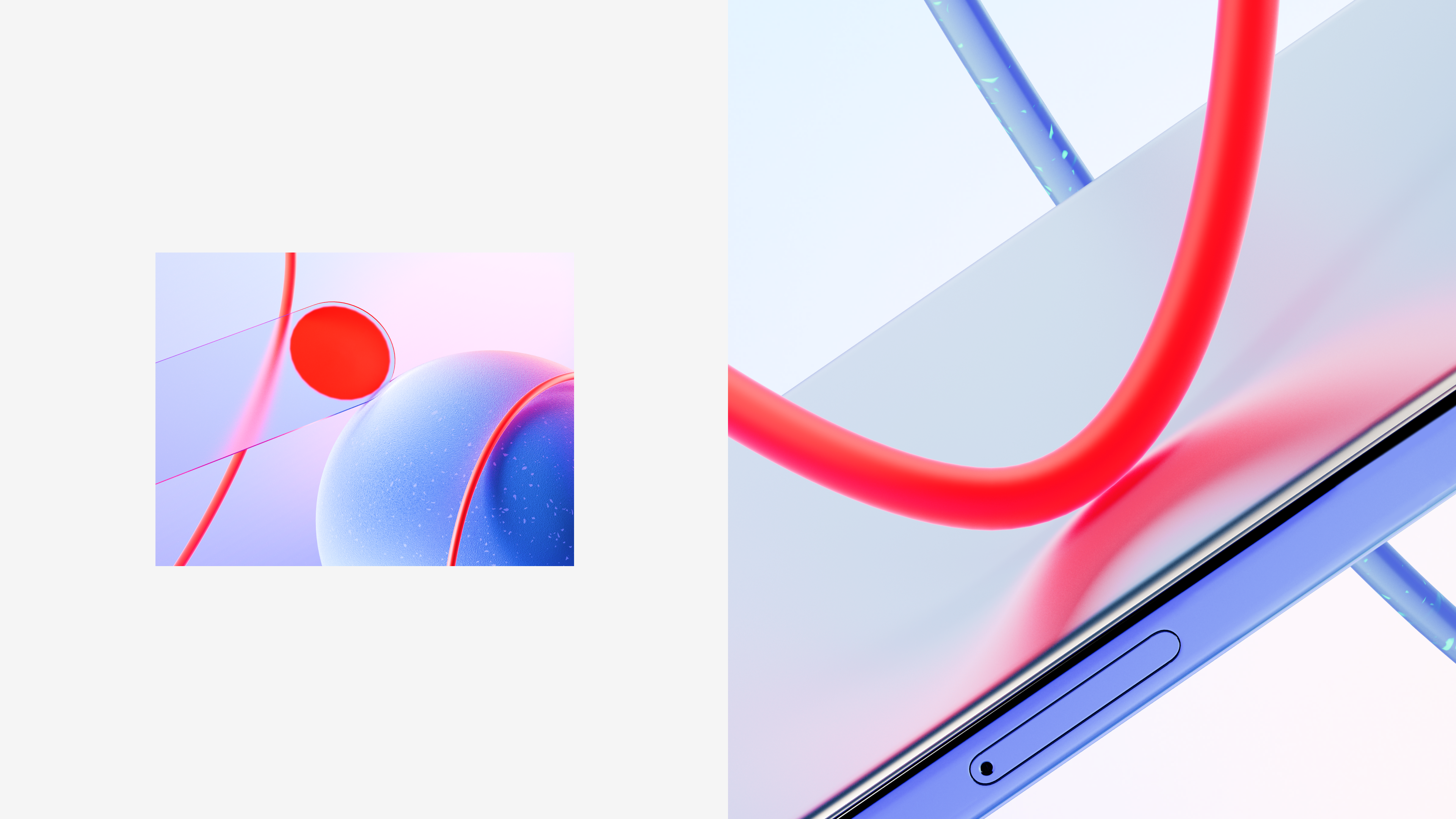
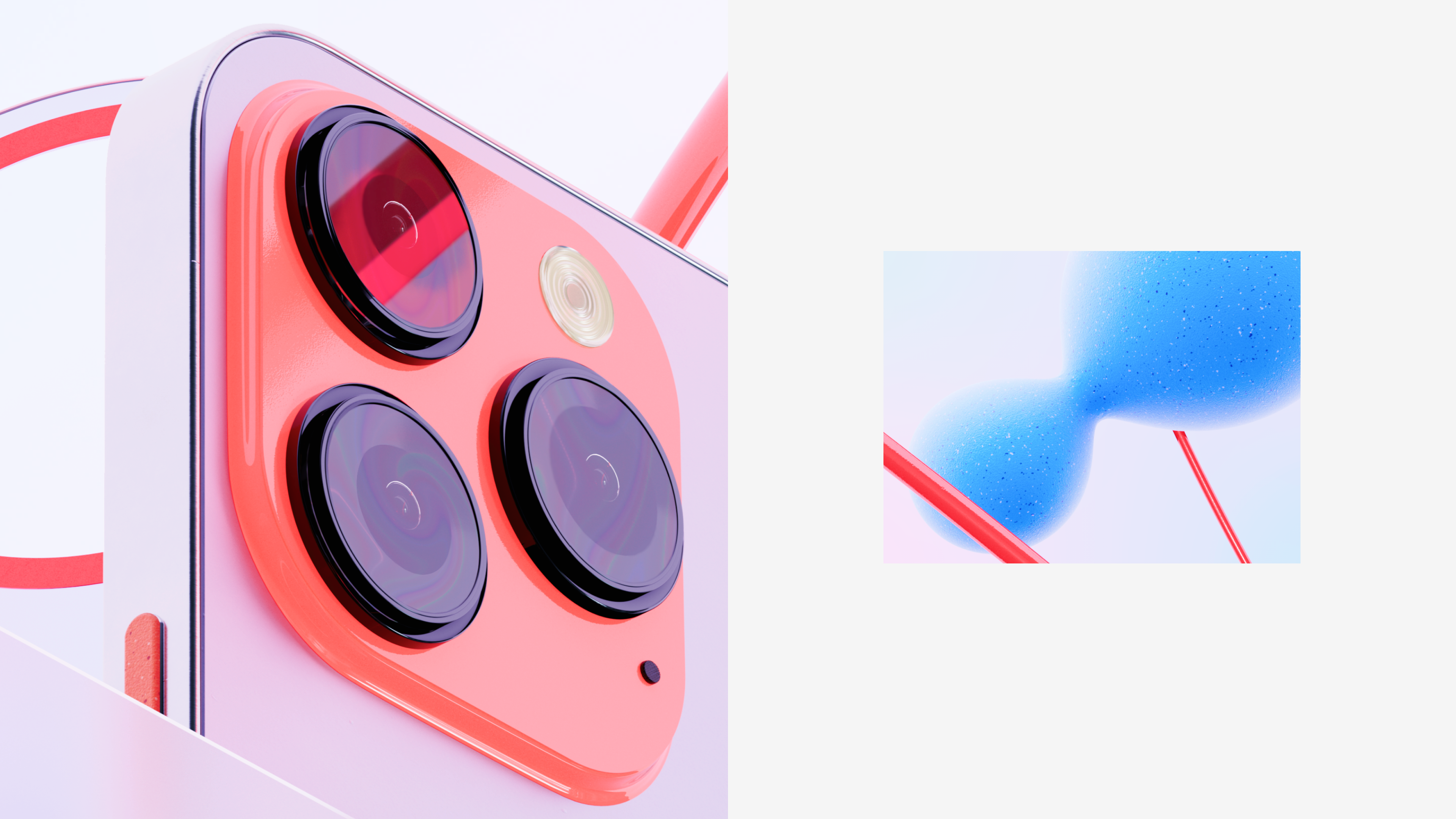
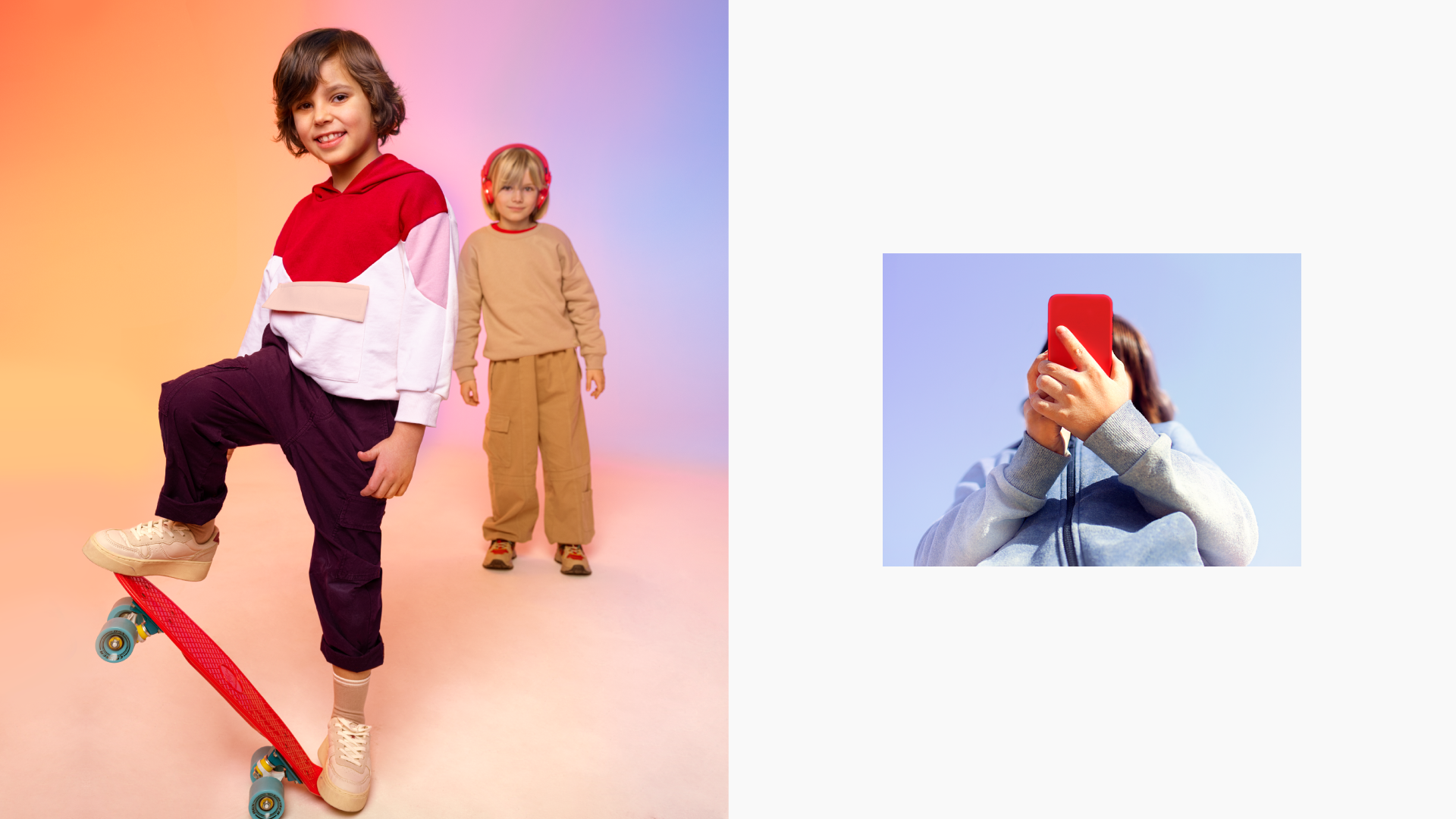
We have suggested a system for the photo style which would obligatorily contain both cold and warm colour spots: blue is responsible for the digital, and red is for the energy and cheerfulness of the brand. The storylines include artistically accurate scenes, non-ordinary angles and lively characters. MTS seeks to make work with photos much easier, by refusing sterile shots and plots, and the proposed solution has been proven to work on both studio and lifestyle shots, as well as on stock images.
The fonts used by MTS have now reached 21 lettering styles, designed by Ilya Ruderman.
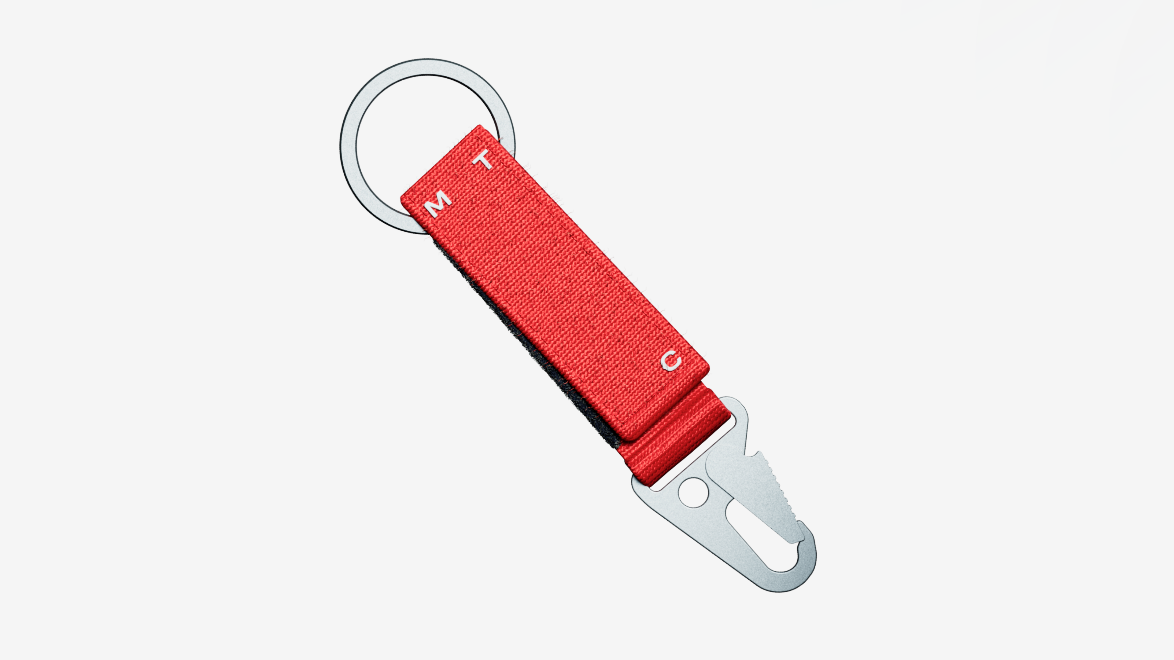
Round and oval controllers have become an additional communication tool: touch-friendly 'buttons' that recall mobile communication, the digital environment and telephones – where the company takes its roots from. They become containers for text or service icons on layouts and also work as functional elements within apps.
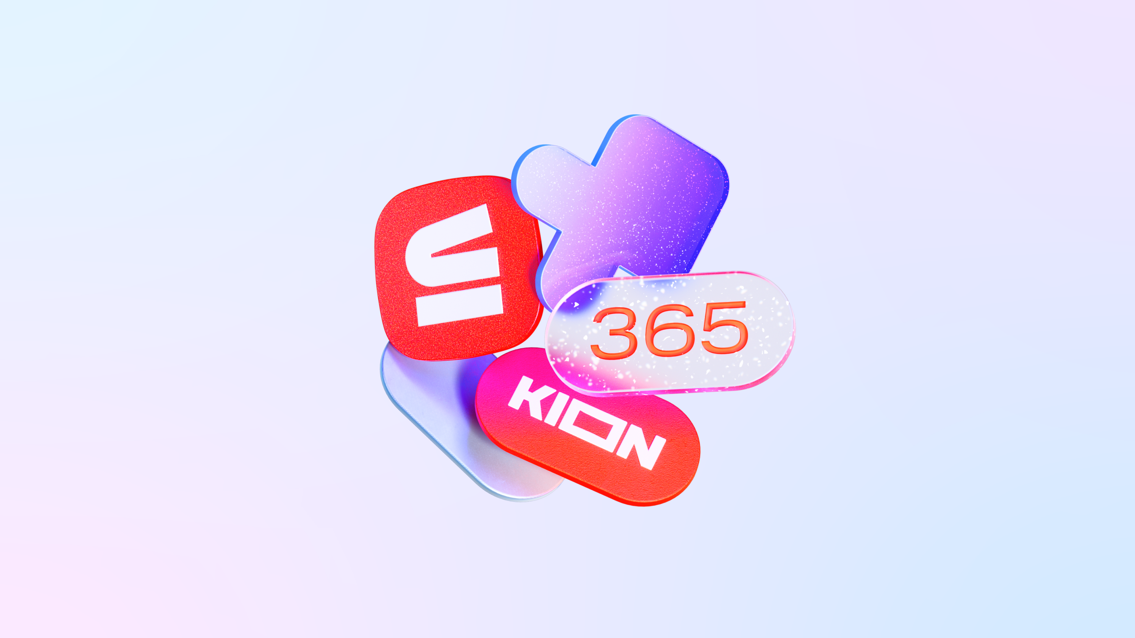
The style elements reveal themselves in a different way within the communication of each individual product. The initial branding constants unite all MTS communications, whilst additional tools give sub-brands plenty of freedom: the more specific features have to be taken into account, the more independent tools and approaches it has for product communication.
In 'MTS Auto', for example, the controllers become more like widgets familiar to the car's onboard computer, and a 'dark theme' appears in the layouts. In 'Music', the idea of CG graphics appears differently: the core metaphor for images is pulsation, which reflects the vibe of different tracks. While 'Stroki' (rus. Строки – Lines), an online multifunctional library space, contains its own expressive means, for example, running lines give an additional semantic layer to each layout.
We can see that the identity gives the company new opportunities and makes the development and introduction of new products easier thanks to the adoption of all the solutions to real-life brand challenges and testing them in action. A vibrant design system can evolve while retaining integrity and reflecting brand positioning across all communications.