Building dialogue. МТС Exolve
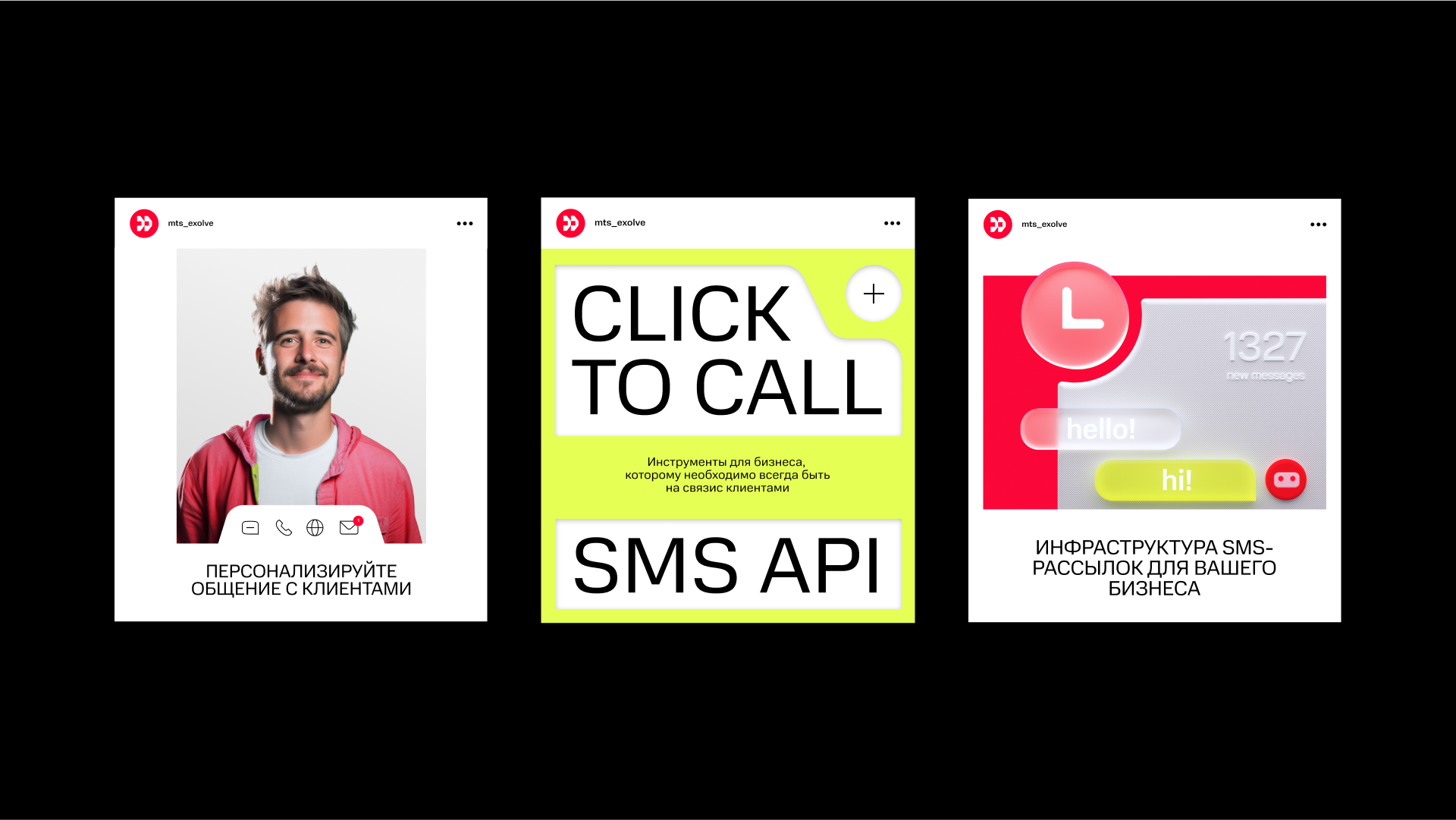
MTS Exolve is a new product of MTS company. It is a cloud platform designed to facilitate communication with customers through different channels. The platform has its distinctive feature: it offers ready-to-use code solutions, which makes it easy to customise and implement. It is convenient for developers, profitable for businesses, and customers eventually get more personalised and better-quality messages from the brand. MTS Exolve approached us for branding and a brand platform.
The Signal (part of ONY) and MTS teams have conducted a joint study and dived into the omnichannel communications experience. It has turned out that the market is still immature, and the use of numerous omnichannel services is chaotical; different contractors — different solutions, the business has its requirements — and developers have their own. All this makes the daily work of IT specialists very complicated. We had to focus on the latter in the new positioning. Mutual understanding and a strong bond that envisages the interests of developers, businesses and their customers are the basis of th e brand platform, which is captured in the slogan: "Building dialogue".
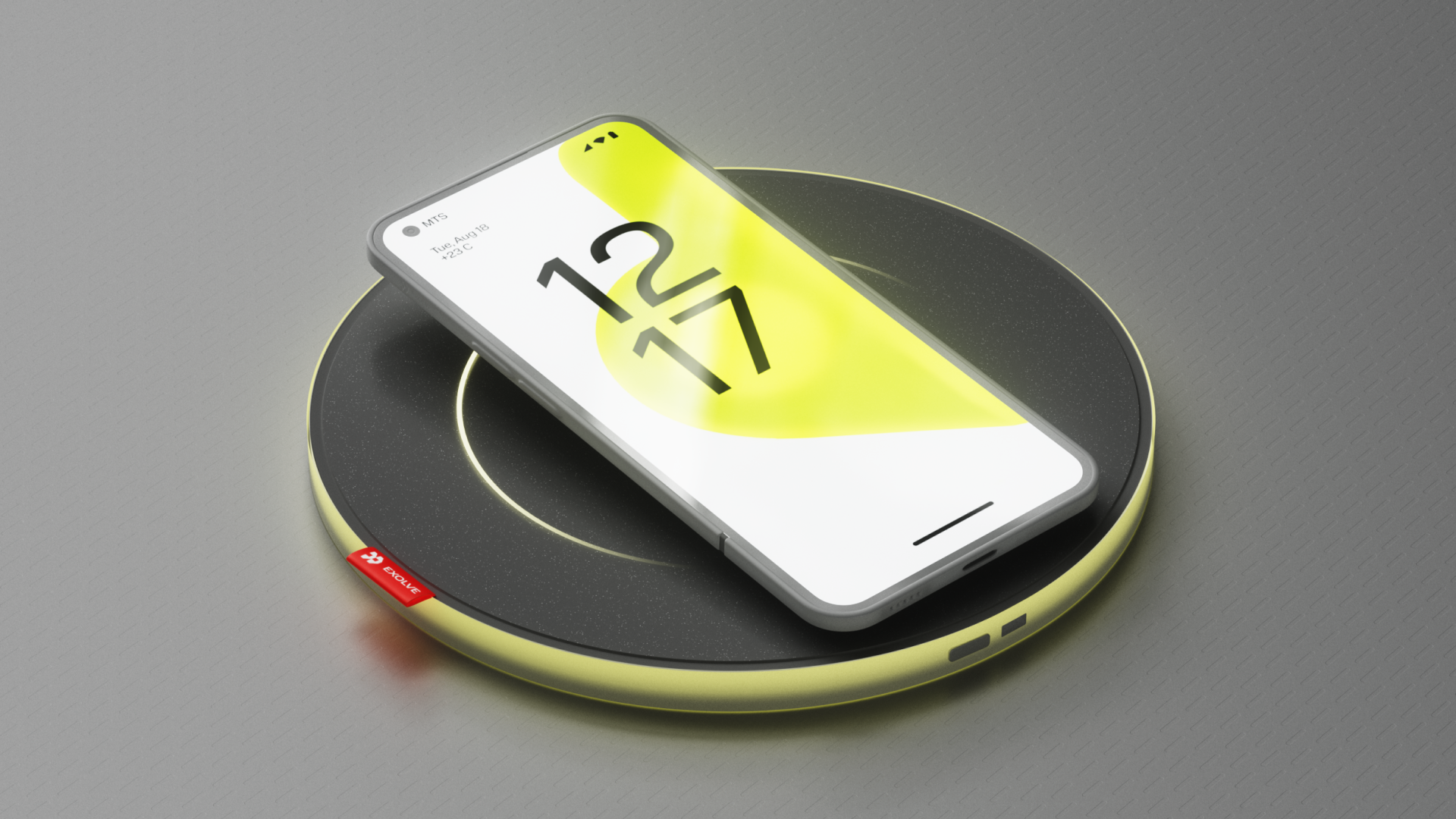
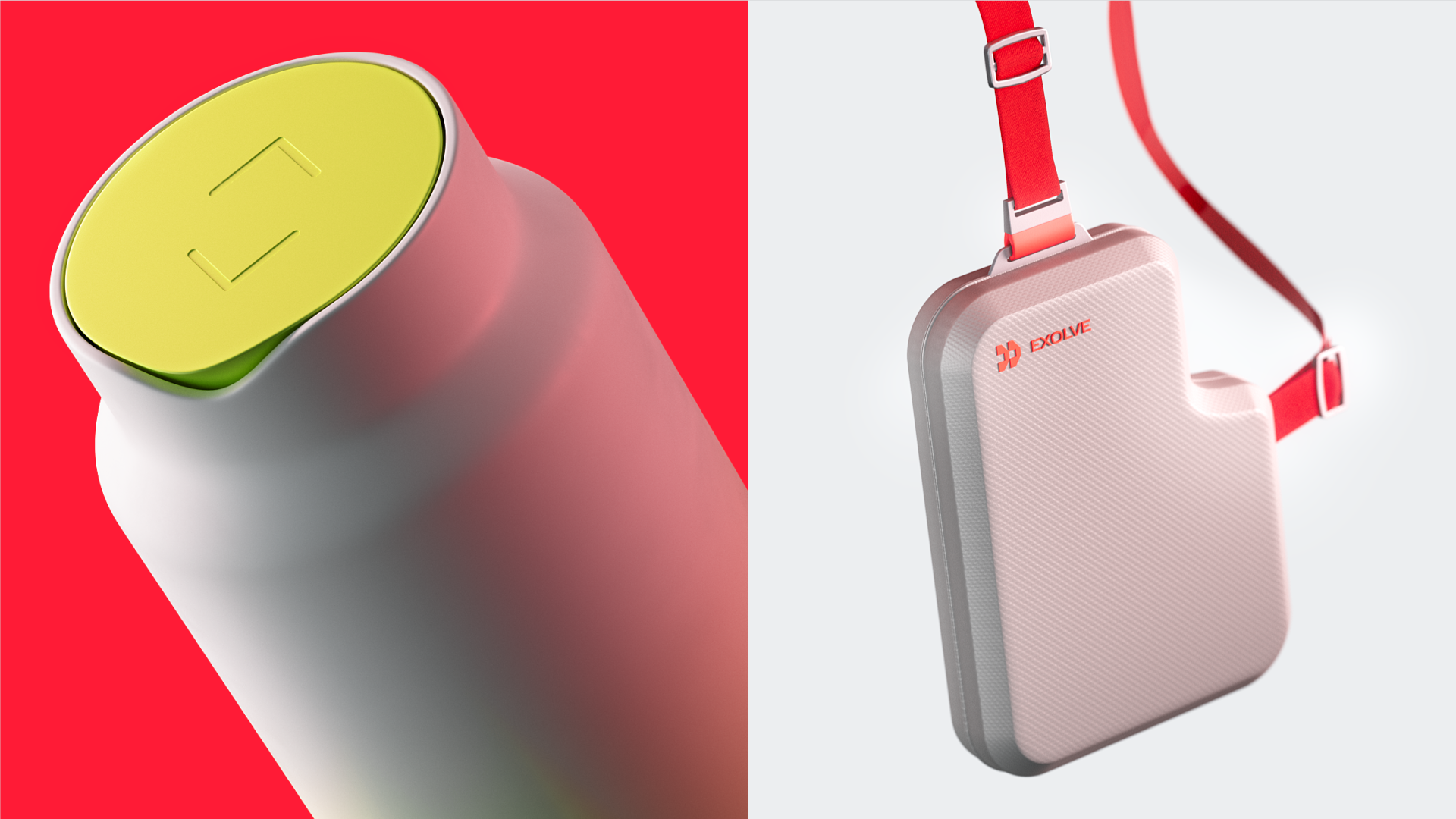
The basis of the visual style is forms of the interfaces from the future. A constructor form communicates the idea of a dialogue, where various shapes are connected — just like MTS Exolve services, which are customisable for any business.
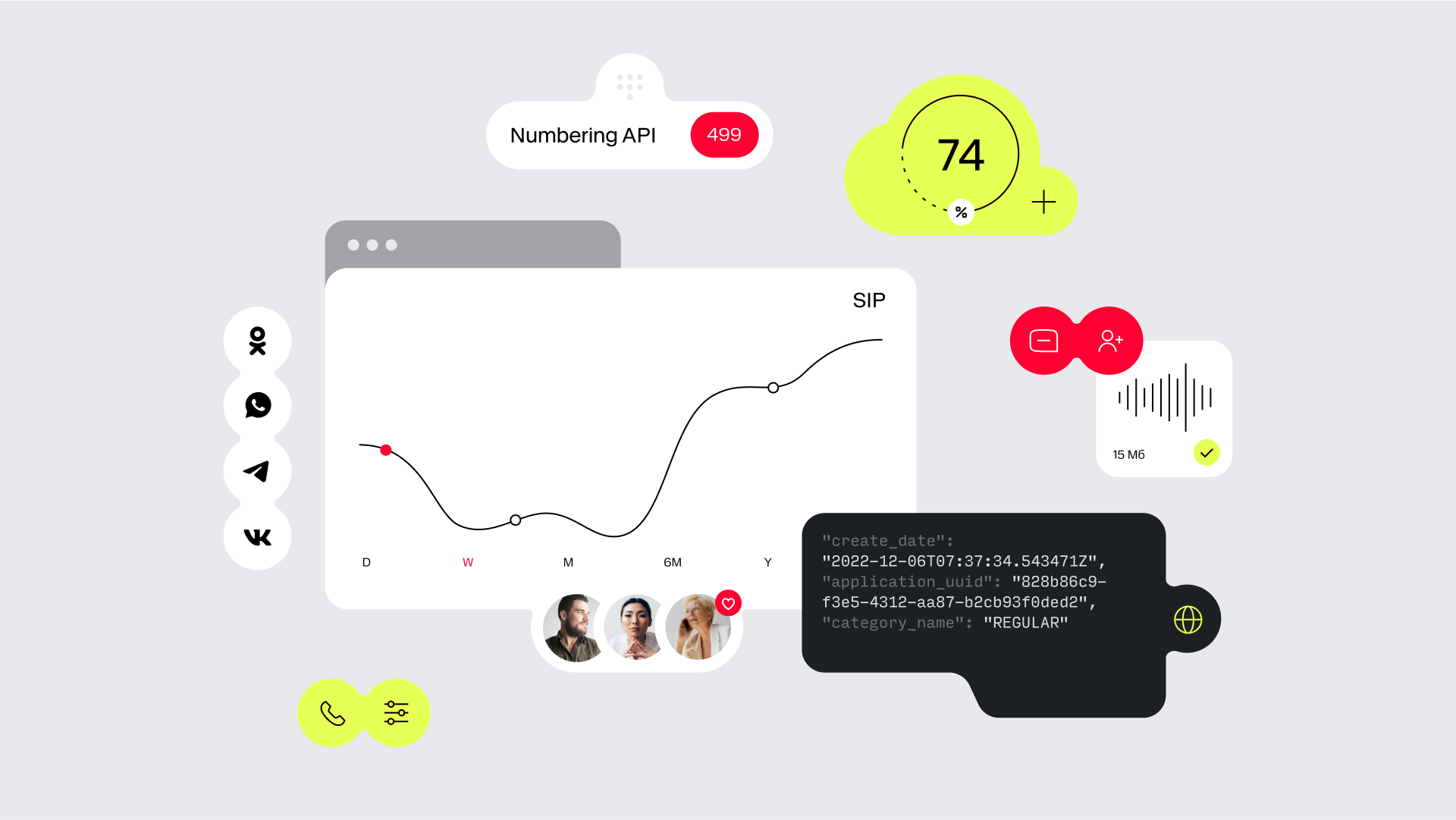
CG style continues the idea of a constructor by assembling different parts of a product into one set. The key graphic element in the style is a shape, which consists of two or more simple geometric shapes. Shapes are complemented by interface elements: icons, buttons, bubbles and text. The signature materiality of CG objects is the result of the search for an image of a futuristic yet tangible interface.
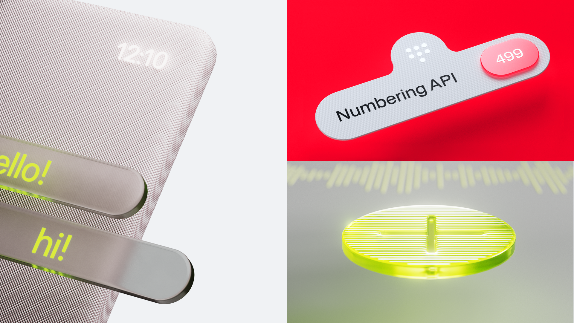
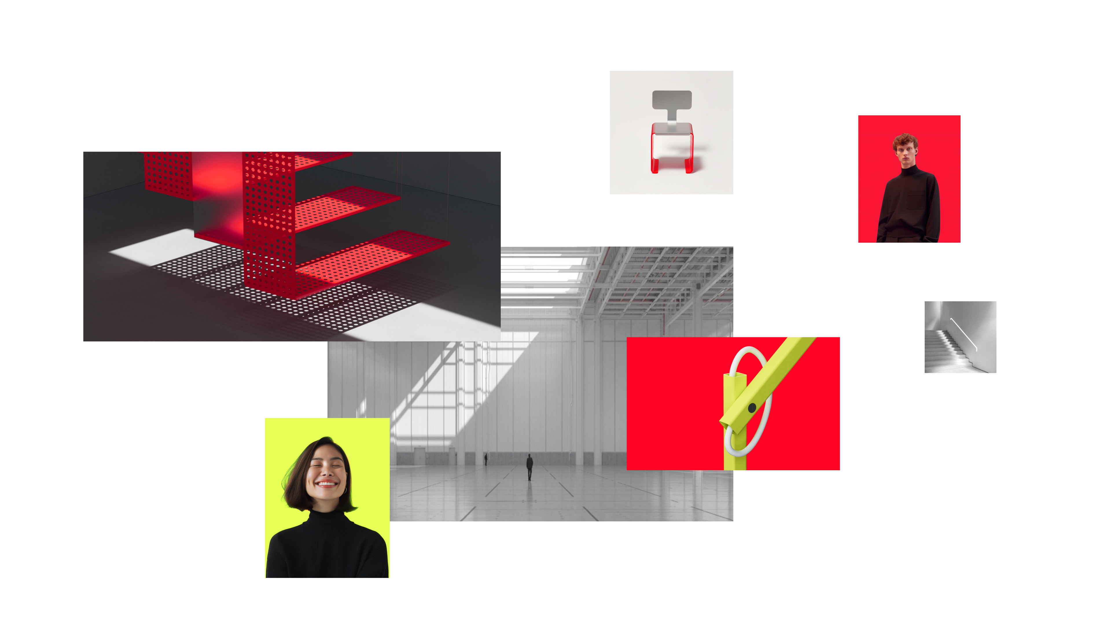
The photographic style incorporates restraint and technological character. The stand-alone, lab-like backgrounds do not distract from the futuristic and relatively abstract subjects. The illustrations follow the same aesthetic paradigm: they adopt the lightness of composition and objectlessness of the sketches, while transparency in layers allows underlining the properties of technological materials.
The service logo hides the image of eyes shaped like arrows of code – a kind of wink to the audience of developers, and a telephone receiver – a symbol of communication. The result of our work is a visual identity. It reflects the mission: comfortable communication between people on both sides of the platform.
