Rambler. What's inside?
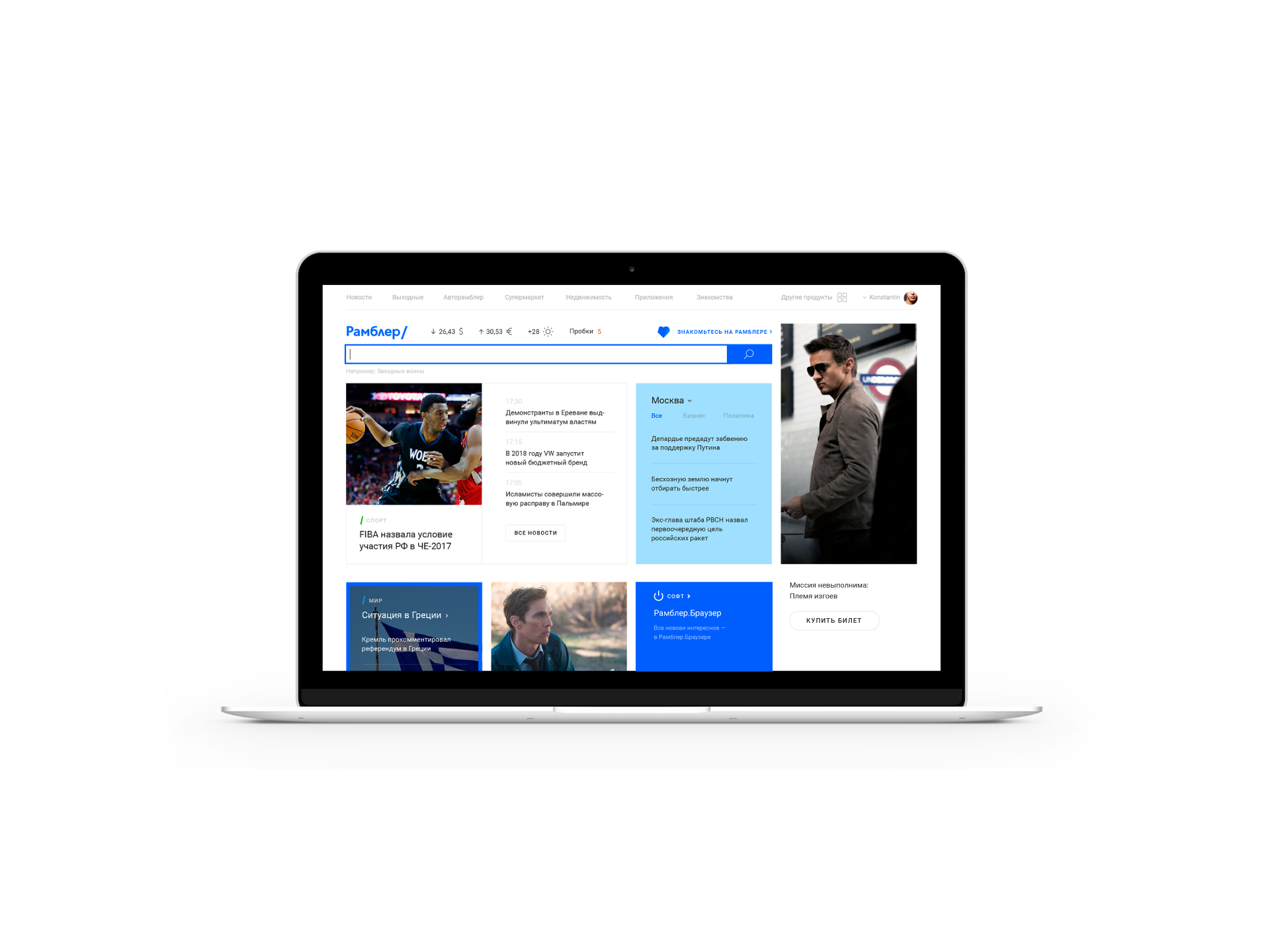
Rambler.ru is one of the biggest search engines in Russia. It has undergone many epochal metamorphoses on its way. The last such change was a global repositioning of its product and switching to a media and service-aggregator model of operation as a result. Our team faced the task of portal rebranding and its key interfaces complete redesign.
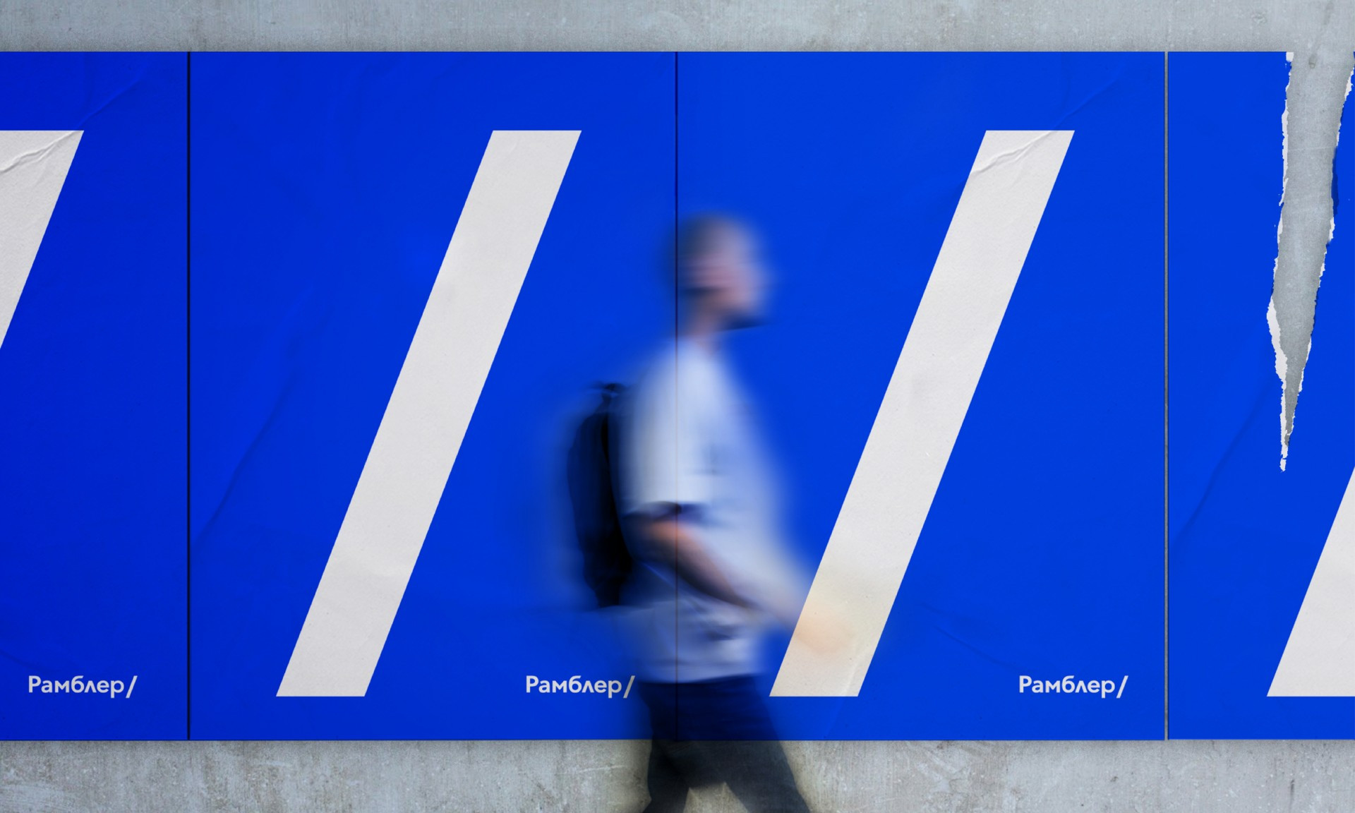
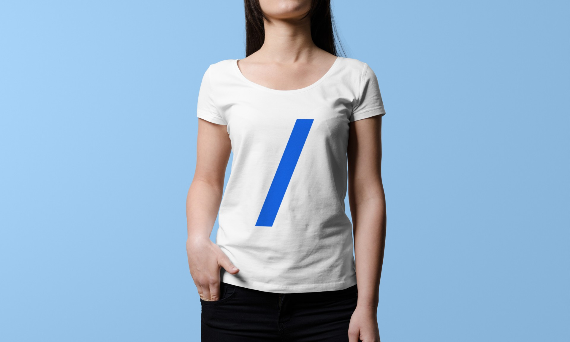
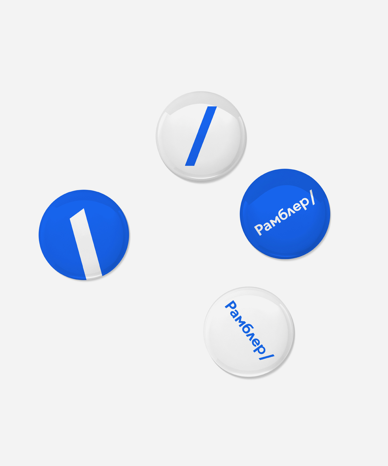
We suggested using the slash sign known to any Internet user as an element of a new logo. Simple and archetypical symbol allowed us to express uniqueness of Rambler brand as the portal that stood at the origins of the Internet in Russia. Slash symbolizes the embedding of content and services, and positions Rambler as a space where users can find answers to all their questions.

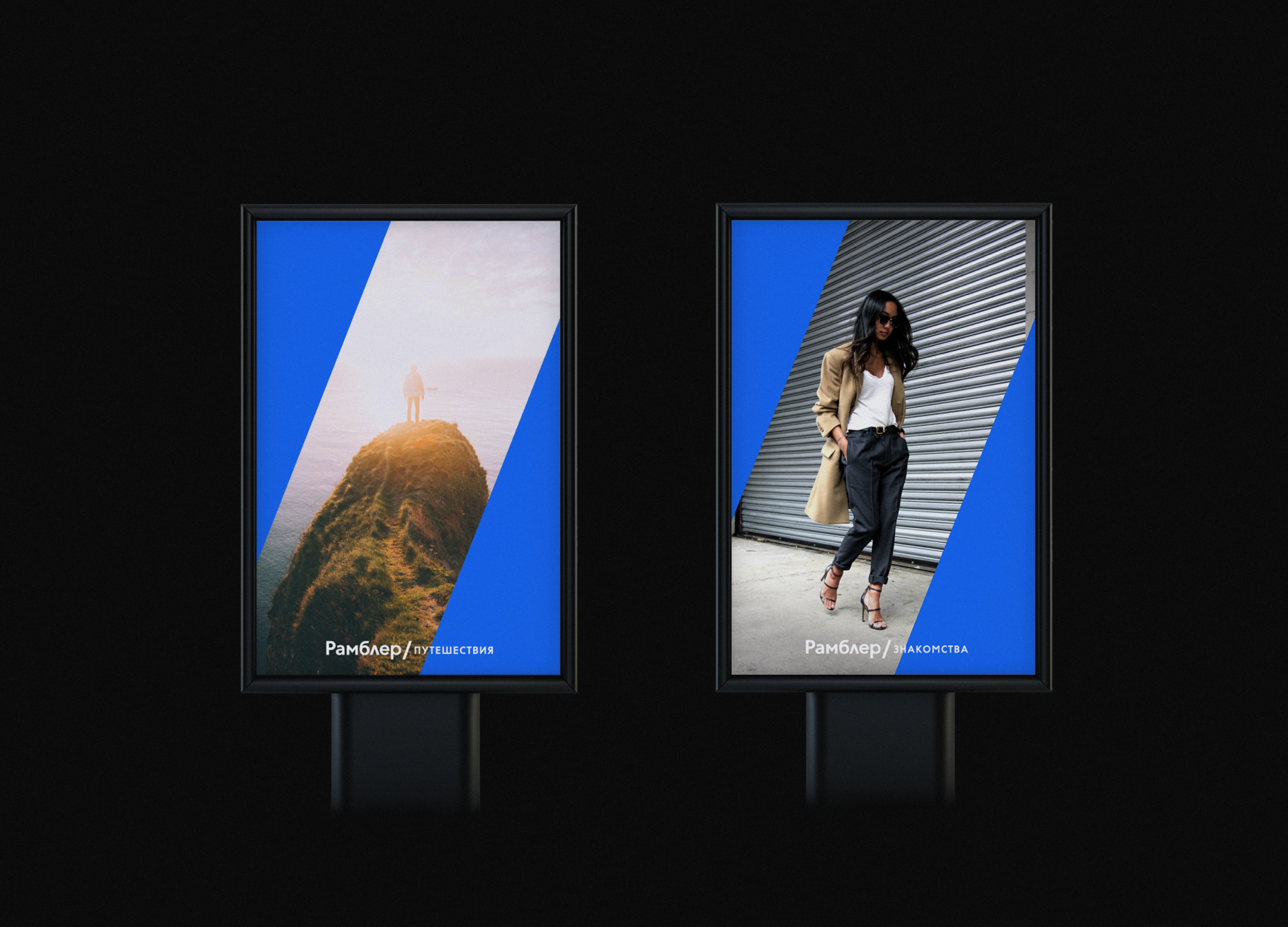
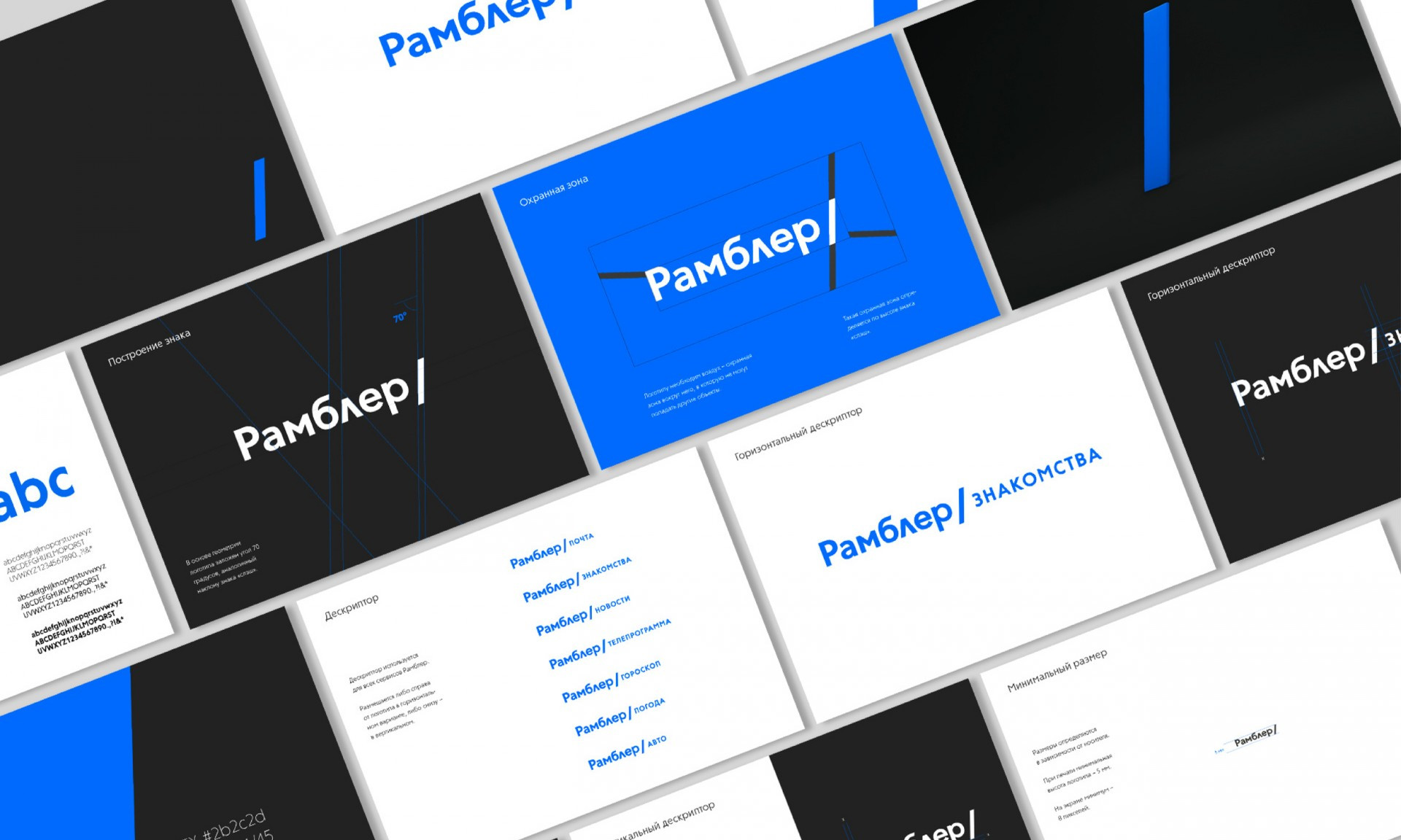
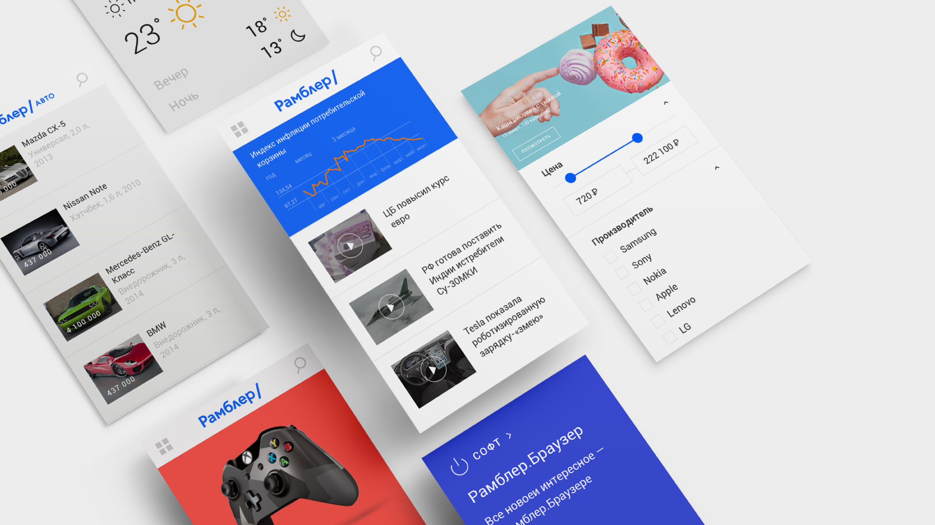
We have also developed a new design for the portal interface and collected detailed guides for the implementation of the new style in all new Rambler products within the project workframe.