Samolet. Neither difficult nor daunting
Samolet is one of the biggest developers in the Moscow region. The company came to ONY for help developing a new style and design system that could communicate the company’s primary focuses on openness, modernness and high-tech solutions. Common sense says that “buying real estate is hard, time-consuming and scary”; the company wanted to break that stereotype, and their brand image had to demonstrate that.
Samolet’s distinguishing feature is their desire to avoid the «sell it and forget it» mentality, instead building long-term client relationships to help them throughout the purchase process and support them with additional services. In searching for a concept, we arrived at the organizing metaphor of building blocks and a calendar, both of which served as the foundation for the new style. Building blocks represent construction, flexibility and change. They represent a service where you can choose the components that you need, rather than just picking out an off-the-shelf combination. The horizontal movement of blocks refers to the calendar’s timeline, letting us create additional motion in the layouts that supports the company’s idea about relationships that develop over time.
Historically, the company’s style had always focused on typography: there was lots of text without many images. In addition, the company had worked hard to make their signature blue color palette recognizable. It was important to preserve these two constants. The blue color remained but became more radiant, youthful and “digital.” The new official font is a grotesque, Cofo Sans, from Contrast Foundry. Neutral and utilitarian thanks to light squaring of letters and narrow setting, it reflects the Samolet team’s strong and confident character.
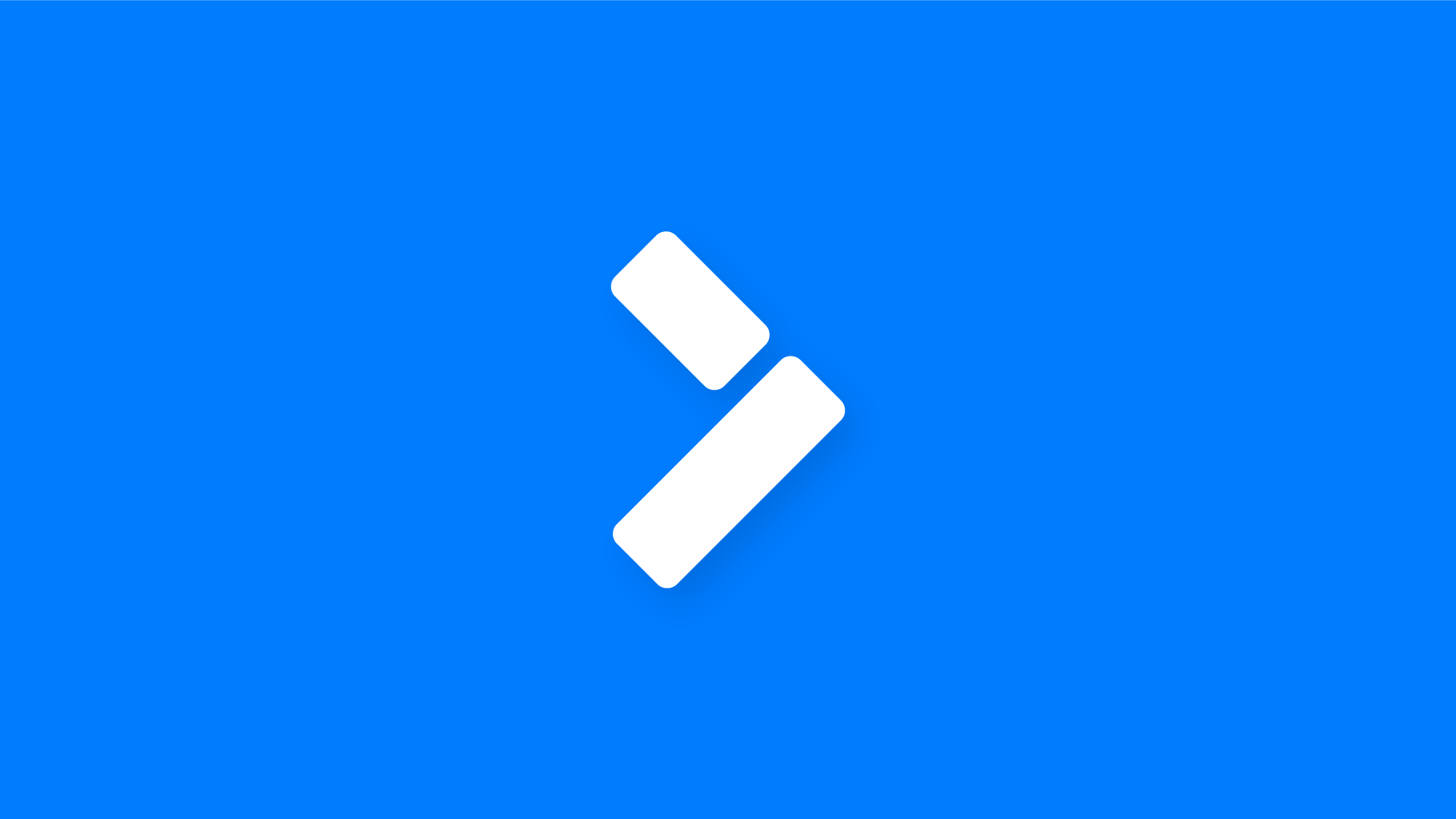
For the logo, we gently changed the structure of its symbols to show off their geometricity. The form of the letters started to echo the style’s primary graphics. This created a symbol as well, which can be used together with the main logo or as an independent branding element. In it, we joined two images together: an arrow pointing right, symbolizing movement forward, and the symbol for an urban block in construction diagrams.
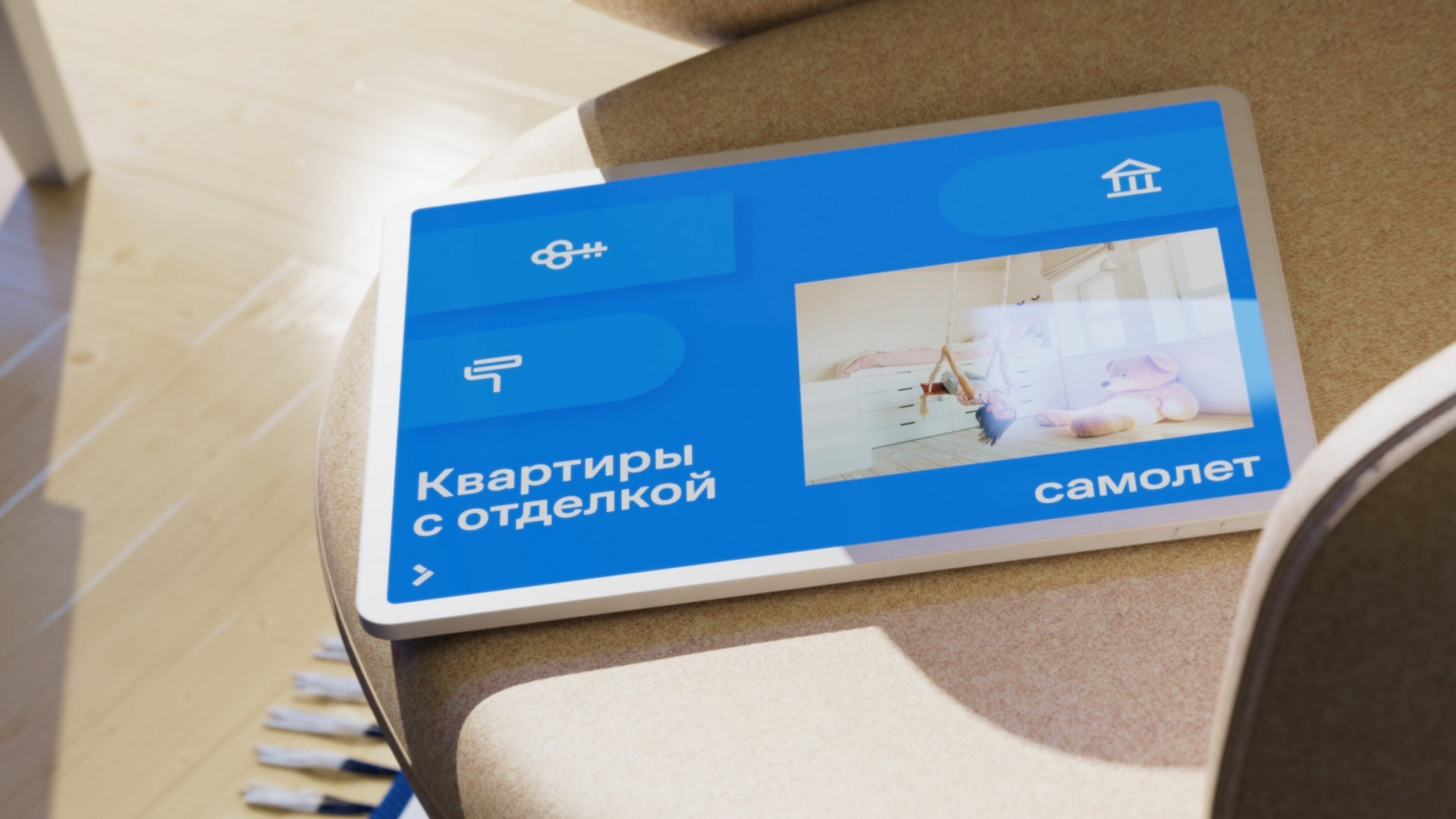
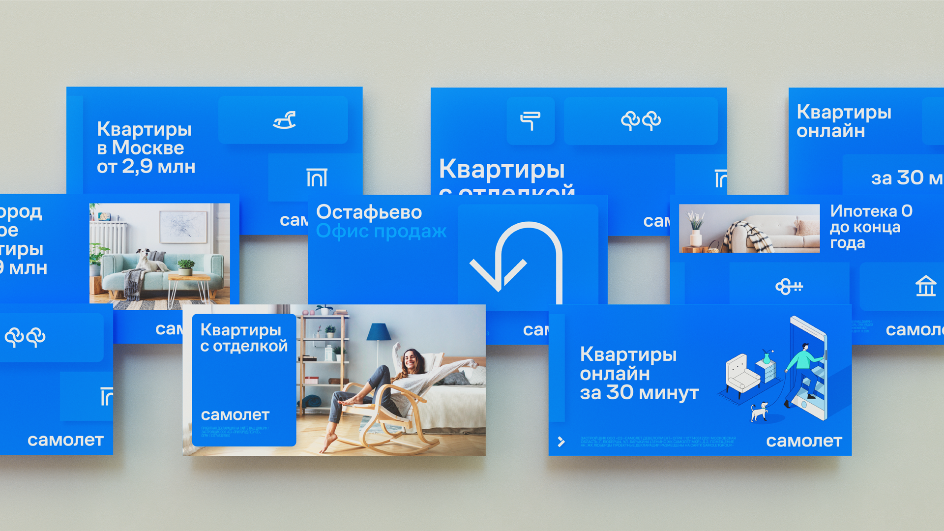
The typographical style might seem fairly spare and offers few opportunities to the design team. In reality, it’s a very different story. Using digital design language, we were able to communicate a great deal. For instance, we used overlays with lighter hues, which allows us to easily distinguish information layers from each other. Meanwhile, this materiality reflects the brand’s personality through artistry and concreteness—as though they were things you could touch, just like the objects that fill a home.
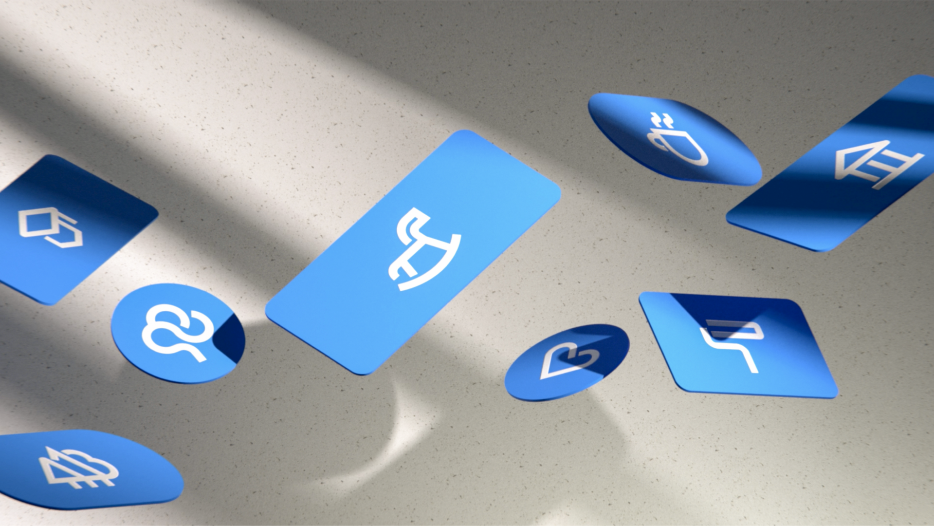
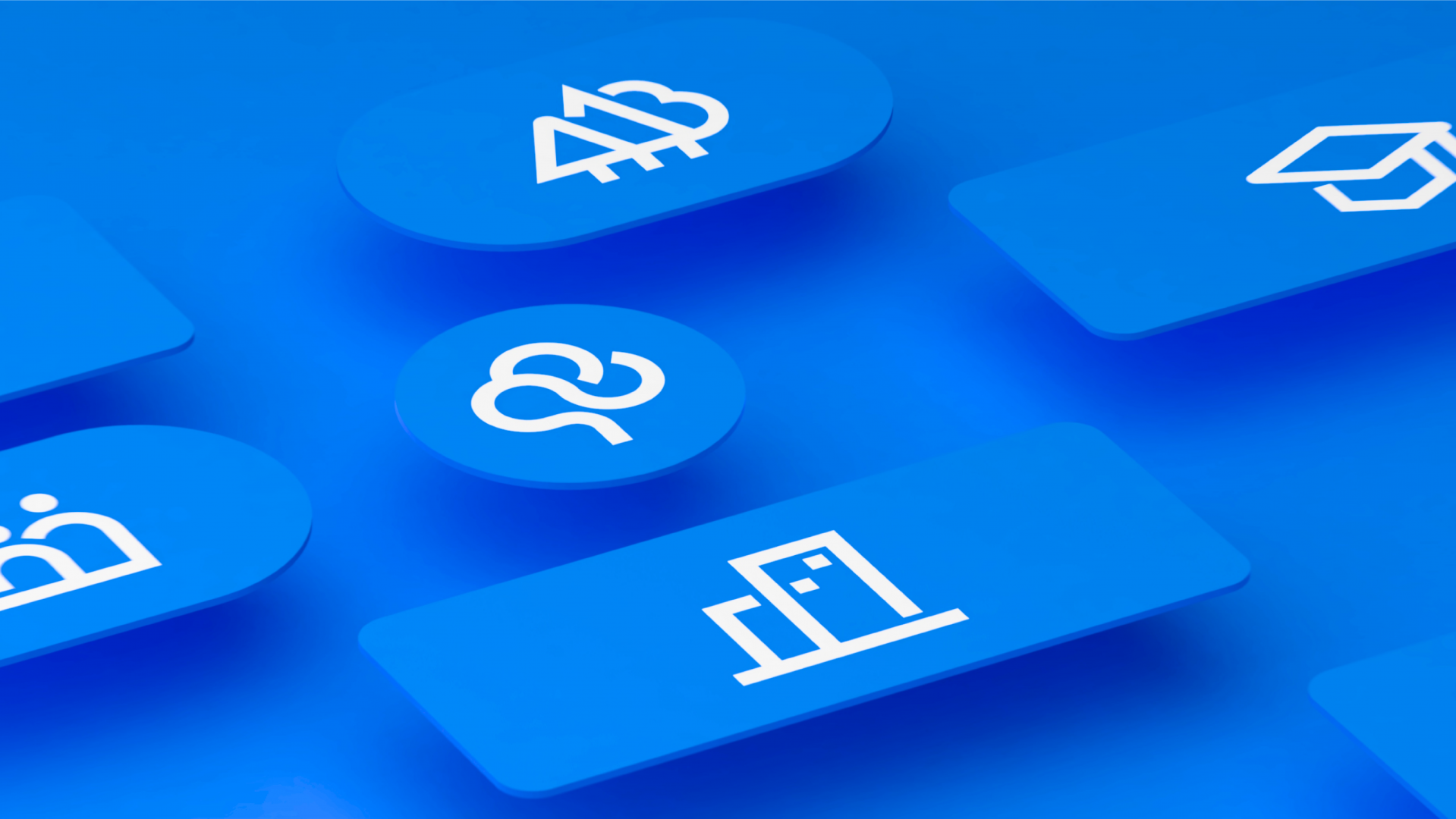
Pictograms added to the typographical language. We created unique linear micro-illustrations, preserving the balance between recognizable images and dynamic style. There are two sets of pictograms: larger illustrations for marketing communications and a lower-detail package for maps and smaller applications.
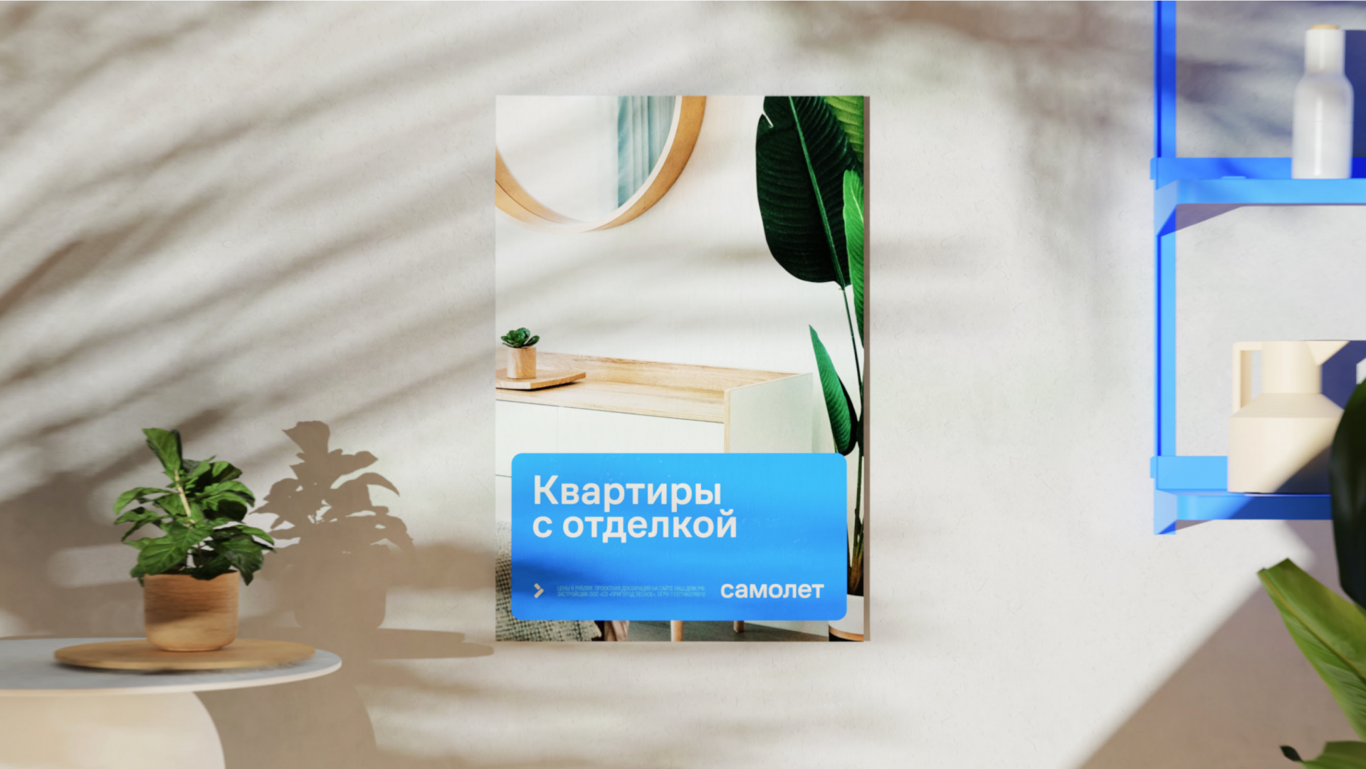
Alongside the style concept, we had to create a clear design system that the client could easily support and develop in the future. We developed numerous templates, including leaflets, promotional and navigational outdoor advertising and signage, all while creating instructions for working with them. We held several art direction sessions with the Samolet team so that their designers could get a better sense of the style and learn to work with it. At these sessions, we analyzed layouts made in accordance with our guides, resolved ambiguities and found alternatives for cases where our new style didn’t work so well.
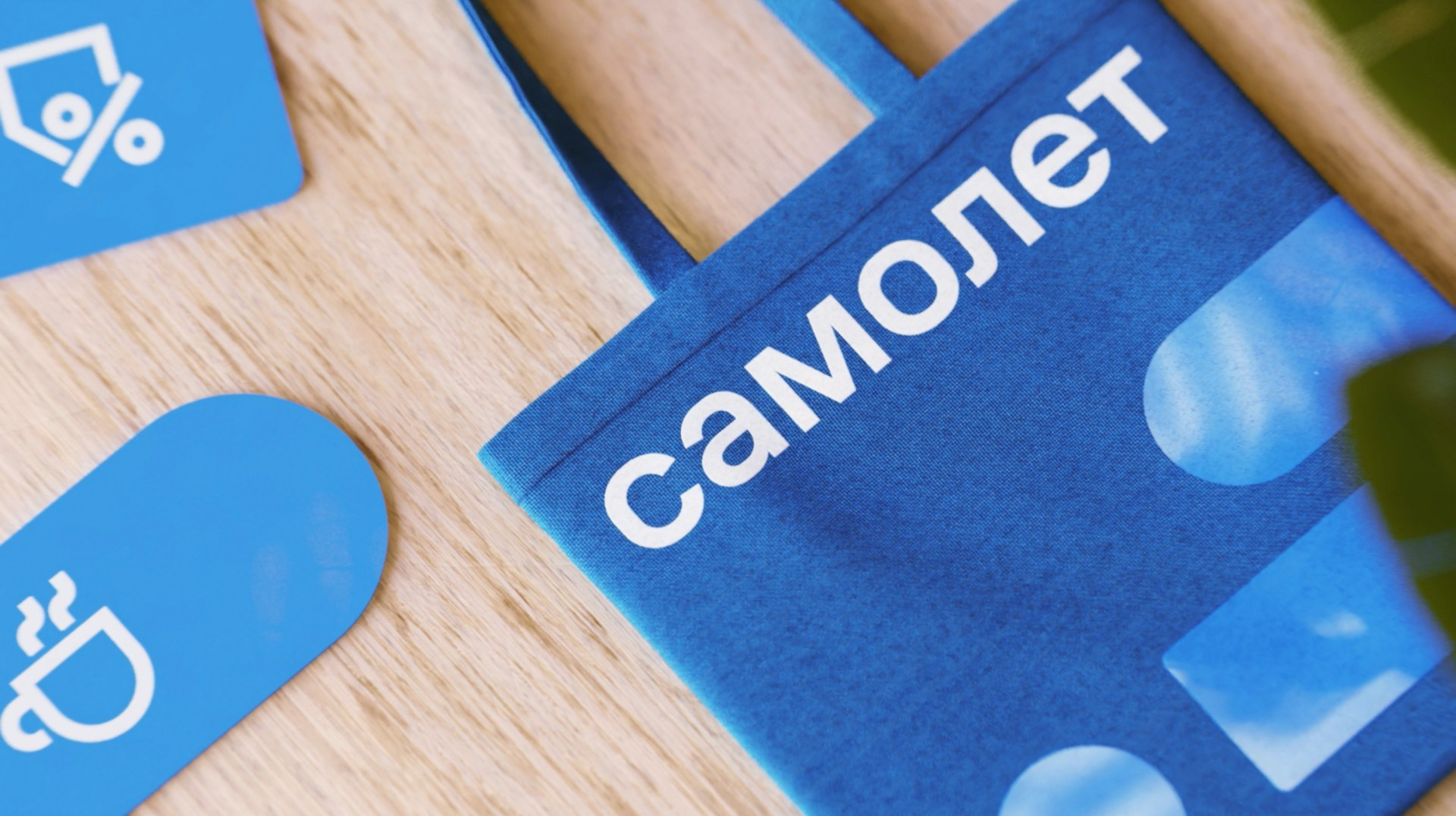
Samolet’s new design now reflects its most important transformation: into a technology-forward developer with a wide spectrum of useful and easy-to-understand services that people can comfortably use every day.
