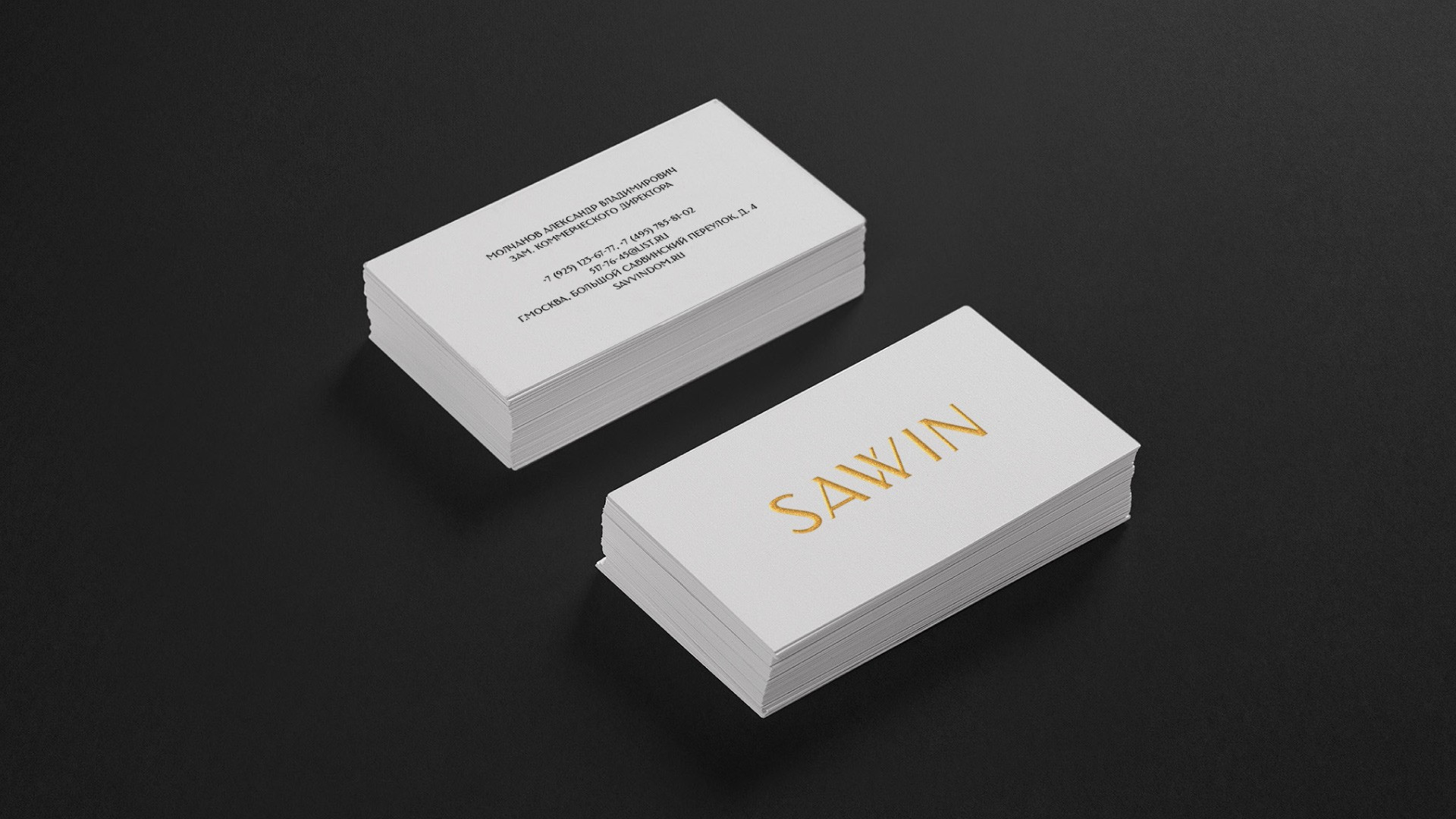
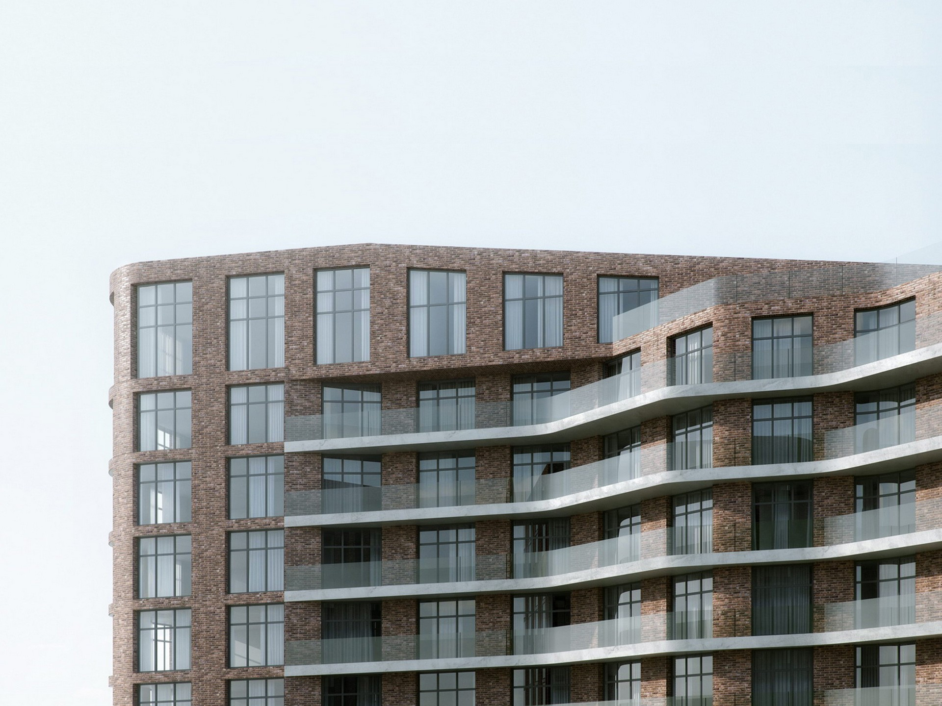
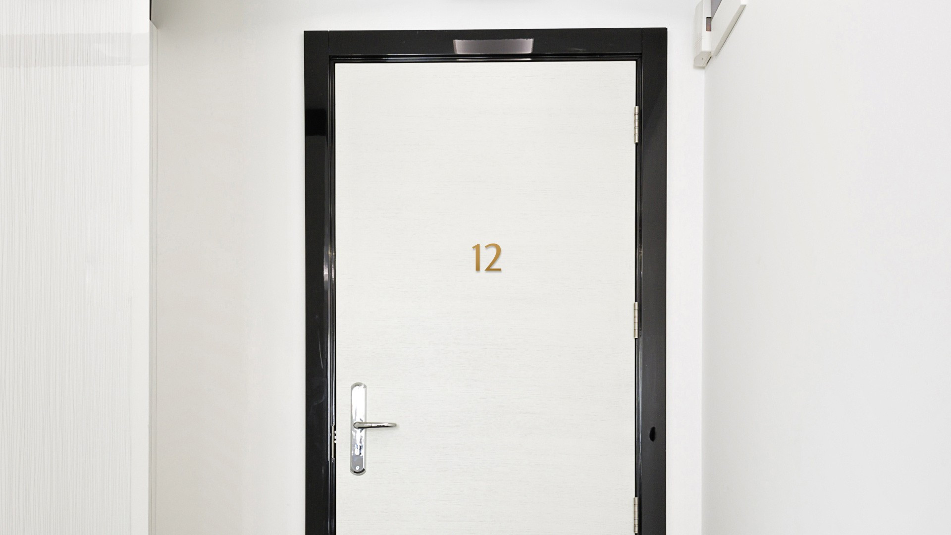
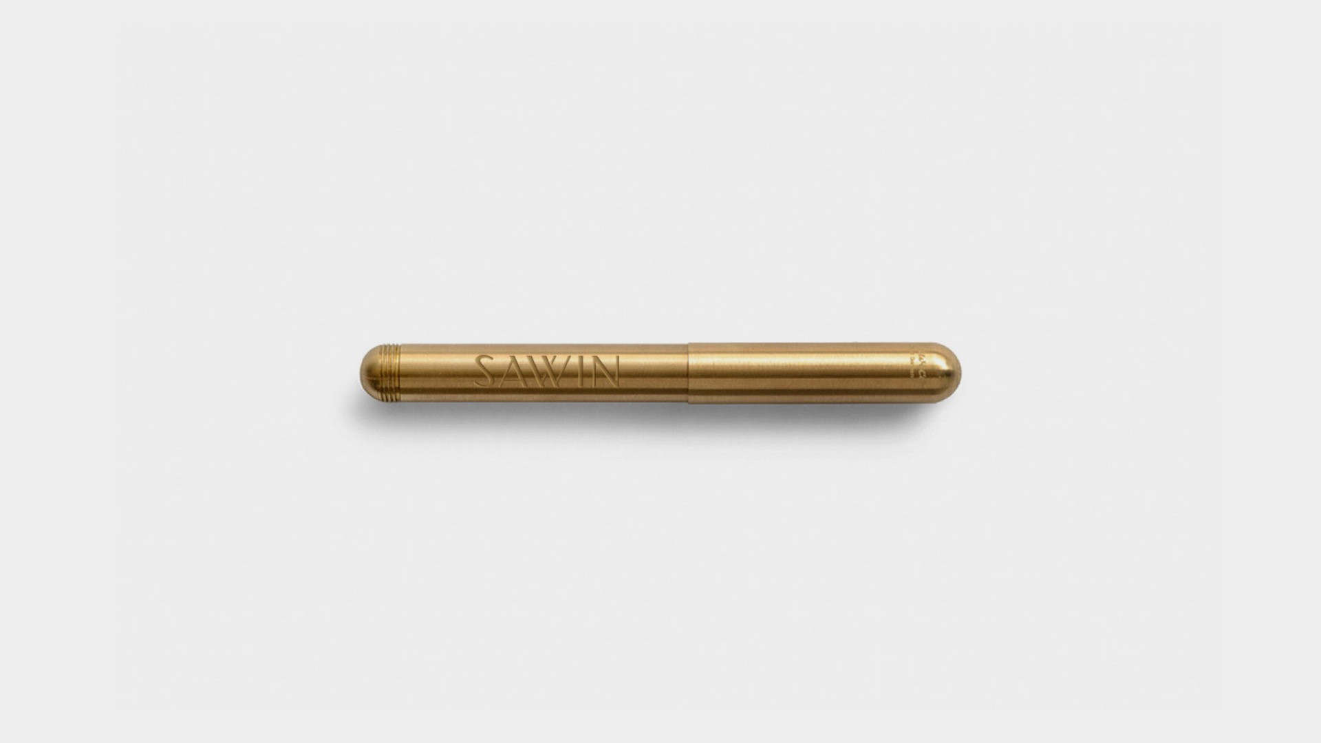
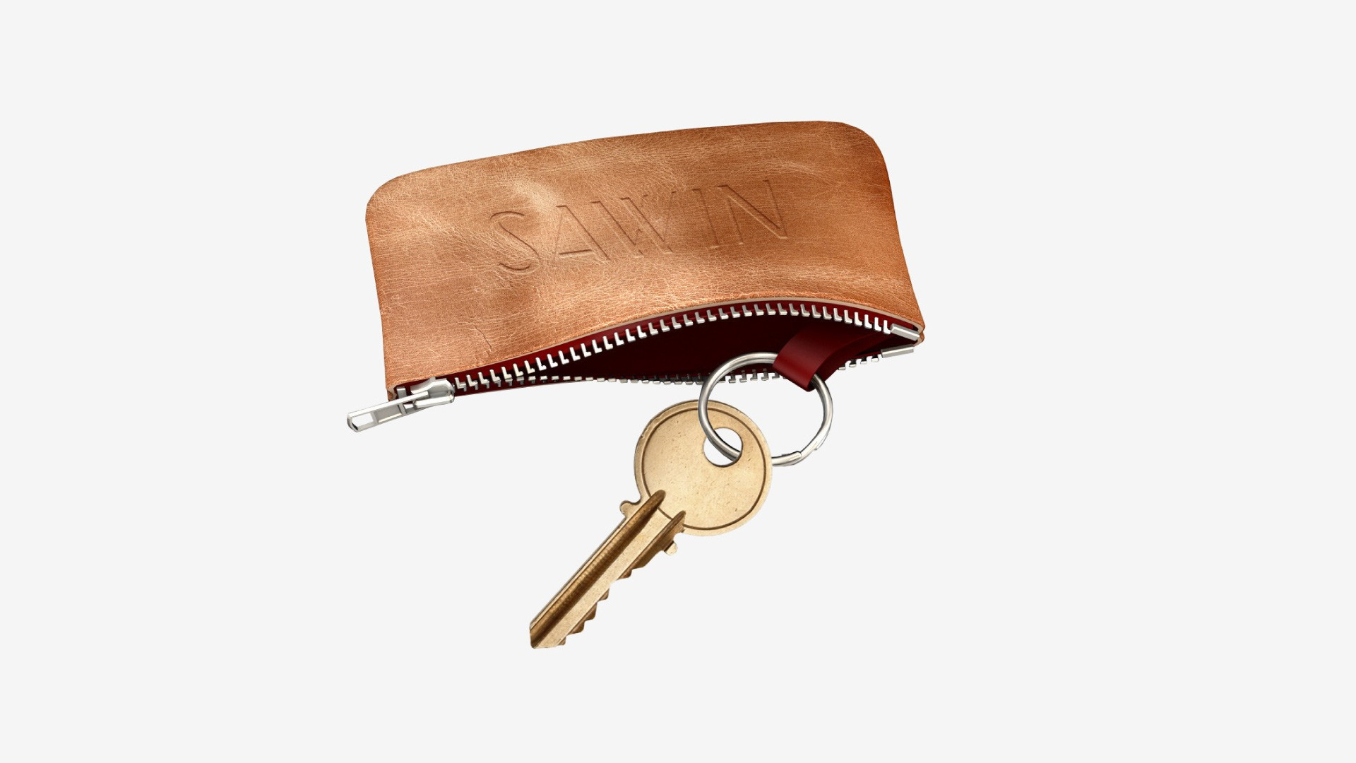
Savvin. River residence
Savvin — an exclusive project of the house at Savvin quay in Moscow from architect bureau TLP. We had a task to develop an image of the brand that would express historical associations with locations and would underline a status of residence.
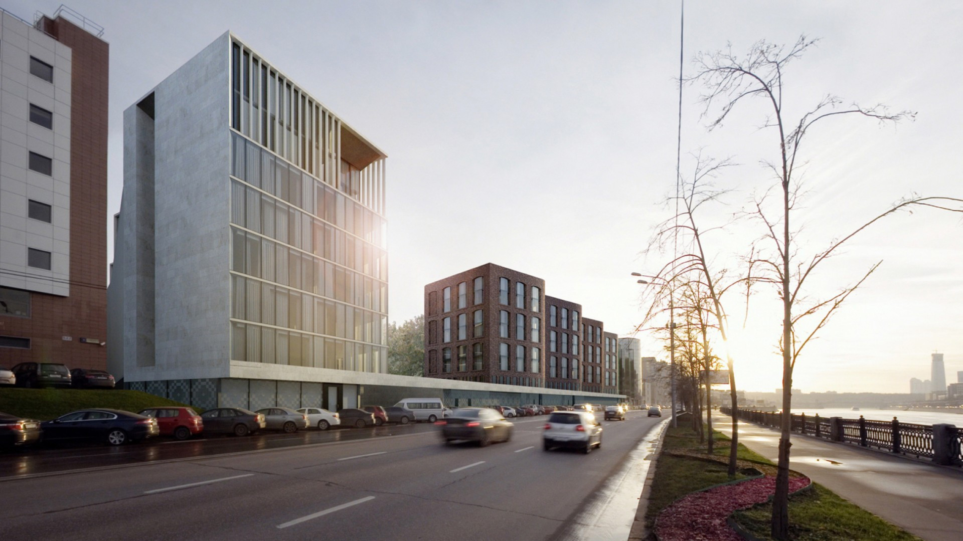
Among variety of proposed title versions the name was chosen based on historical associations with the location. Savvin quay was given a name in the beginning of XX century because of Savvin monastery patriarchal quarter which had been situated there in XV-XVII centuries.
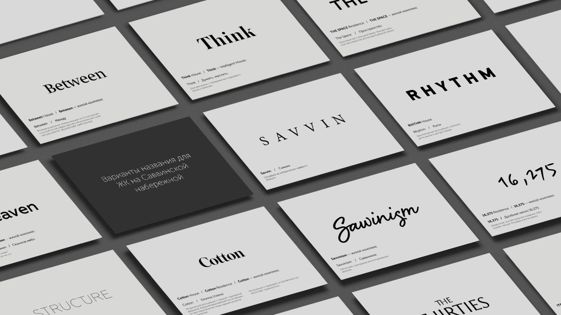
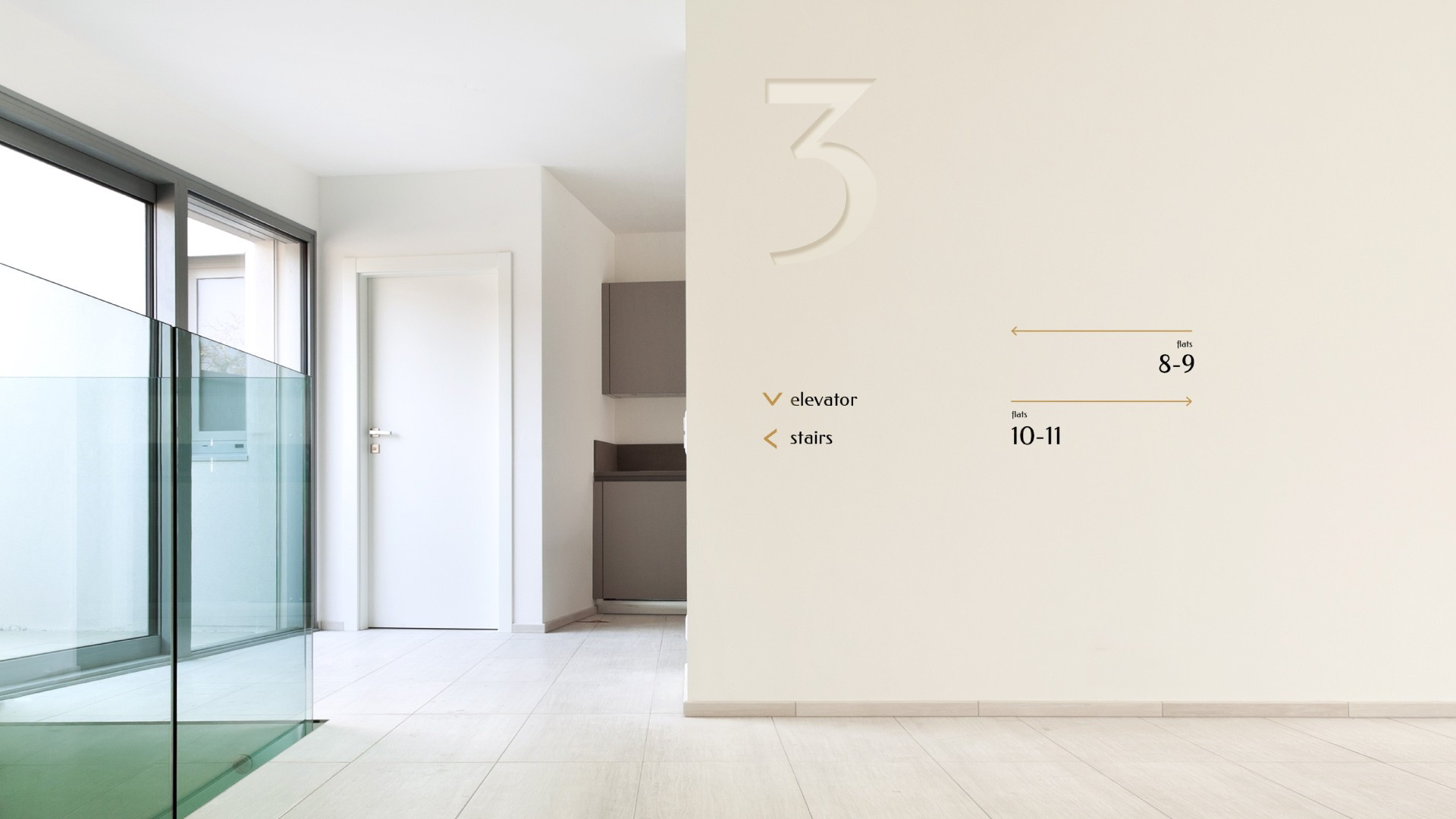
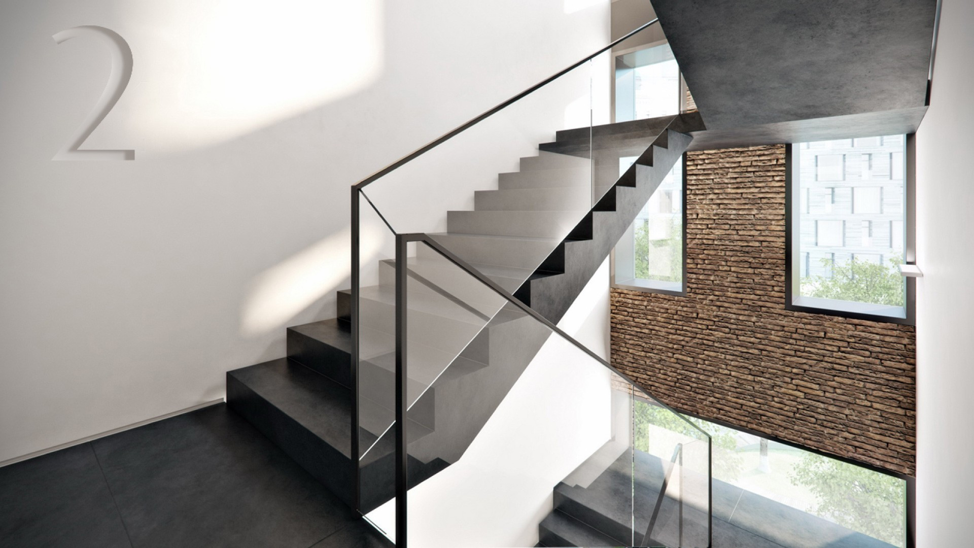
For visual demonstration of the brand we offered a reserved, minimalistic solution, based on typography. The font Romanovsky, re-created by examples from the Osip Liman type foundry, make style full of historical associations. Contrast of the font with its strict module structure and modern navigation graphic assigns style to modernity.