Trekhgorka. A modern reimagining of space
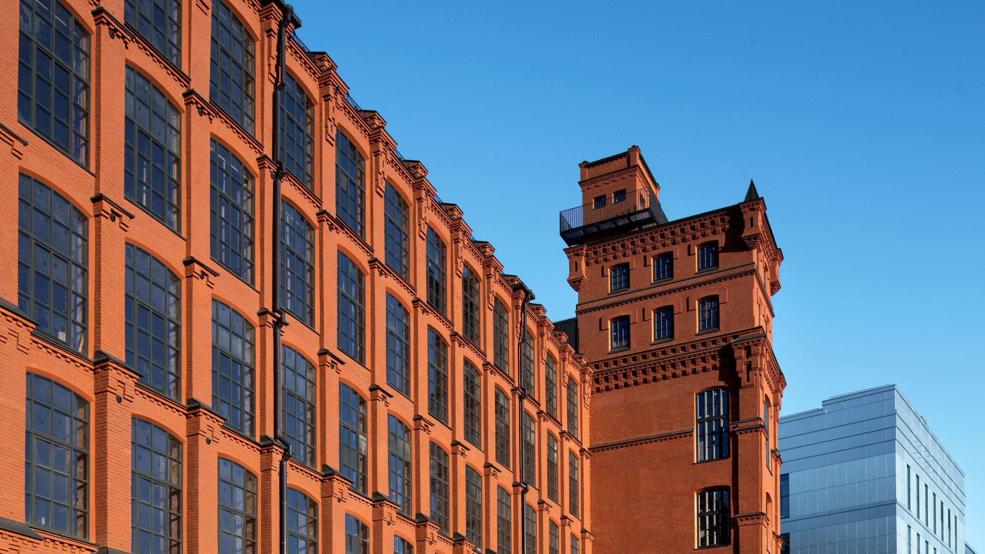
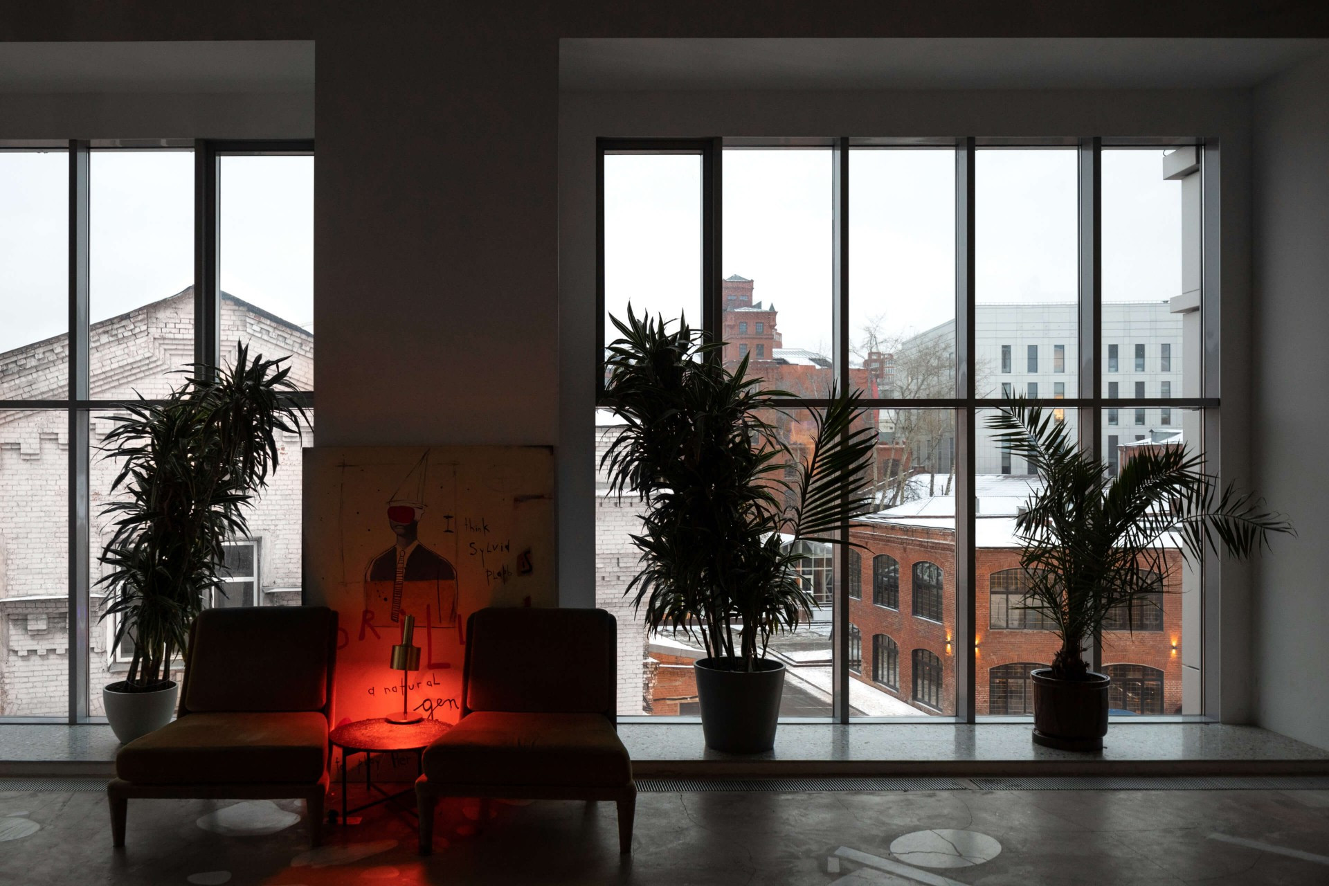
Trekhgornaya Factory is a business and leisure district. Before this, the location was occupied by one of Moscow’s oldest textile plants, but today the factory’s more than thirty buildings are available for rent. The Trekhgorka team came to us for a new site with simple, clear functionality and a design that reflects their centuries-long legacy. Our task was also to bring both new residents and guests to this space, for whom the space is of interest both for its unique architecture and contemporary cultural program.
In developing the concept, we were inspired by the factory’s architecture and sought to underscore its cultural value. In order to understand the client’s demands more clearly, our team held a creative session at the Trekhgornaya Factory itself, where we identified the most valuable aspects for our client’s positioning: minimalism, the sense of “preserved history and a contemporary reimagining of space.
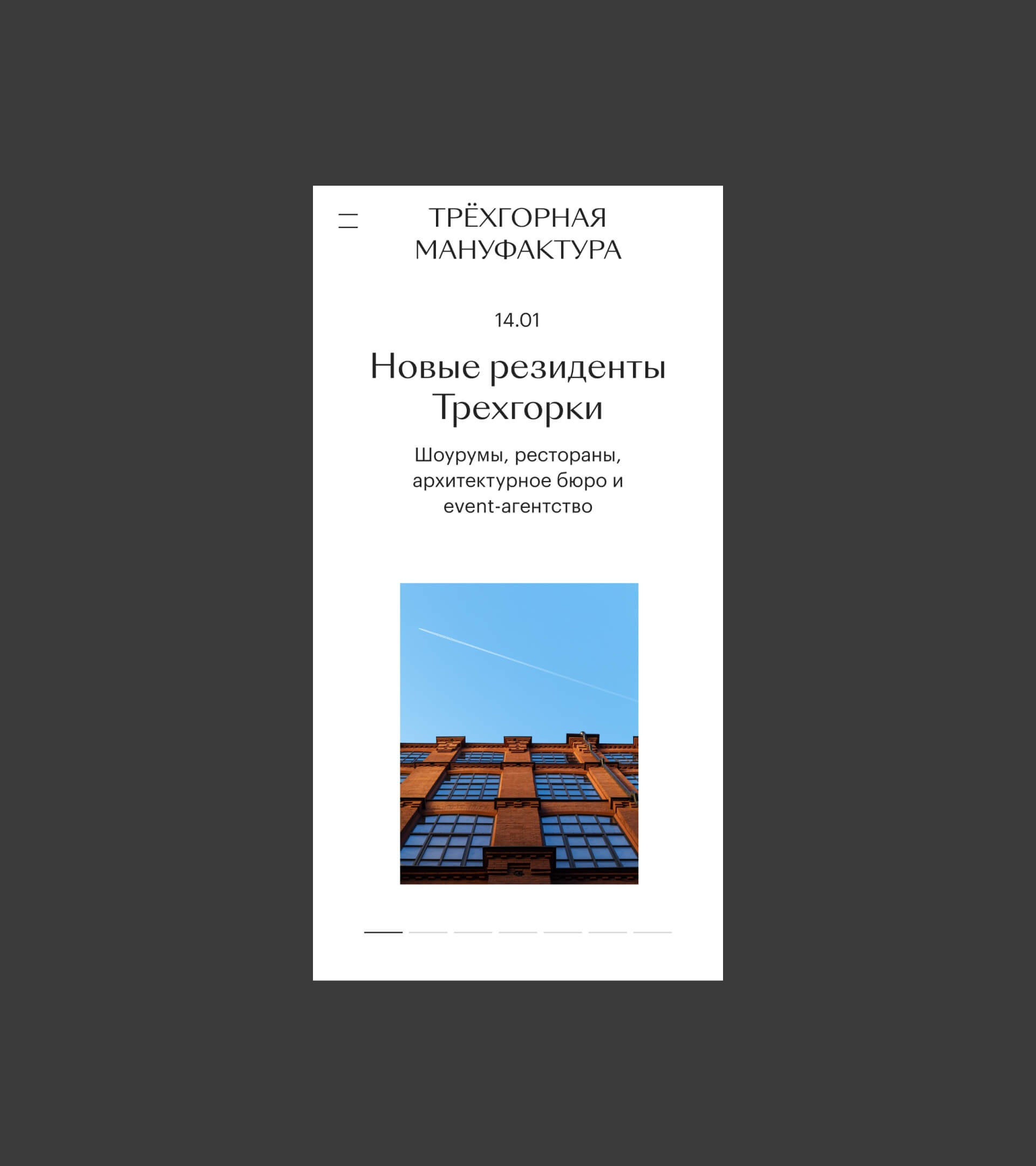
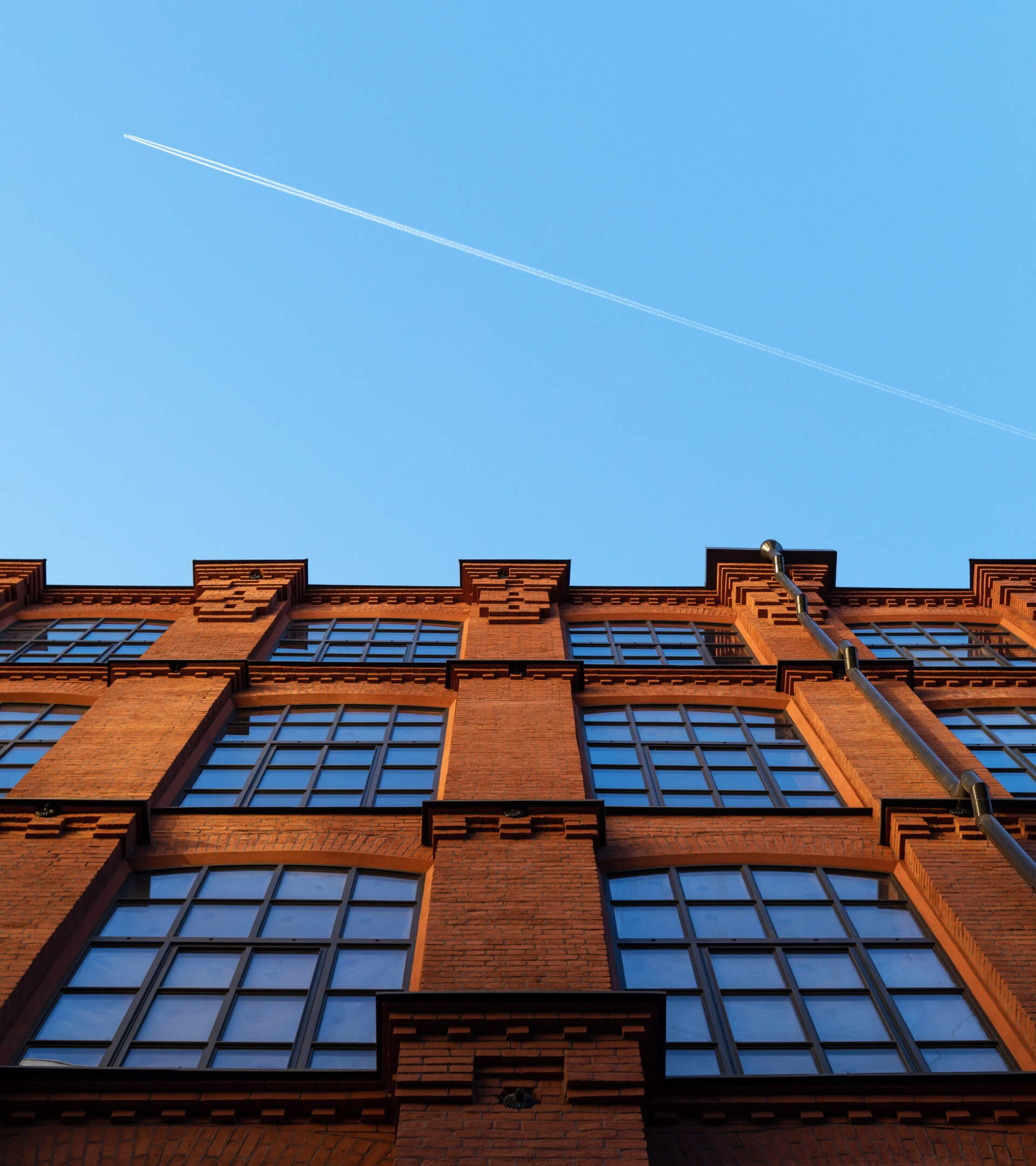
Our design incorporates plenty of air and negative space, with photographs of the factory itself serving as the only bright accents. It was important to preserve the heritage of architectural forms in building the layout: for instance, the dominance of vertical lines in the space gave rise to the idea to use vertical photography, uncharacteristic for the web format. For printed matter, we chose the expressive Activa, reminiscent of 20th-century modern fonts. We balanced it out with a neutral Grotesque, a contemporary font suitable for a user-friendly interface.
We tried to give the Trekhgornaya Factory a face on every possible level, including in the choice of typographical constructions. This led us to ground ourselves in the brand’s “factory DNA” using industrial and typographical elements as our basis. If you take this out of context, it could look flat in a vacuum, yet focused at the same time. We organized all of the technical information in the center, visually anchoring us in the style of 20th-century brochures and advertisements.

The Trekhgornaya Factory is a cultural space. The grounds are rich with food vendors, fashionable boutiques, nightclubs and bars. In order to visually present the territory and the location of the services there, we created an interactive map with small (15px) but concise and contemporary icons. Even with these minimal tools, we were still able to achieve an individual look.
One of the client’s main business challenges was expanding space rentals. Therefore, the site was to serve as a convenient and clear tool for future residents. We created a functionally simple map with filters to search by area, price, purpose and finish, while simplifying the communication between managers and clients and allowing them to search on both a list and a map.


Ultimately, we were able to create a site that meets every target audience’s demands, from visitors to residents. By grounding ourselves in the trends in web design for public spaces, we accounted for every key need: a functional map and easy search. Still, Trekhgornaya Factory distinguishes itself from the majority of business districts by being a historical space whose store we were able to highlight in the design.
