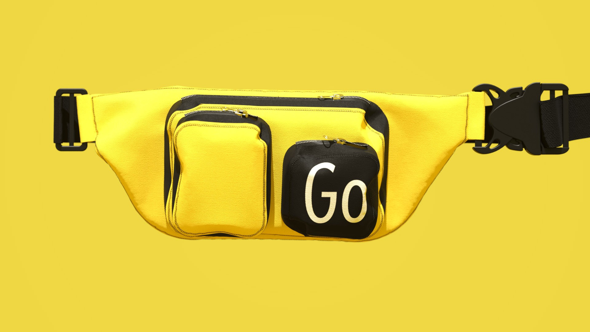
Yandex Go. A super-app for city life
Yandex Go is a single app to take care of everyday tasks in the city, based on Yandex.Taxi. This super-app combines all of the company’s services connected to life and movement around the city in one place: from taxi, carsharing and moving services to grocery and food delivery. The main idea behind Yandex’s universal app is to make people’s lives easier.
The branding for the new product had to meet three important criteria. First of all, we had to create a system where various services could comfortably coexist together. Second, we needed a direct graphical link with how the product was designed. Finally, it was important to preserve its continuity with the style of Yandex.Taxi in order to help people transition smoothly to the new logic behind the app. We had the advantage of being the team who developed the previous style, so we had a clear understanding of all of its components and the constants that needed further development.
In search of a solution, we examined various concepts, from blocks placed on top of each other like windows in a mobile browser to timelines that illustrated the capability to use different services sequentially. The logic of the app itself was the determining factor in choosing the final concept: the main screen of Yandex Go shows all of these capabilities in a smart feed of shortcuts which give users quick access to functions that are most relevant to them at a given moment.
The starting point for the final branding concept for Yandex Go were split blocks from the previous design system. Previously, the icon for the Yandex.Taxi app combined two visual ideas: the letter T and a taxi checkerboard. Now that the service is becoming part of an enormous ecosystem, we tried to scale up and take a «wider look» in order to see all of the options in the feed. This is how split blocks turned into shortcut cards directly referring to how the service’s app looks.
The essence of Yandex Go’s visual language is that it should work on the widest possible variety of media and in the large number of scenarios that the product is designed for. As a result, the style should be as simple and straightforward as possible while still giving the opportunity and space to solve extremely varied communication challenges. To do this, we provided a system that would allow the Yandex team to easily create new layouts for any situation.
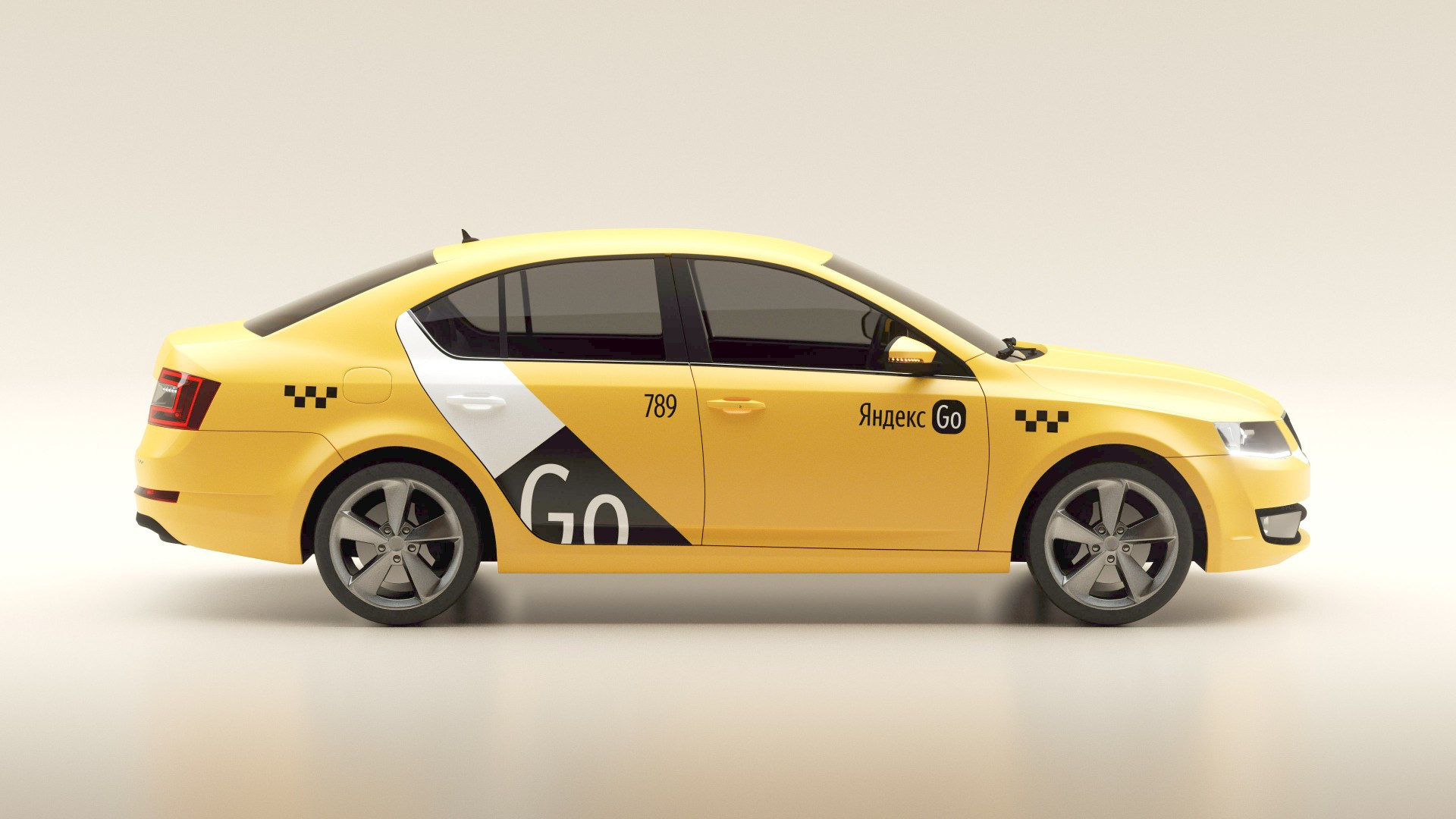
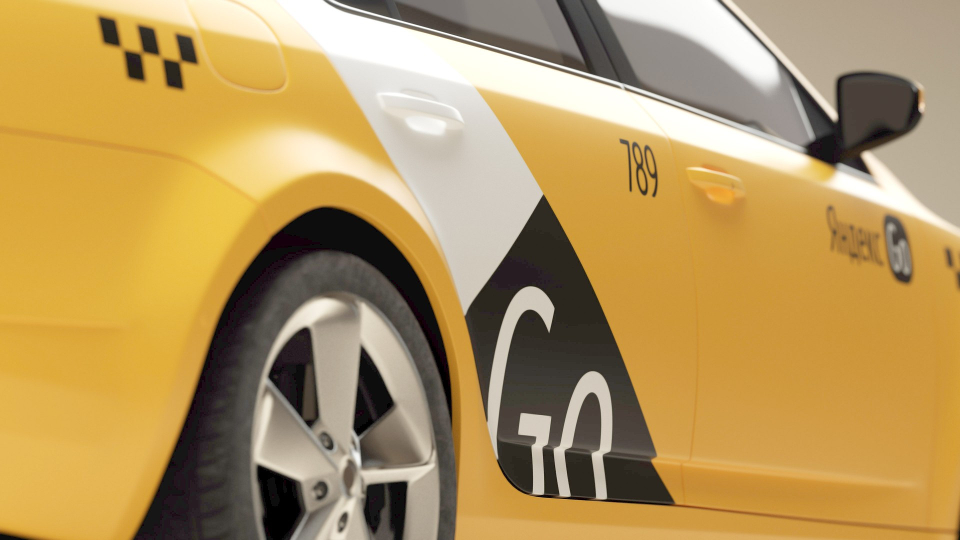
We proposed using three types of layouts as a foundation: 1. A composition as close as possible to Yandex.Taxi’s style but with rounded split blocks and a shadow to add a pleasant materiality to the graphical elements. 2. Layouts with a lot of negative space and cards, providing a greater level of visual harmony with the outward appearance of the new app and explaining its mechanics in the best possible way. 3. Formats with full-screen photographs for image communication. In essence, these formats look like large shortcut cards from the app’s feed.
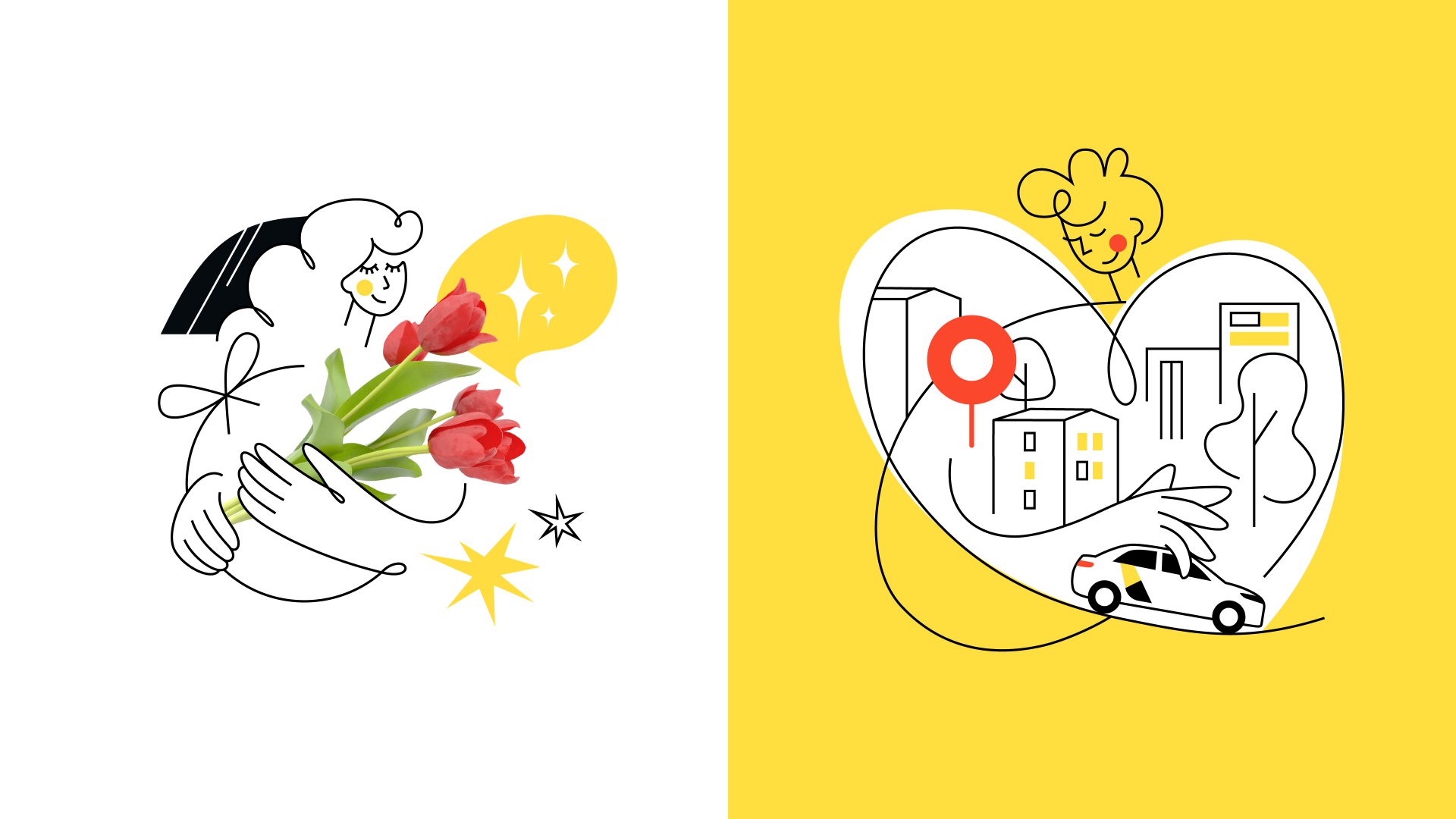
The style for Yandex Go was developed in close collaboration with the client, and we spent no shortage of multi-hour workshops together. At one of them, we generated a concept for updating the app’s illustrations, which we later passed on to the designers at Yandex Go’s creative studio, Magic Camp. It was based on a line, as a metaphor for roads on a map. We also created three-dimensional objects and characters who talked about different use cases for the app.
We created a design system for Yandex Go together with the Yandex team, maintaining a balance between the recognizability of their existing branding and a reflection of the all-new product on offer to users. We hope that we were able to make it simple and flexible enough to explain the new logic of the app’s functionality to users.
