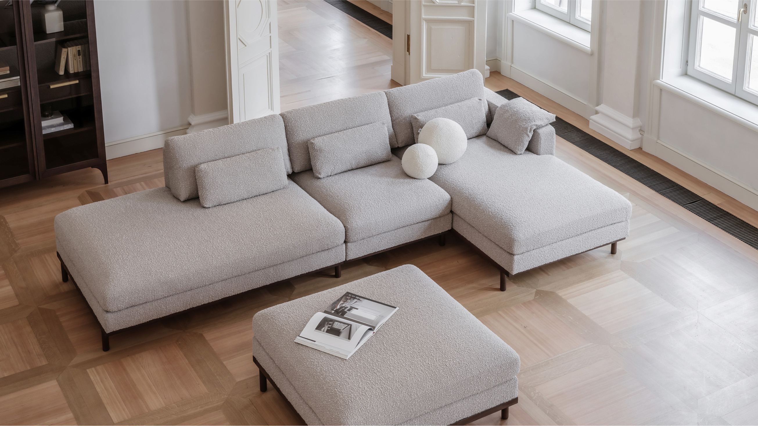
Dantone Home. Forms and functions

Since 2014, the company has grown and changed – the previous website could no longer reflect the style of the brand. Therefore, the team of Dantone approached us for an audit, redesign and technical update of the online shop and subsidiary websites of the brand.
The ecosystem of the brand includes the Dantone Home e-shop, the manufacture of kitchen furniture Dantone Kitchen, the design studio Dantone Buro and the B2B business Dantone Contract, which offers solutions for furnishing of residential houses and commercial spaces - offices, restaurants, hotels, apartments. We started our design work with the most extensive direction – Home. It consists of furniture and home accessories. First, we carried out a design audit of the brand and realised that the previous website version was outdated stylistically but not functionally. The site had a well-established catalogue structure and an extensive database of articles. We dismantled all these elements, kept them all and re-packaged them into a modern look and feel.
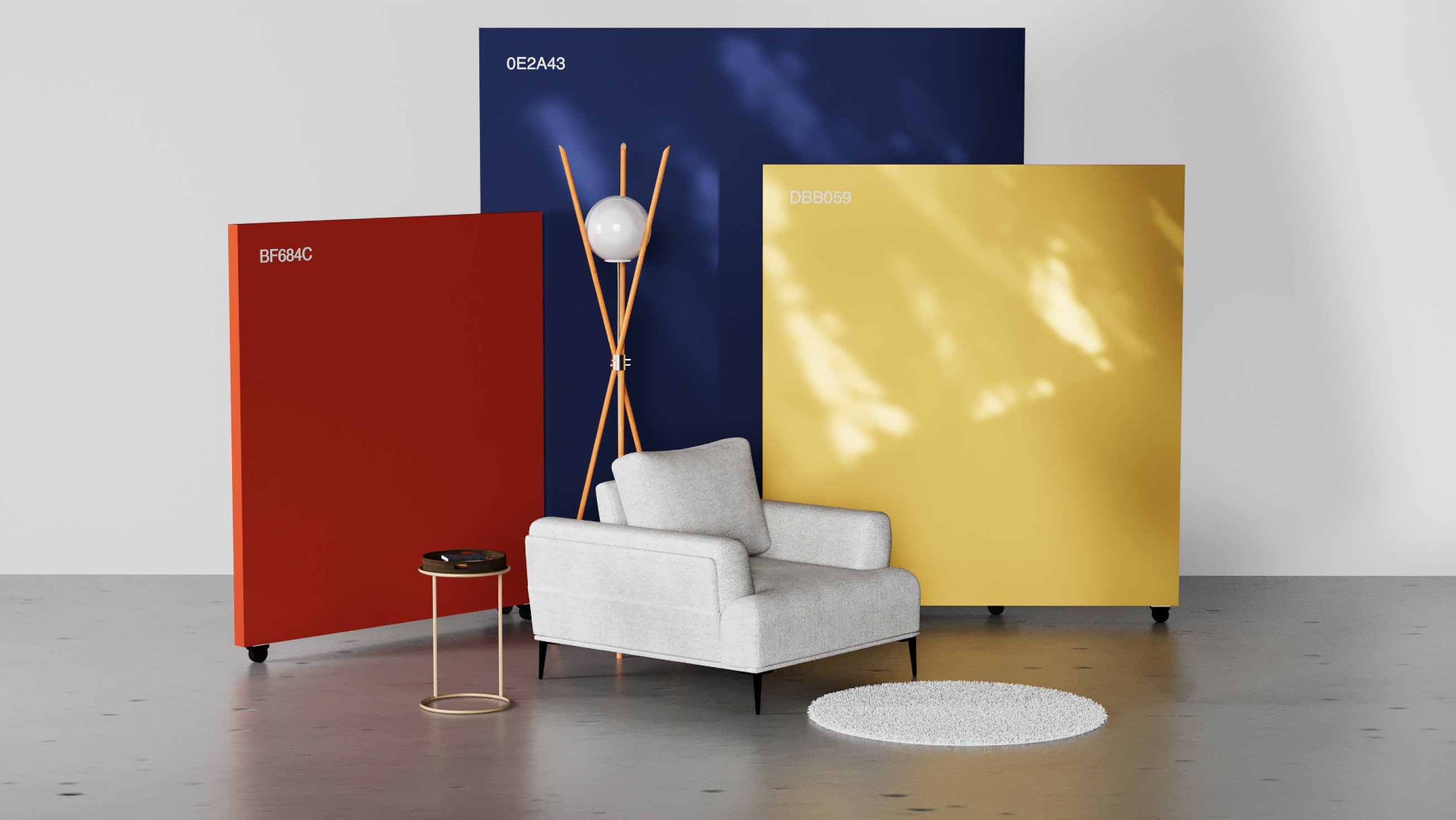
The spirit of the brand is cosmopolitan, moderately traditional and yet cosy. Guided by the brand book, we have used an intelligent triad of colours.
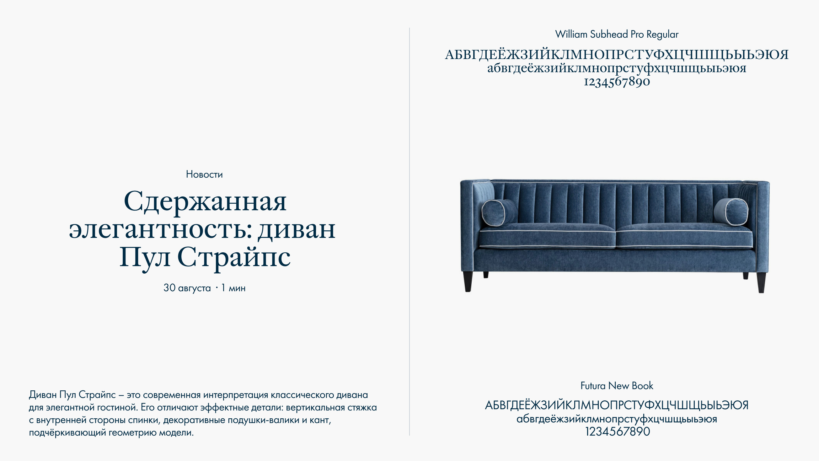
We have chosen an antique William font paired with a chopped Futura New to emphasise the neo-classical notes.
Photos are a distinctive feature of the brand, and we have emphasised them on the website. We left only succinct and brief messages on the banners, and essential product info in the catalogue, to avoid cluttering up the images. The result is a magazine-like layout.
In addition to a rich catalogue of home furniture, the company has a separate catalogue of custom-made kitchens, business space design services and interior design consulting. We have put all this together in a single menu so users are not confused by the company's wide range of products and can quickly find the right sections with goods and services.
Dantone Home customers often come to the company's showrooms to see samples. It was necessary to design the cards in the catalogue where users could see all aspects of the furniture in detail: fabric, fittings, materials, and size. For this purpose, we have interviewed customers and found out which characteristics they wish to see in the card in the first place. The catalogue contains products of different complexity: a modular sofa with finishing options or a vase. The products have various payment and delivery terms. When working on the purchase scenario, we have been seeking to make it clear and understandable. That's why we made blocks about payment and delivery methods with modal windows so the client could quickly view the information without switching between pages.
A significant part of communication between the client and the audience takes place in the blog. Our task was to make it simple, but visually rich. We have also added a constructor inside the articles so the client could build the structure himself: create photo galleries or blocks with product sections.
The constructor is available not only in the blog but also in other sections. With its help, the client can add pages to the site without developers, for example, to create lendings for new services.
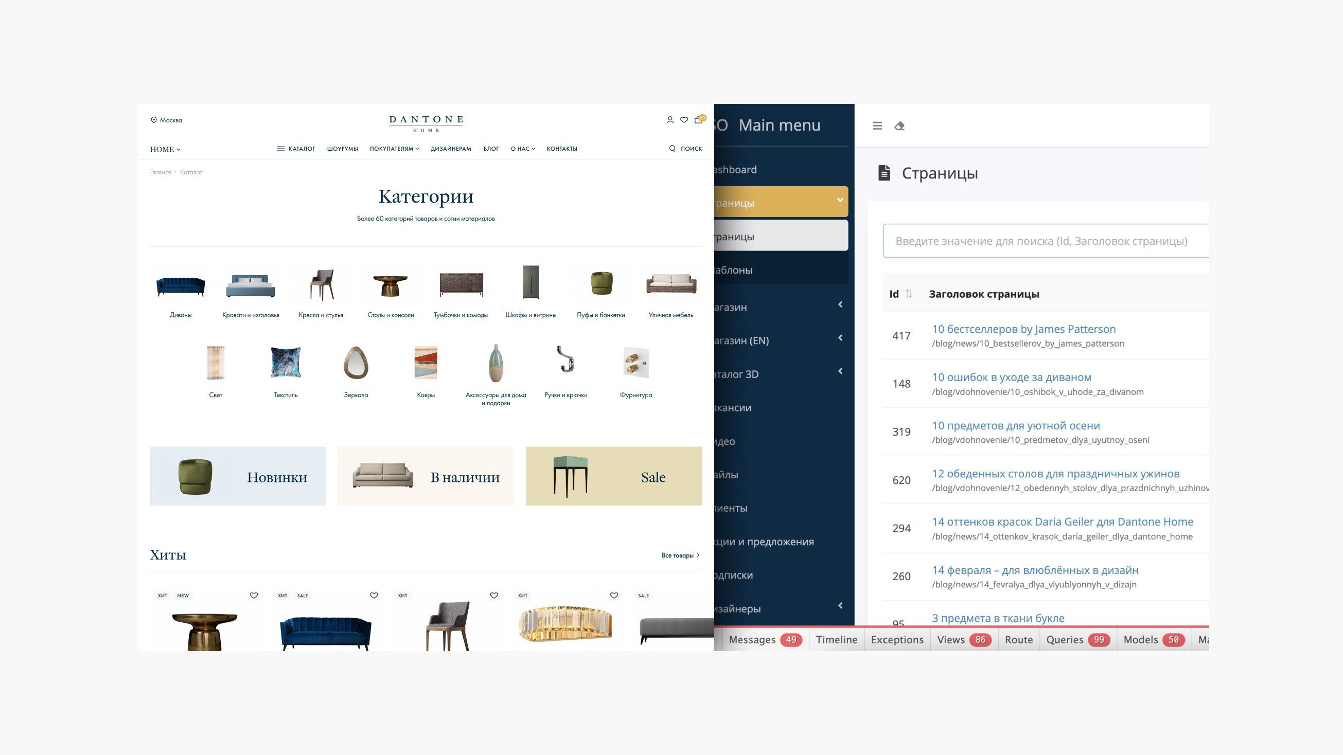
We have used the Laravel framework as the main stack and the front end separately, which can operate on a different server and interact with the backend via APIs. This architecture enables the company's scalability: The launch of an additional site in another region in a short period of time. Besides, we have created a single admin dashboard for all the company's directions: To make content management easier and faster.
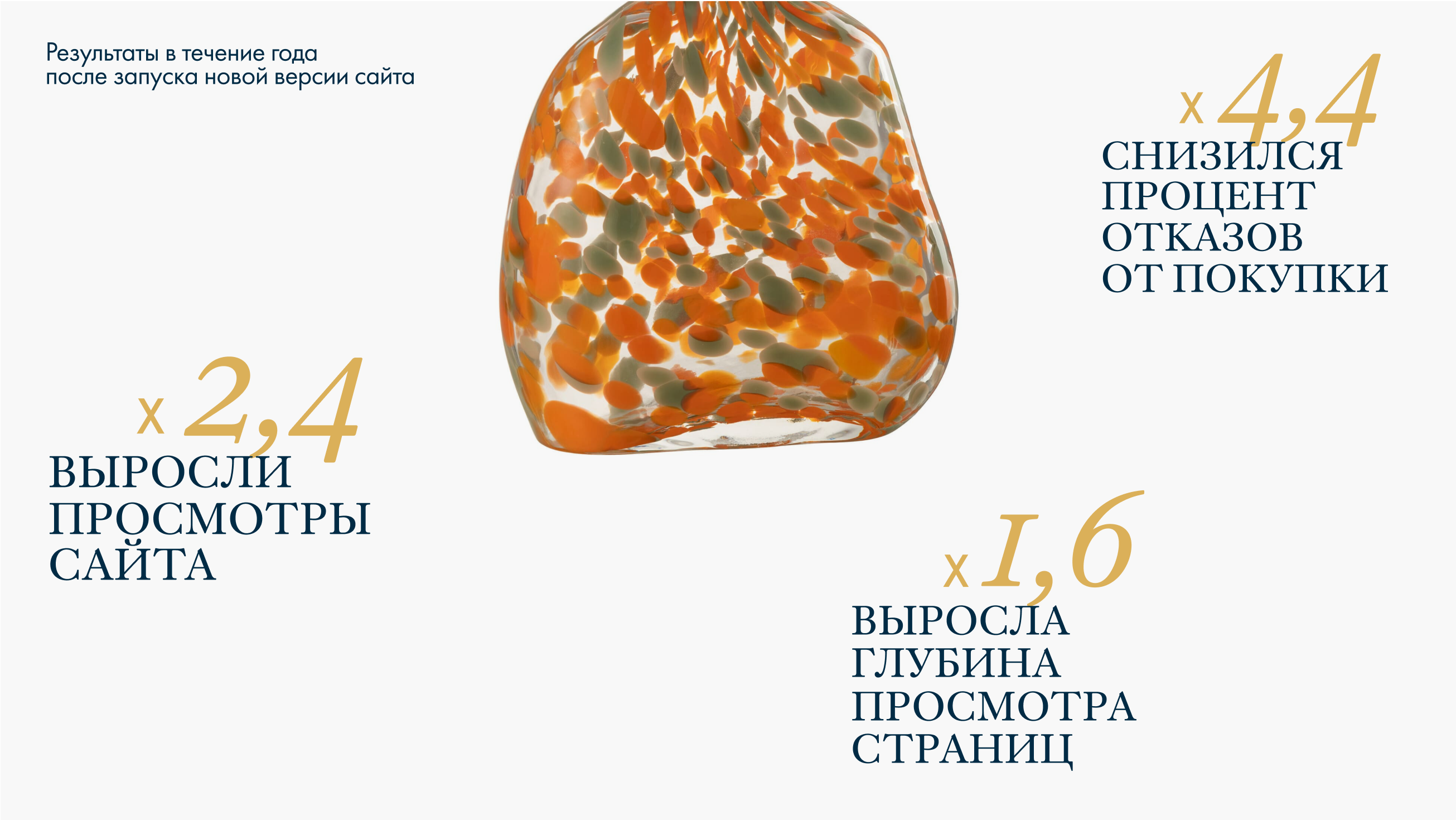
The new design of the Dantone Home website reflects the brand's style - a synthesis of classics and contemporary, of design products and cosiness. We continue to cooperate with the company and implement new features. For example, we plan to add the possibility of customising furniture to the product card: a choice of materials, fittings and equipment.
