The Child's View of the Digital World. MTS Junior
MTS Junior is a sub-brand of the MTS ecosystem created for children and their parents. It is a complex subscription that includes various services ranging from – spam protection and parent access to the child's location in real-time – to music streaming, an online cinema and a service with educational games for children. MTS Junior has approached us to develop the brand's positioning and identity. MTS Junior targets two audiences simultaneously: children from 6 to 12 years old and their parents. So, it was necessary to incorporate attributes that appeal to the child and make the brand look safe and beneficial from the parent's perspective.
Signal (part of ONY) has compared the world of childhood seen by parents and children through ethnographic research with elements of semiotics. Afterwards, we juxtaposed the results with representations of adults and kids in children's brand communications. A deep understanding of both visions has given us a new perspective on how children and parents perceive time with a gadget. In this difference, we have noticed a shared need for development: for children, a driver is a curiosity, whereas for parents – a need to give modern skills to their children. However, we have also identified a problem: activities that the child enjoys may seem useless to adults, and things that parents consider valuable may seem dull and not engaging to their children. This insight is at the core of the brand platform – MTS Junior plays the role of a guide – the one who gives parents peace of mind about their child's development and, in an entertaining way, introduces the child to the modern world while educating.
Thanks to semiotic research, we have also discovered a gap in the aesthetics of the world of childhood seen by adults and children. Although animation and cuteness characterise a kids' world, they are not the only visual attributes typical for childhood culture. Children's aesthetics allow breaking the rules, combining incompatible things, using various kinds of "nasty things" and "weird things". MTS Junior subscription also incorporates contradictory meanings: game and development, fun and safety, and interests of children and adults. We have used this finding to recreate in a visual style a childhood universe filled with energy, fun and games while giving peace of mind to parents that their children are safe.
Eyes, as the main connecting element between the world of an adult and a child, were used as the basis for the logo: they accurately reflect children's curiosity, their desire to explore everything around them, and, at the same time, recall the parents' desire for the child's development. Eyes can be attached to any object, whether animate or inanimate, thus turning it into a character. That is how the central metaphor of the new identity was born, based on a metacharacter-constructor who follows us all the way and adjusts itself to different scenarios. The character is represented graphically via stickers of detached elements – eyes, mouth, and others. The elements adapt to a child of any age thanks to attributes from various fields: music, sports and education, or toys for kids (for example, slimes and springs). In the identity, these details interplay with different stories to make communication more expressive and convey various emotional reactions.
Another attribute that makes space vibrant and dynamic is the control buttons, which also behave like animate characters: they adjoin and stick to each other, turning into snake-like figures.
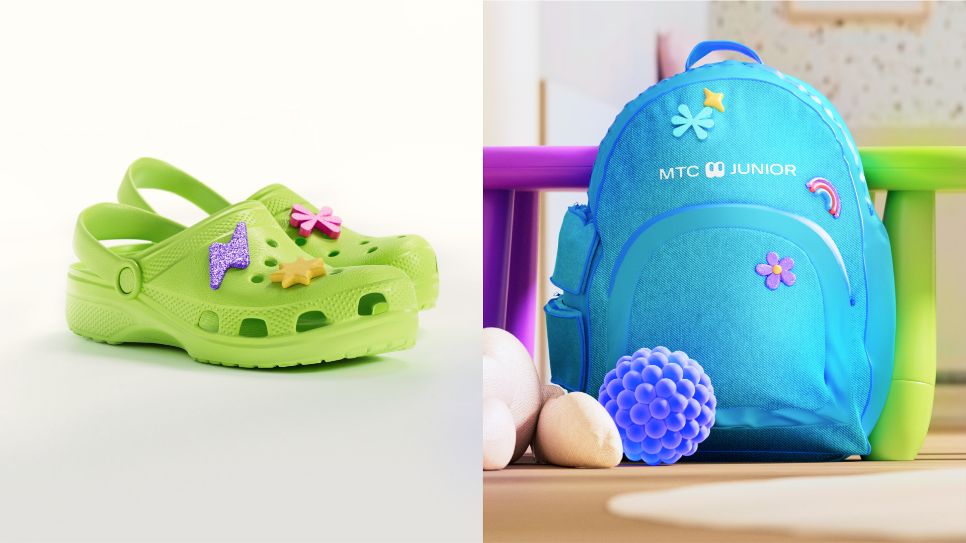
We have developed a colour palette that emphasises the visual language and personality of MTS Junior. Blue, green and purple are the principal colours of the new style. This selection reflects the bright, expressive and energetic spirit while differentiating the sub-brand from the portfolio of other MTS products. We have chosen a calm white colour for all typographic elements to balance the multicolour palette. The colour palette is also the basis of Junior's photographic style. It appears in backgrounds, clothing elements, elements in the staged portraits, in studio, lifestyle and object shootings. Photos show various narratives with children: play, lifestyle, and family. Branded 3D objects compositionally are connected to the photos, support their dynamics and interact with the characters via movement, layout and looks.
The 3D objects also recreate the contradictory aesthetics of a child's world, where games and exploration come first. To achieve that, we have mixed and matched various textures and surfaces: plasticine, smooth and rough, glittery and luminous objects. 3D figures compositionally are connected with photos and control buttons, support their style and interact with the characters.
As a result, we got, on the one hand, a bright and lively brand filled with attributes from the childhood universe; on the other, an understandable and worthwhile from the parent's point of view.