Virtuoso performance. МТS Link
Webinar Group, a developer of educational and online communication solutions, became part of the MTS ecosystem in July 2022. The new brand goal is to become a UCaaS (Unified Communications as a Service) platform that offers, in addition to educational products, services for corporate communication: video conferencing, chats and built-in collaboration tools. The MTS team turned to us to create a brand platform, identity and naming for the new brand. Signal agency (part of ONY) was in charge of the strategic part and supervising the MTS research. We have run interviews with IT directors of large-scale companies and office workers at the start of the project. All of them were concerned about frequent failures in collaboration services, which reduce the efficiency of processes. Employees are unable to perform their tasks efficiently and promptly, and the IT department has to spend time constantly solving issues with the services and searching for new solutions.
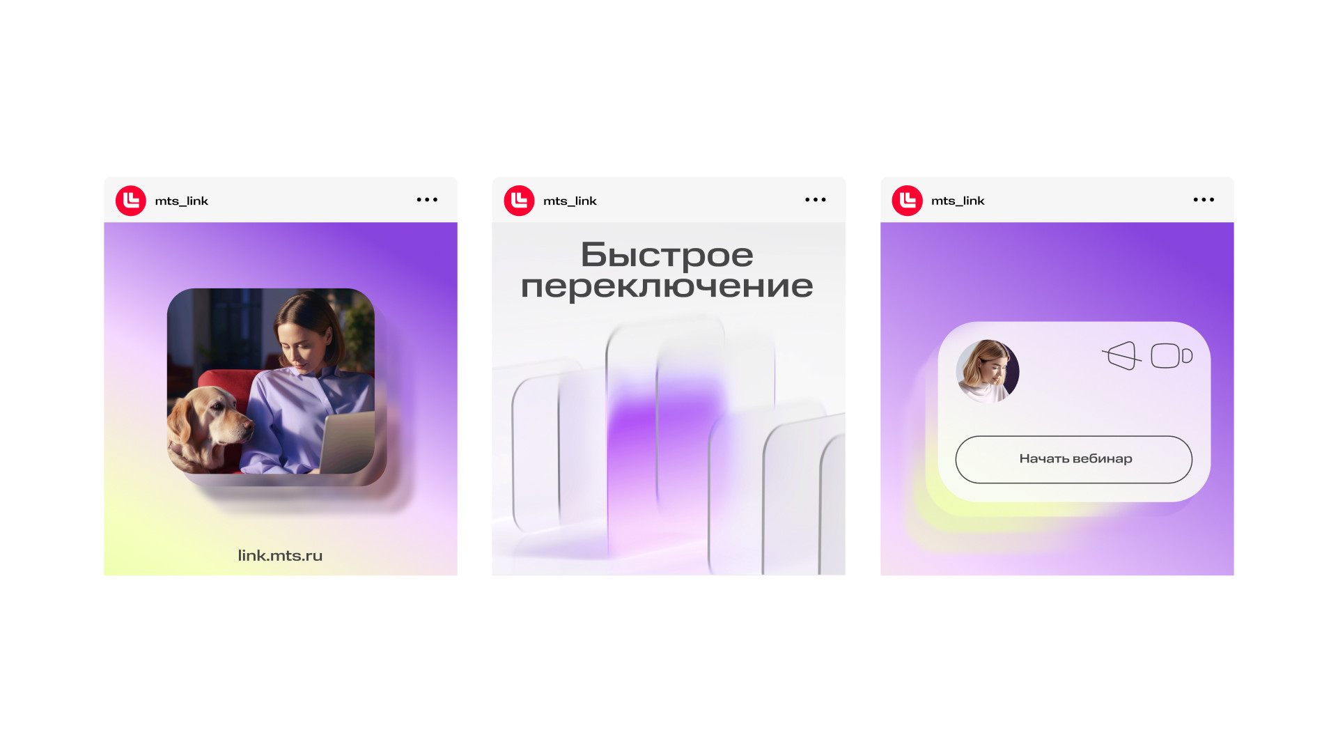
Everyone wishes to have smooth, coherent and harmonious online work communications. We have compared communications in a large-scale company to an orchestra in which our brand plays the role of conductor. It does not play the music but facilitates the musicians to play in unison, to hold a steady tempo: Just like the combined in-one-place communication, analytics and engagement tools help people work together cohesively. Bearing this metaphor in mind, we have developed the naming and visual style concept: Webinar has changed its name to MTS Link and its main style elements now are minimalistic blend-plates. They recall open application windows for work, linked to each other and moving in space following harmonious trajectories.
In the logo – which inherits style from its parent brand MTS – the synchronised layering of these open application windows turns into a Latin L.
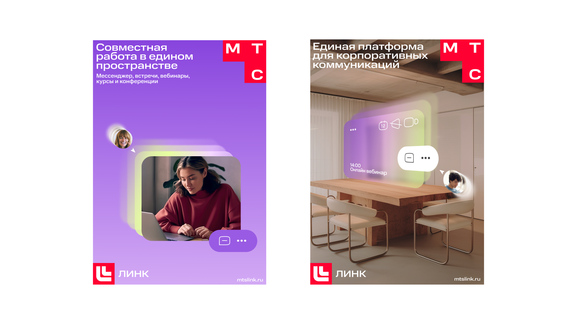
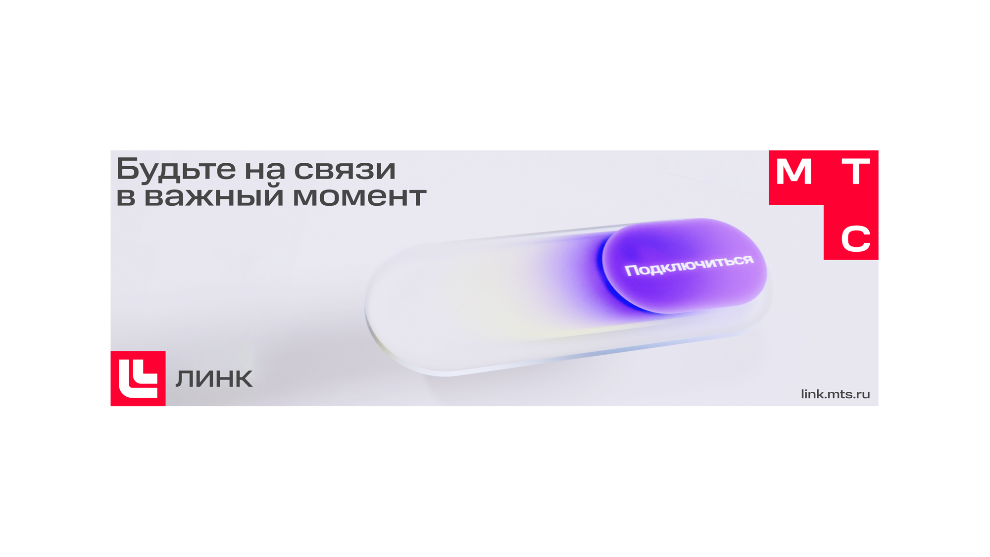
We have created three types of graphics to address different brand objectives. 2D blends illustrate various teamwork services that are used simultaneously. Blends can appear on top of pictures – to demonstrate what is going on on the employee's screen or in the office space. They can also become containers for photos, icons and MTS-branded control buttons.
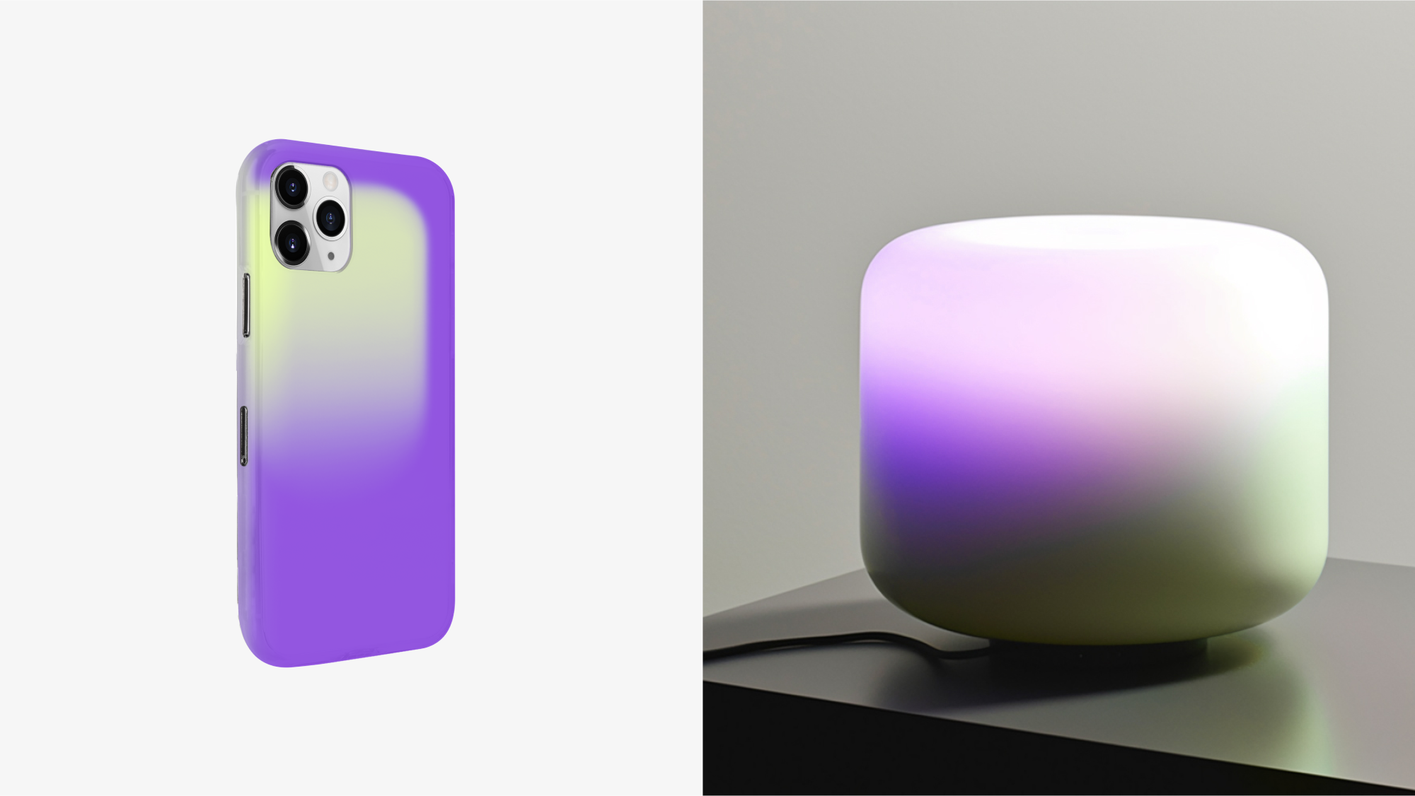
In 3D, we use the same gradients, adding a touch of lightness to the elements. The brand can use these minimalistic graphics to tell its stories and illustrate the teamwork processes.
Motion graphics reflect the idea of independent elements synchronisation: Blends move on their own but always follow a shared harmonic trajectory.
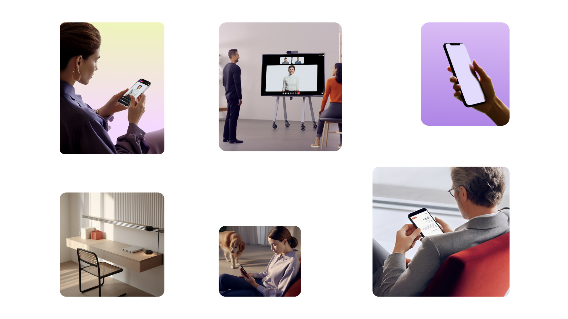
The photographic style of MTS Link is now warm, in contrast to the cold background gradients. The subjects are calm, people are in comfortable clothes, and the interiors do not look too strict and «white-collar».
As a result, the new brand has a precise and clear positioning that offers a stable platform for development and communication. Its visual language is tool-filled but easy to use and perfectly reflects the essence of the service, but it is not detached from the style of the parent brand MTS.