Travel portal. MTS Travel
In 2023, within the global rebranding of MTS, we designed and now continue to develop a new visual identity for MTS Travel – a digital service for hotel booking. It was essential to maintain the consistency of the style of the entire ecosystem and use simple tools to showcase the vivid emotions that await the user during their travels.
The key theme of the concept became the idea of "portals" that transport users to new places. The scenes within the portals and in the background complement each other and create a cohesive image. On the one hand, they clearly show a location from the travelling world and, on the other hand, keep the focus on the emotion.
The control buttons, from the main style of the ecosystem, serve as an interface that enables interactions with portals. MTS Travel control buttons, unlike the ecosystem ones, can be grouped into large accentual compositions and become a part of a story.
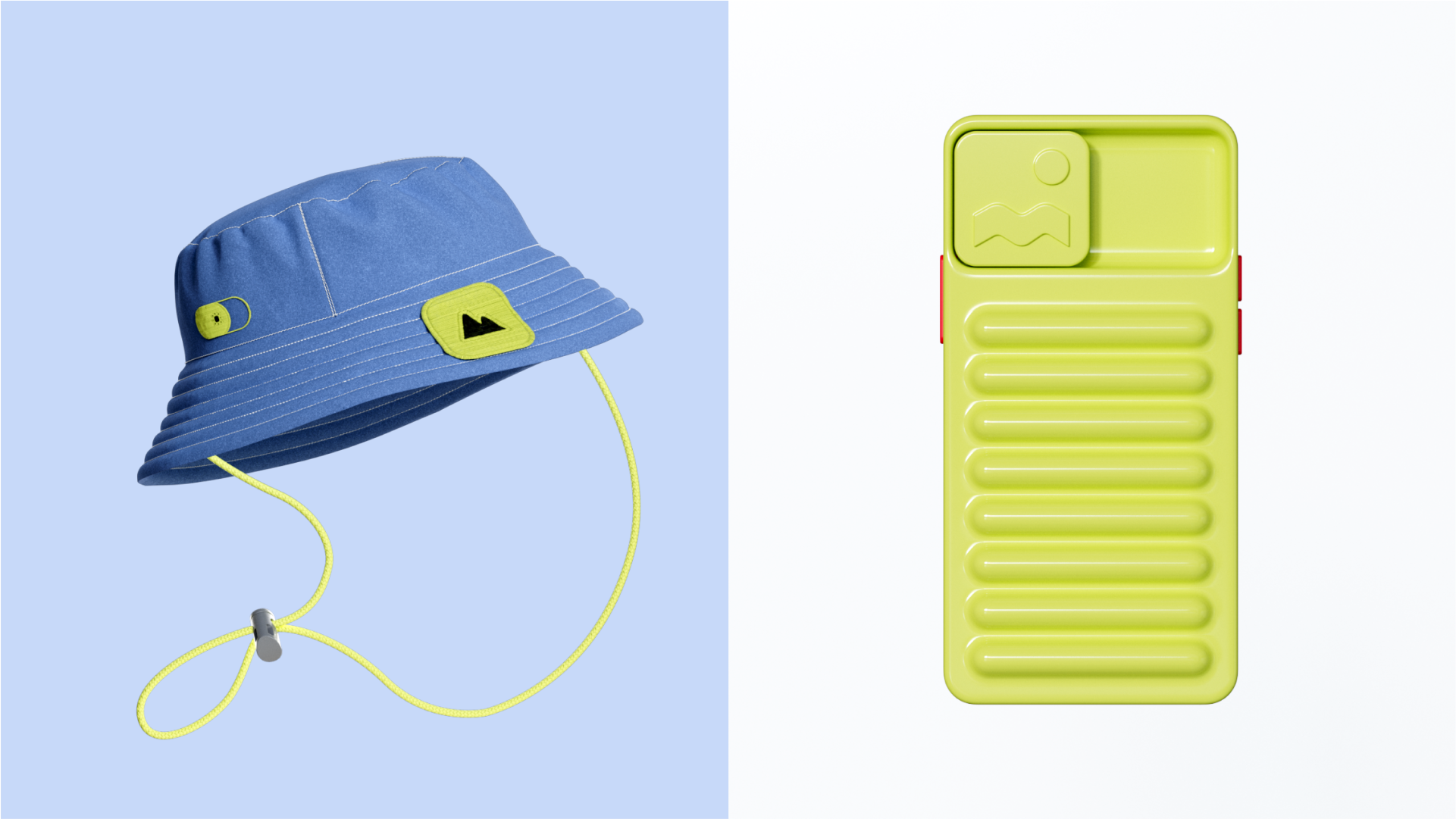
The yellow and blue colour palette refers to the bright safety colours of travel gear, but at the same time, it contrasts with the shades of natural locations, which appear in the photographic style. Additionally, we have developed colour correction guidelines to emphasise this contrast.
At the core of the 3D graphics concept lies the idea of harmony between the digital world and nature. We associate the basic soft textures with travelling and a comfy sensation, while metal and cold shades serve as a metaphor for technological effectiveness. Ambient lighting and smooth shadows prevail in all scenes, creating an organic feel of reality.
The iconography in the layout and interface keeps the connection with the original MTS style. Yet, it considers the service functionality, for example, the ability to select dates, book hotels and purchase tickets.
As a result, we have created a style with a user-friendly toolkit, which uses associations to show the emotions we acquire while travelling.
