Digital lab. MTS True Tech
True Tech is a community organised by the MTS IT team. Over time True Tech MTS has become a great platform for organising events and sharing experiences. Its goal is to support and develop the Russian IT community and the industry. Since the overall branding of MTS has been updated, True Tech has demanded the development of a new corporate identity as well. On the one hand, the identity had to correspond to the new language of the ecosystem. On the other hand, True Tech is not an ecosystem product, but a community –– a point that had to be emphasised.
With the help of extensive semiotic research, conducted in collaboration with the Signal (part of ONY), we have identified the main cultural codes that constitute the image of today's IT sphere. This way we could understand what True Tech's positioning and identity should be. In its brand communications, True Tech had to move away from the conventional and overused stereotypes associated with the image of the IT sphere in Russia and reword new meanings based on global trends. One of them is the image of a new-wave software engineer –– intelligent, creative, with good taste, who appreciates comfort and freedom. He values lightness, fun, an opportunity to take his mind off the work, freedom of life organisation and the principles of work-life balance.
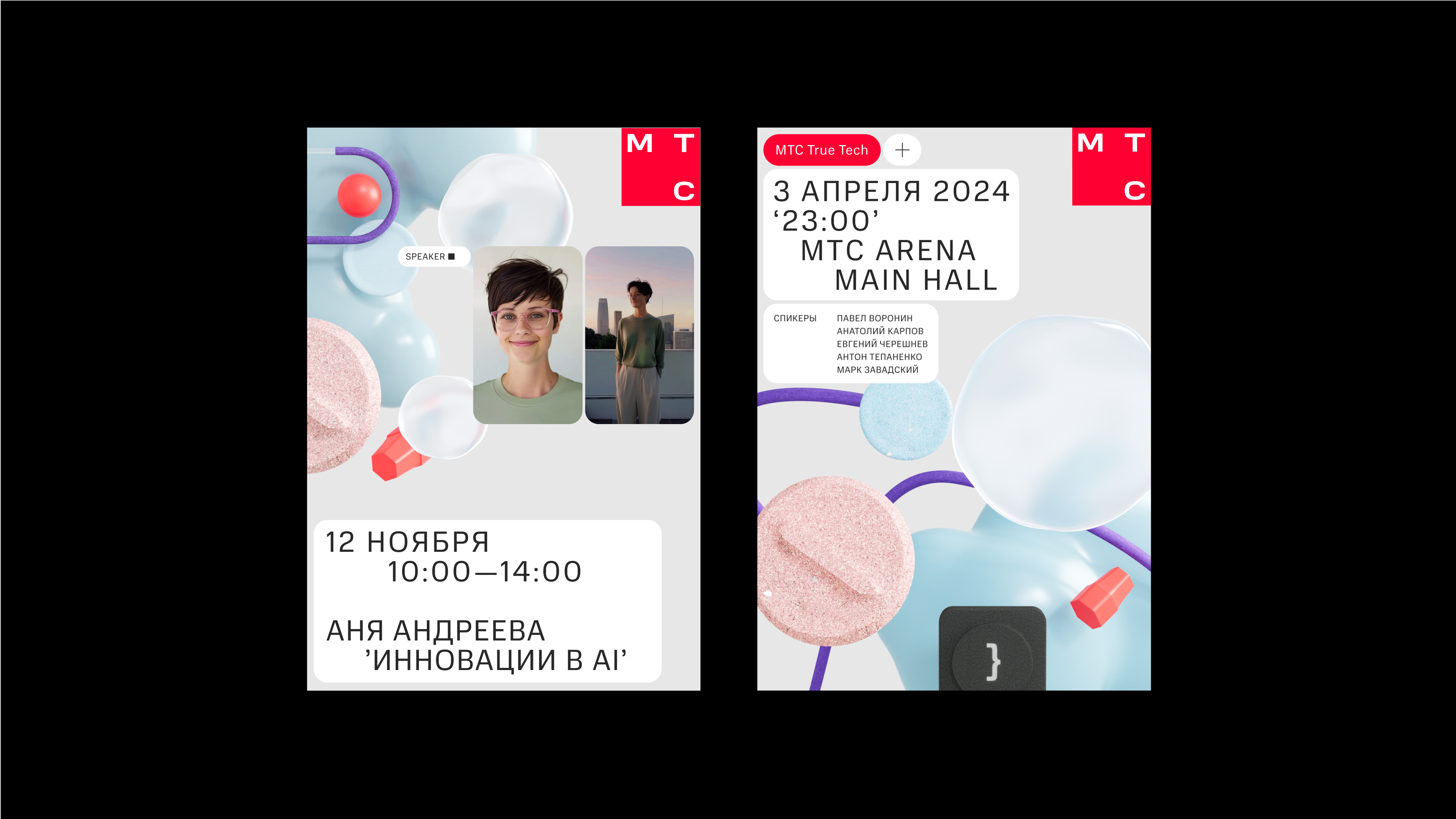
The brand's identity is built around the idea that True Tech is a digital lab, a place for experiments, where objects of the future are designed. Graphic elements create a digital space that imitates the interface of the development environment, while software code is used to create prototypes of future products. These objects are depicted abstractly as if they were in the development stage: when it is not clear yet what they are and how they will work together.
The logo is inspired by the informal nature of the True Tech community, which is independent and stands apart from MTS products. We have developed a dynamic logo structure, to easily include True Tech sub-brands. It consists of the primary control button with the brand name and an additional control button with the ‘+’ symbol –– adjusting to different activities and events within the community part of the logo. Each sub-brand has its colour, which is shown in the logo.
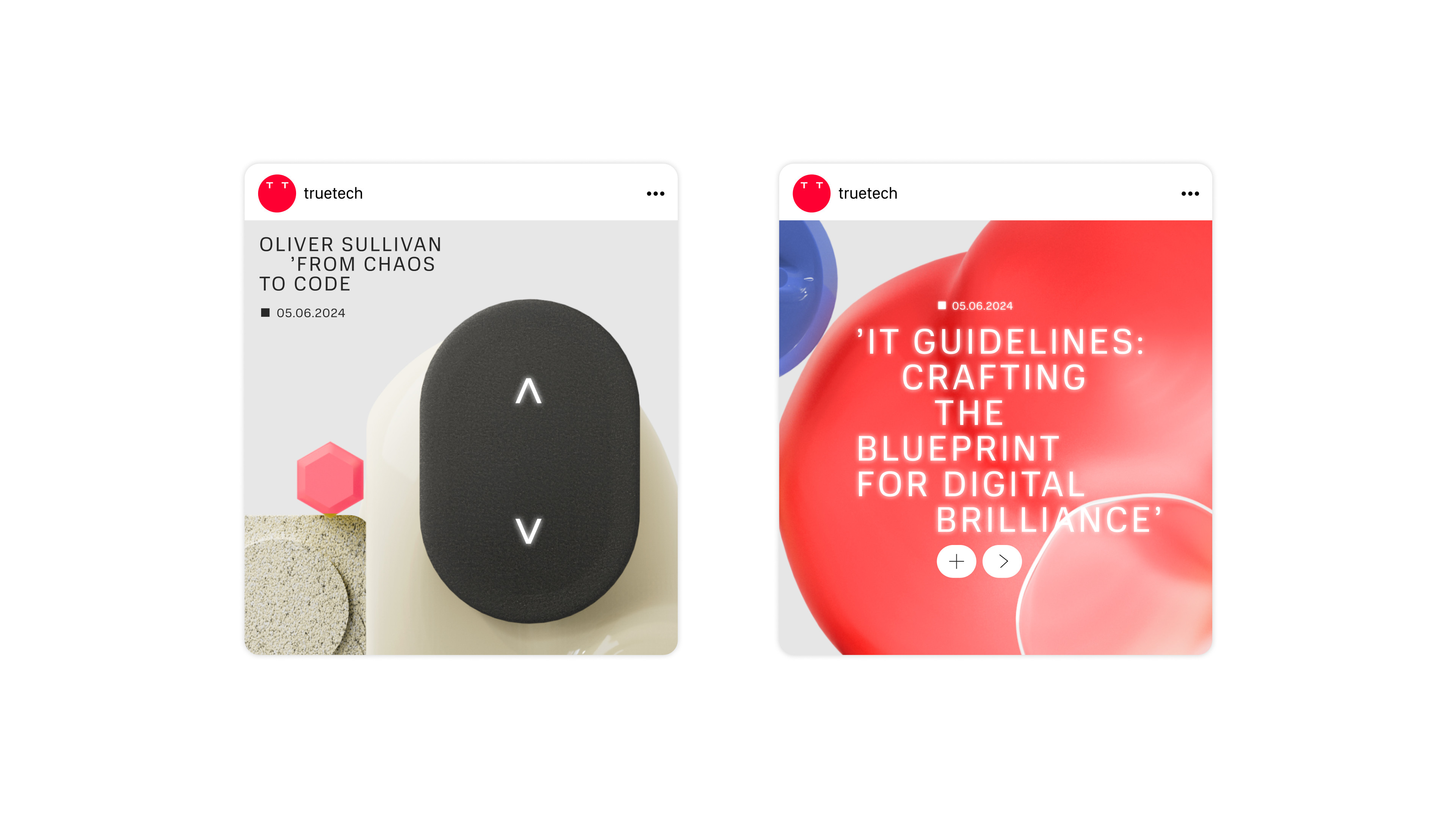
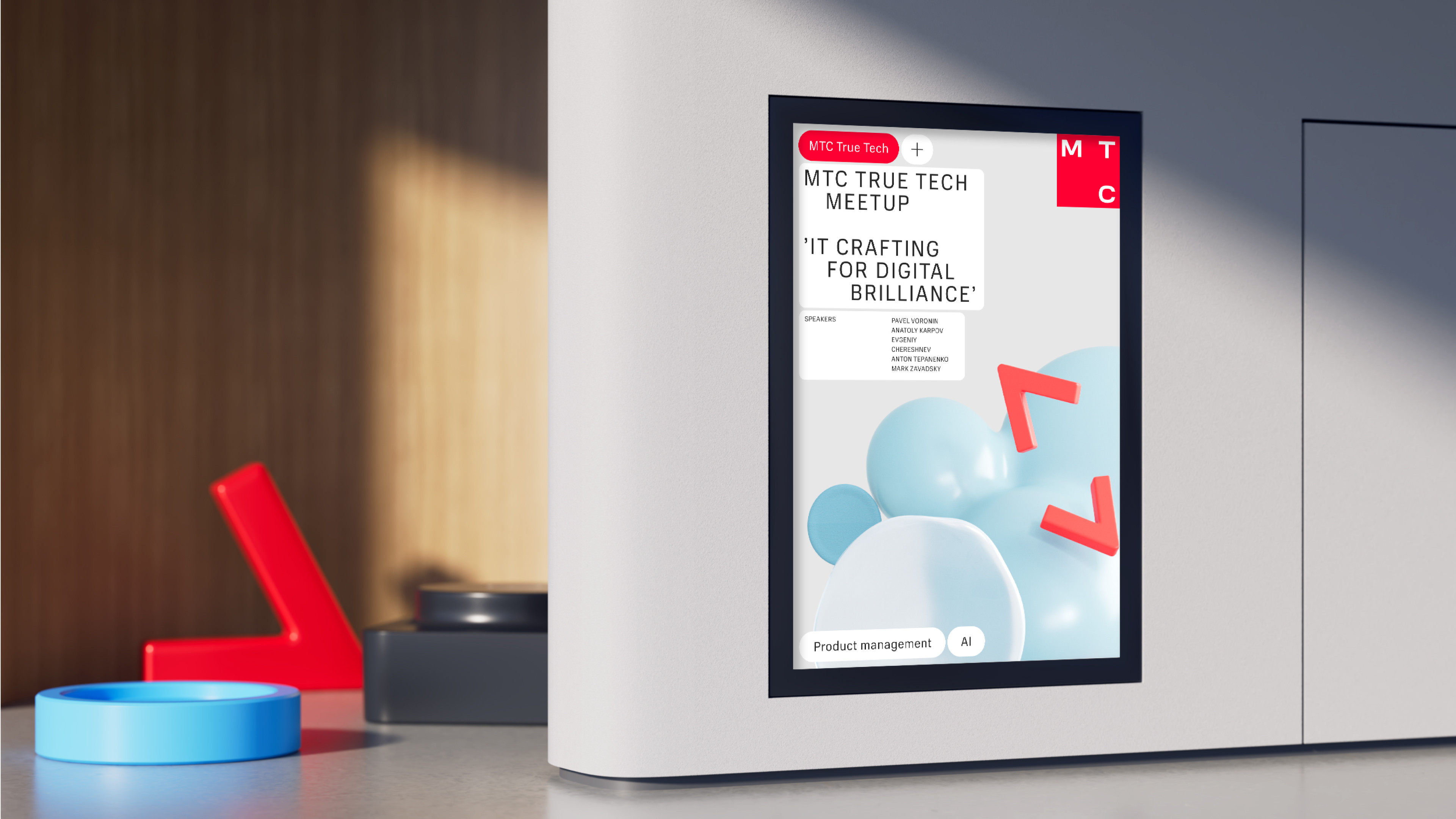
To recreate the software development environment, we have used some typographic techniques. We have used the MTS Compact font and nuanced it by adding inlays, indents and letter spacing. As a result, the typography now has a touch of a technological console font. We have also used symbols like brackets to reference the syntax of programming languages and enhance this effect.
The CG style is placed in the background, depicting the very prototypes of future products that are in the process of development via code. While working on these abstract objects, we have tried to recreate and decompose the world of modern product design and the programmer's workspace –– the objects, tools and devices he interacts with during his work. We borrow the metaball 3D graphics, unlike typography, from the main ecosystem style, but with a broader spectrum of shapes, colours, materials and textures.
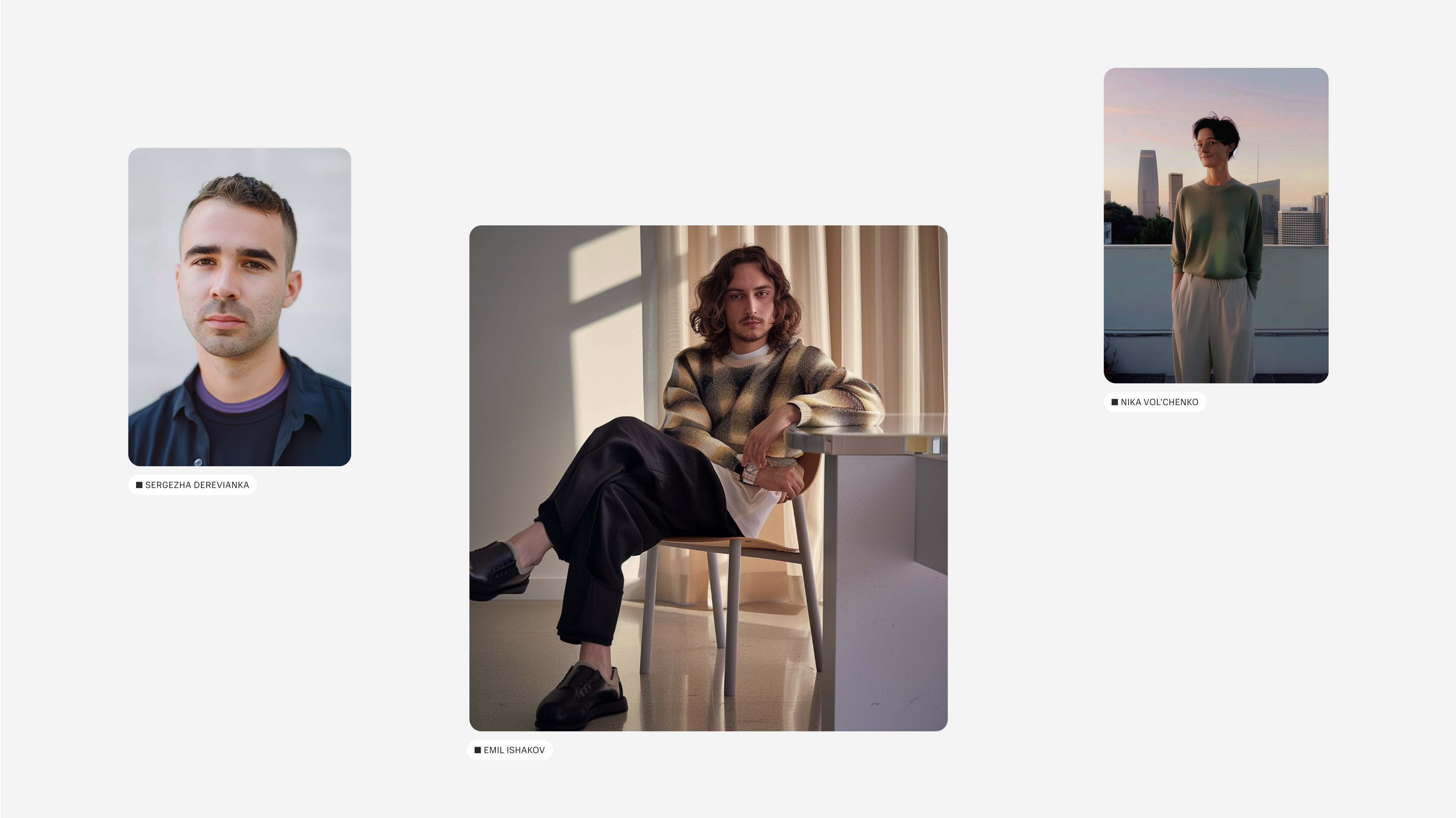
Our goal has been to recreate the sense of comfort and convenience which is the basis of the image of the modern developer. The brand's photographic style supports the values of freedom and comfort –– thanks to the choice of setting, angles and shades.
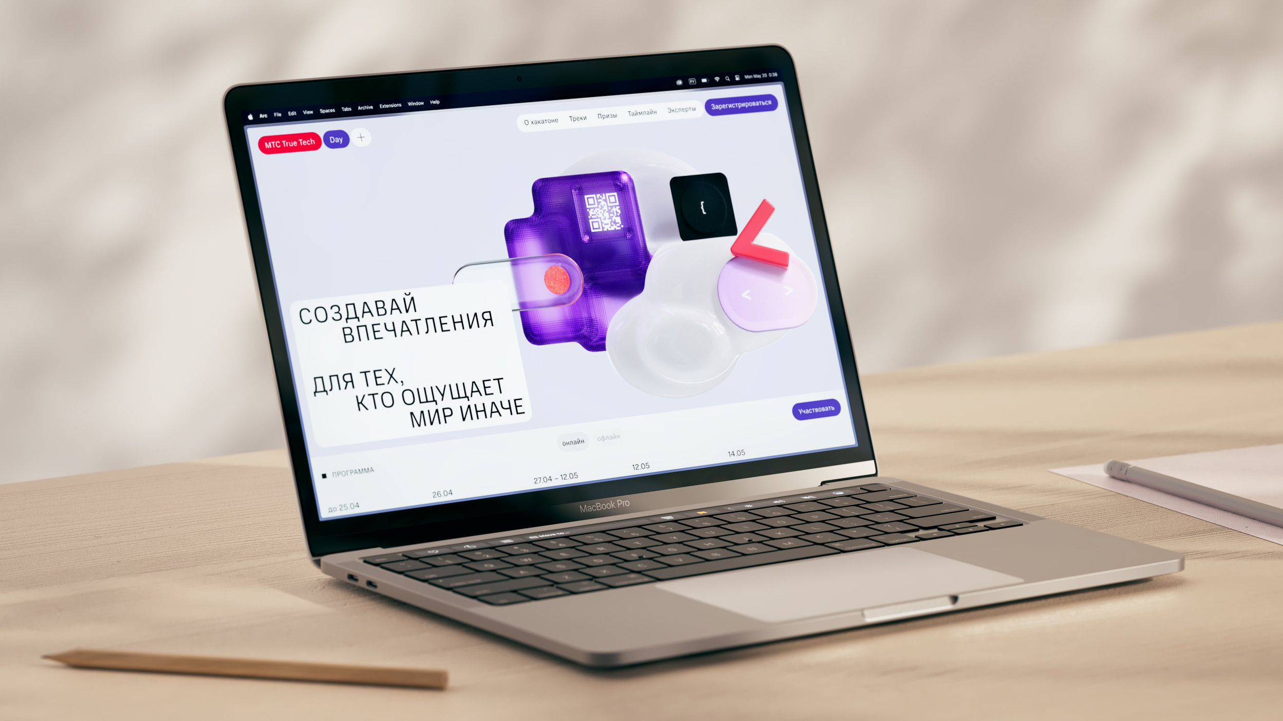
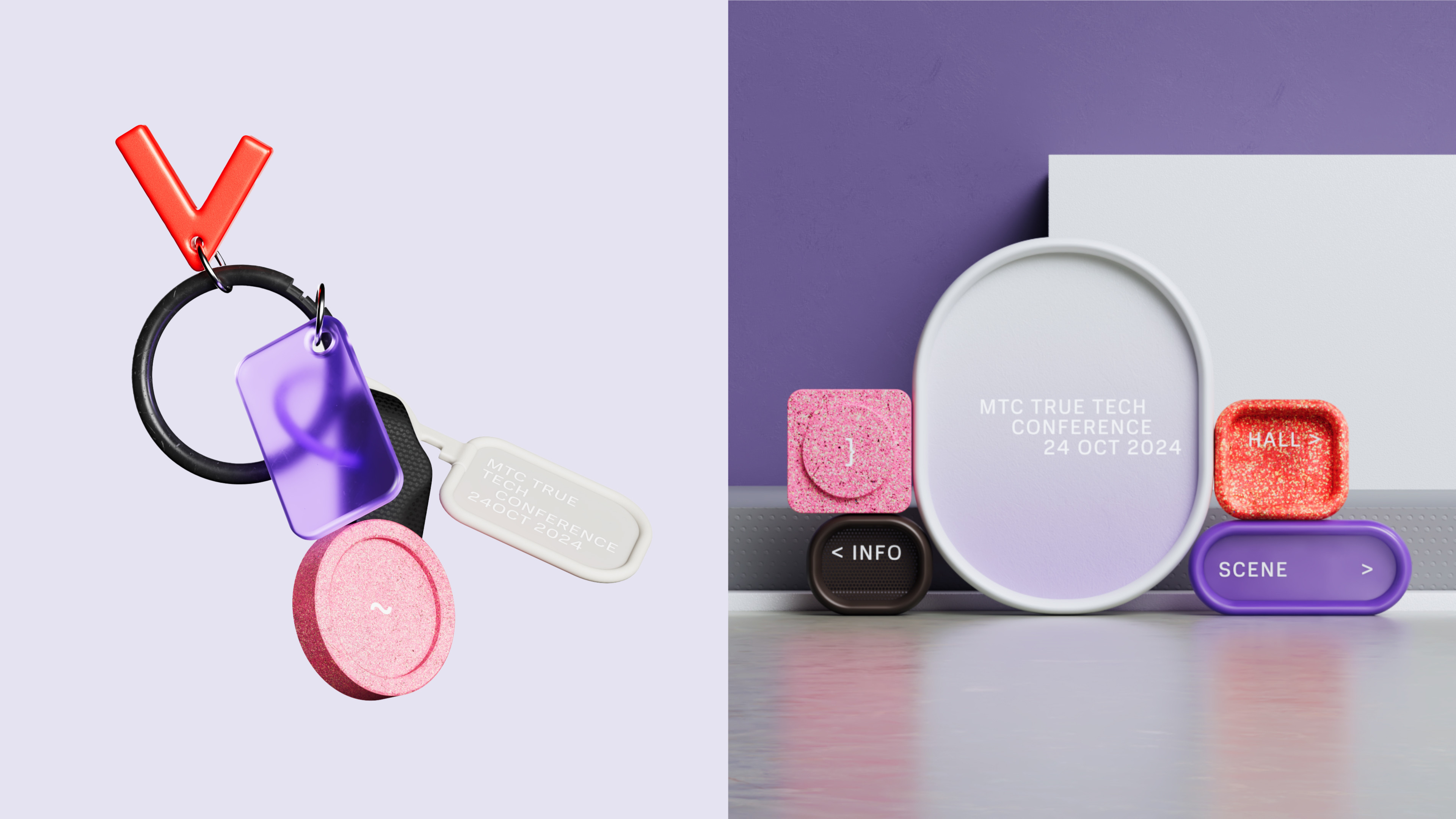
For one of the True Tech subbrands, we have created a separate visual style –– True Tech Day. It is an annual large-scale IT conference organised by MTS. If the main True Tech style is closer to the ecosystem colour palette, the conference colouring style is a bit more daring. True Tech Day has its purple hue and some new colour combinations emerge.
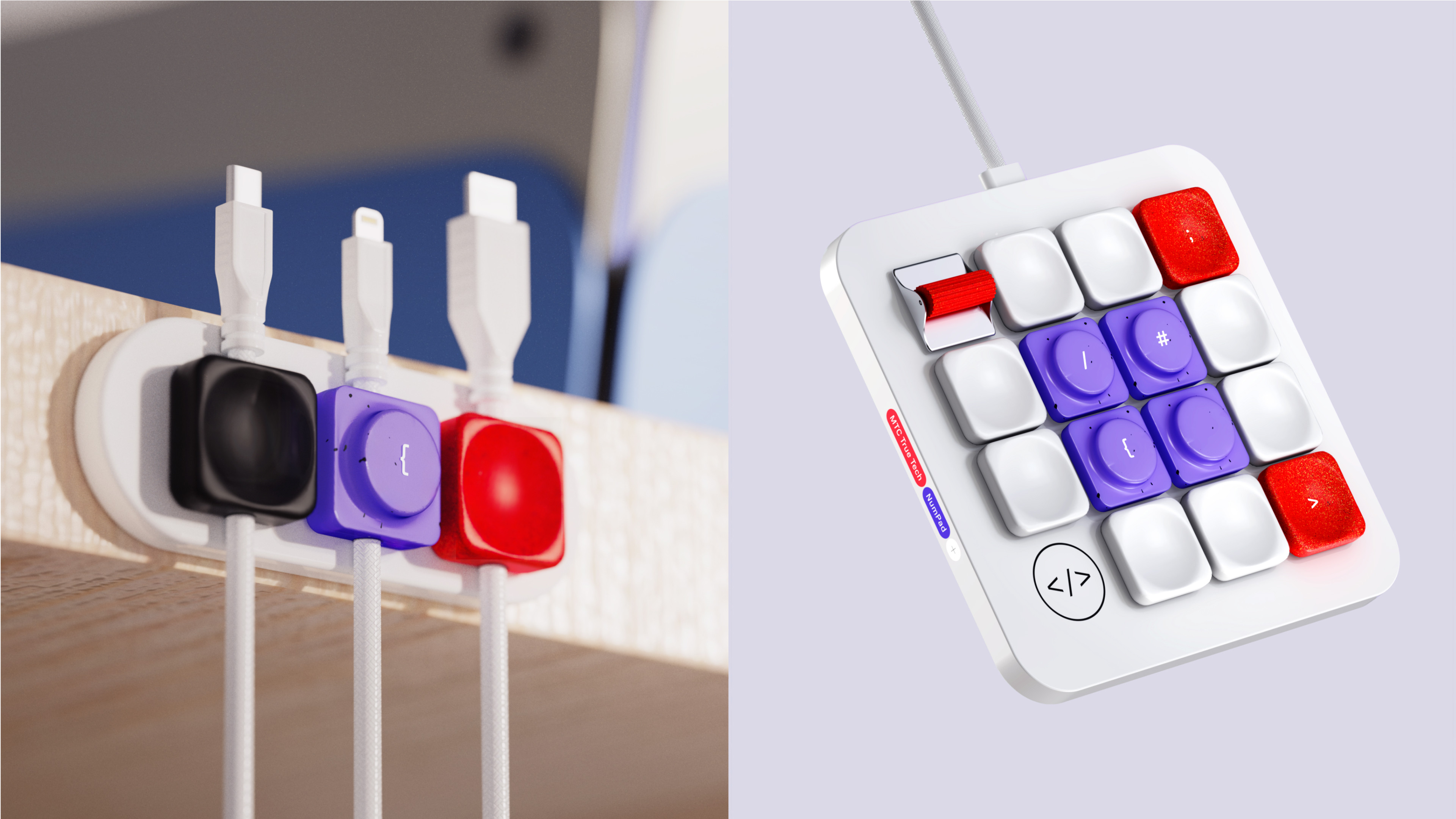
True Tech demonstrates how MTS successfully integrates advanced technologies and the values of the modern IT community into its brand. The new identity not only reflects technology and innovativeness but also emphasises the importance of lifestyle, freedom and comfort for modern developers. It humanises and makes brand communication more friendly, yet aware of global trends and the needs of young talents. Moreover, it reinforces MTS' position in the IT industry, while supporting and developing the Russian IT community.