RED. Insurance that’s always on your side
RED is a new service to help users choose and purchase insurance products that aggregates offers from numerous trusted companies. We were tasked with a comprehensive product launch: the company came to us for strategy, branding and digital platform development.
Our research into the category showed us that insurance companies in Russia have lost their positive image and become yet another source of anxiety for people in difficult situations: the need to prove that a given incident is covered demands more and more energy. These negative associations are only compounded by aggressive marketing with endless phone calls and off-putting, even rude communication patterns. In this market, RED wanted to embody the values of transparency and honesty with a human-first approach. We coined the brand’s ethos, “Insurance that’s always on your side”: simple, positive and kind. This concept was reflected in the brand platform, identity, the product itself and its communication strategy.
The RED team wanted to take a rock-and roll attitude in a market dominated by conservative companies—in other words, exciting and memorable. We chose lively colors and based the company’s style on simple shapes with a sweeping, bold font.
Soft red shapes embody something protective and supportive, a little bit like buoys and floaters in backyard pools. We continued this break with typical notions of insurance products in the logo. A lower-case e is nestled between the capital R and D, throwing down a cheeky gauntlet before traditional, more serious approaches. The style is augmented by icons and illustrations that send viewers back to the aesthetic of an instruction manual, with their clear, step by step explanations.

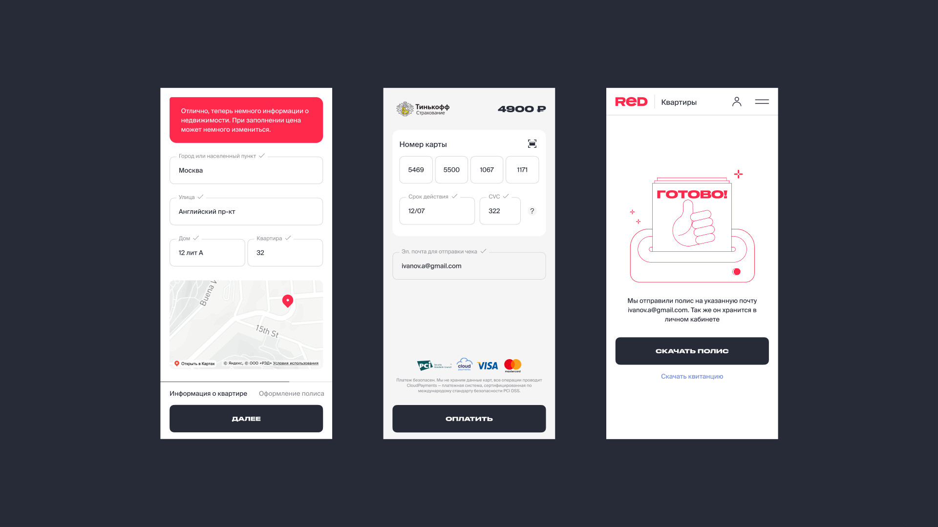
RED articulates their mission as the development of new approaches to insurance that are exclusively focused on human beings. Based on this idea, we decided to design the process of filling out the site’s numerous boring forms as a dialogue. This helped us create an image of a responsive, friendly helper, always online and ready to offer support. The brand’s commitment to taking its clients’ side is also reflected in their desire to simplify all necessary user interactions. For example, the site uses widgets in the construction of its home and user account pages based on each client’s profile, and a claim can be filed with a single click on a panic button. The text entry box on the home page automatically fills out the client’s request, after which the search algorithm sorts its suggestions based on rating and price. The service’s transparency and openness is also shown in how sponsored offers promoted by individual companies are always clearly marked in lists of results with a “promo” tag.
RED articulates their mission as the development of new approaches to insurance that are exclusively focused on human beings, rather than creating a product with high profit margins. To aid in this, we aimed to minimize the burden placed on users.
The majority of users access the service on mobile phones, so we developed numerous concepts and prototypes while testing problem scenarios that might arise on smaller screens. We also developed an adaptation for older devices, as they make up a considerable portion of overall mobile traffic.
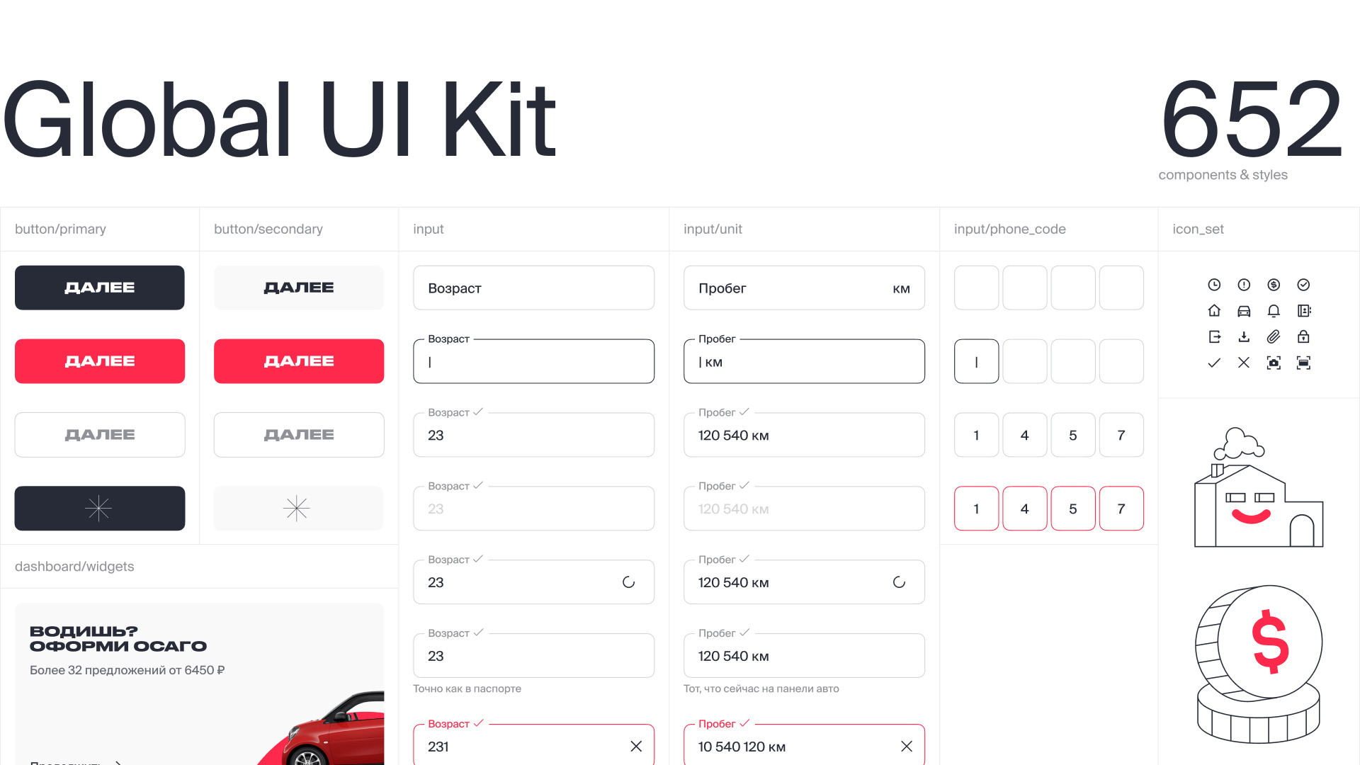
The most interesting and complicated part of the project was creating a scenario for calculating the cost of insurance services. We had to find the shortest path possible in order to assemble a comprehensive selection of offers. All the user has to do is fill in their data in a playful Q&A format. All the steps are consistent and concise, with complicated aspects explained as clearly as possible. For the sake of convenience, we preserved the hints to help find a VIN number or choose a service center. To help design these scenarios, we put together a UI-Kit. For businesses, this tool helps speed up the development process: a new insurance type can be launched faster because the scenario consists of basic elements and the template scenarios contain all of the necessary design elements.
We coined the brand’s ethos, “Insurance that’s always on your side”: simple, positive and kind. This concept was reflected in the brand platform, identity, the product itself and its communication strategy.
