Rukami. Festival of ideas and technologies
The Rukami project includes more than 40 festivals throughout Russia that will bring together thousands of inventors and makers into a single large-scale community of technology enthusiasts. The objective of the agency was to create a brand that would be attractive to adolescents and students aged 12 to 20 years. The image of the festival should destroy the stereotype that technology, technical creativity circles, invention and making itself are something far-fetched, complicated and very boring.
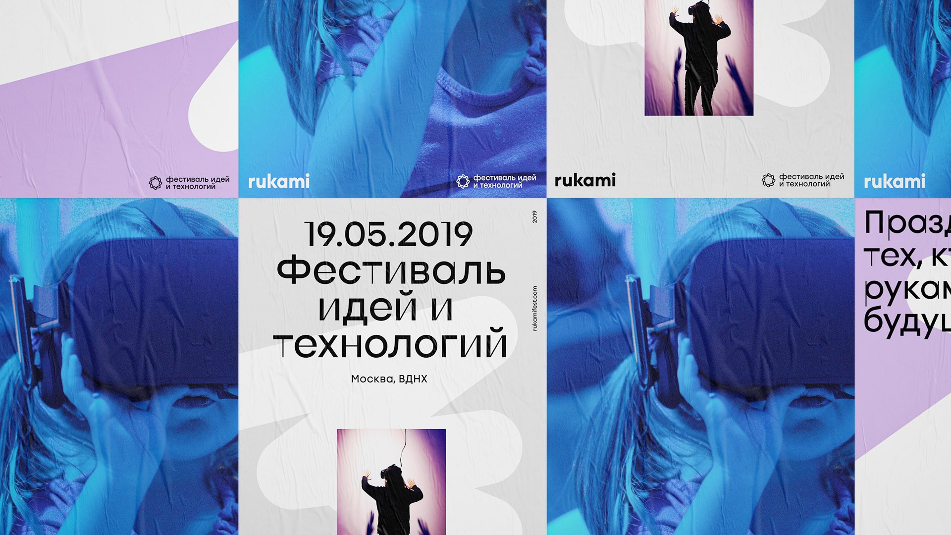
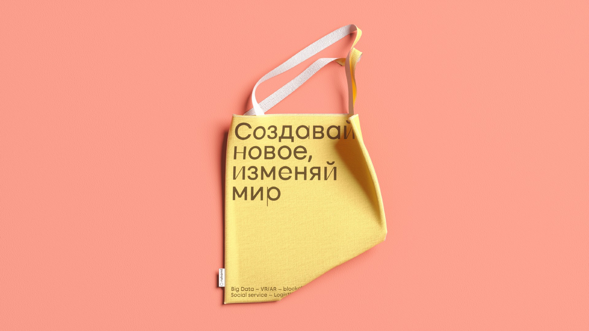
To express the character of the brand was the main thing. So that is it: the Rukami project is a rebel of its time, a bold innovator who is ready to change the world. It does not think in patterns, but inspires and challenges. Lightness, openness and freedom, creativity and invention are the key values that we have embodied in identity.
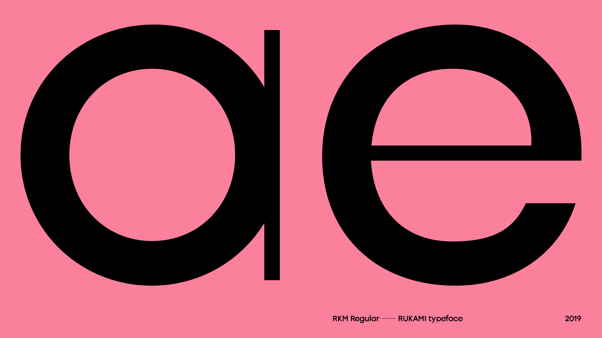
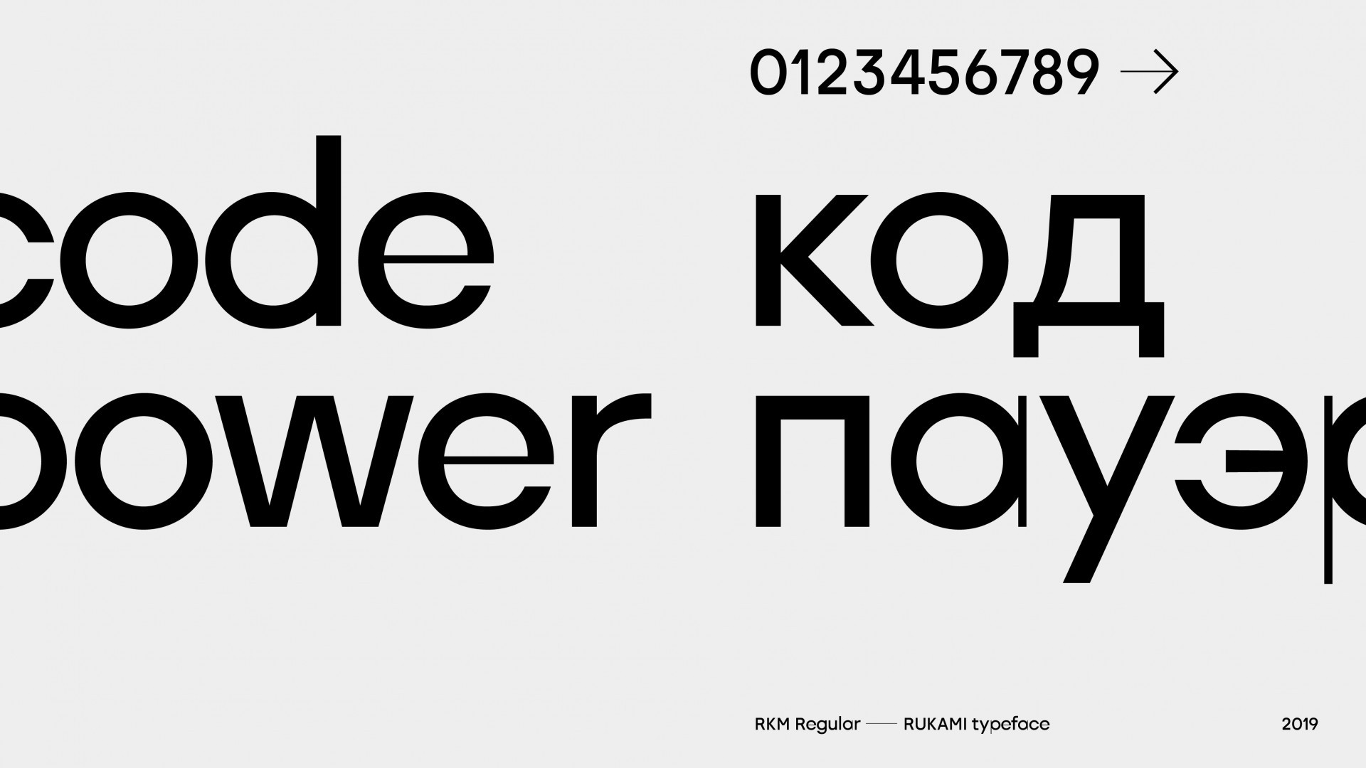
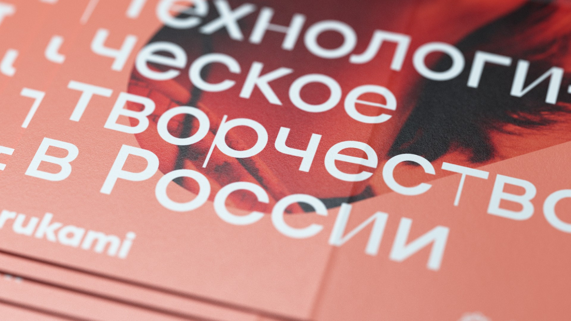
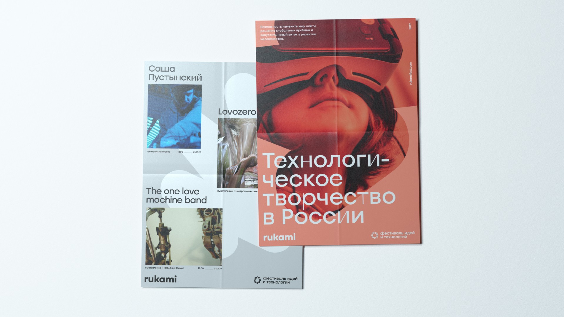
Typography became the core of the style. A geometric font was specially designed for the Rukami project and this is the message of the idea of technical creativity process itself through a combination of dense and thin lines. It is made in such a way as the letters seem to be in the process of being completed right now. At the same time, the aesthetics of the drawings is not quoted directly, there is only a slight sense of adaptability.
The stroke which is the second constant of style, is a metaphor for idea progress, its dynamism. It symbolizes the energy of invention, creation and creative freedom. Due to this fact it can change, live its own life, turning into substantive illustrations or simply abstractly filling out formats depending on the tasks.
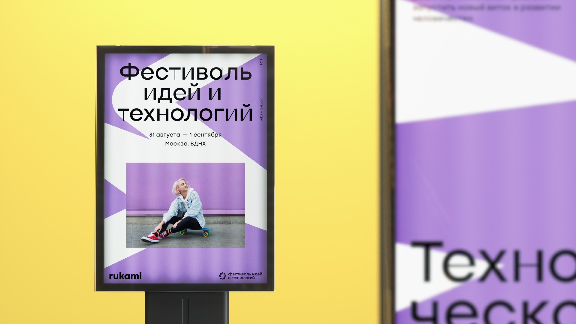
A variety of corporate palettes will allow the style to be flexible in terms of collaborations, and it can be easily used for zoning the festival in areas of technical creativity, in printed materials and creating customized souvenir products.
