START. The new face of Russian content
START Group is a company that encompasses the country’s fastest-growing video service, a studio and talent agency. Unlike other Russian streaming services, START’s key offer to its subscribers is a slate of original shows and films, including hot tickets like «Golddiggers», «Addicted», «Vampires of the Middland» and «Text». In 2021, the company broke into the international market, launched cable television channels and entered new fields as a business.
In the lead-up to such a serious stage of growth, START turned to us to develop a new brand platform, find a unique voice and update its visual language. Still, it was important to maintain consistency with their initial concept while adding variability and flexibility for the company’s continued expansion.
To ensure that the future branding would remain relevant for years to come and help the company develop in synergy, our insights agency Signal conducted a retrospective analysis of the cultural context from the 1990s until today. The prospects were promising: Russian performers took the top spotsand demand for domestic designers is on the rise. Film and television production is another category changing thanks to talented new industry players. This is helped by general cultural trends, since television shows are no longer a guilty pleasure; instead, they are high-quality projects that build an enthusiastic fanbase at home and abroad.
The conclusions of this research lay at the heart of the new brand platform. We formulated a mission for START: to change people’s relationship to local content and make it a source of pride. Using real stories and characters and avoiding taboo topics, START has already begun communicating the new codes of Russian identity. The next step is to create an environment to mint and develop new and exciting members of the industry.
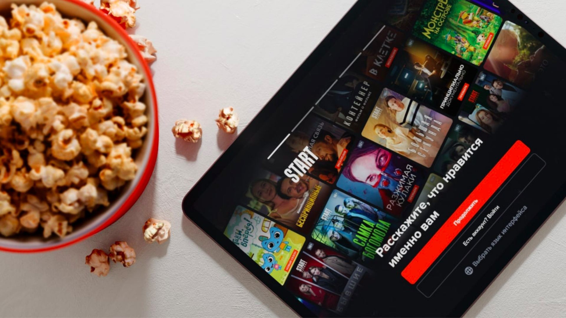
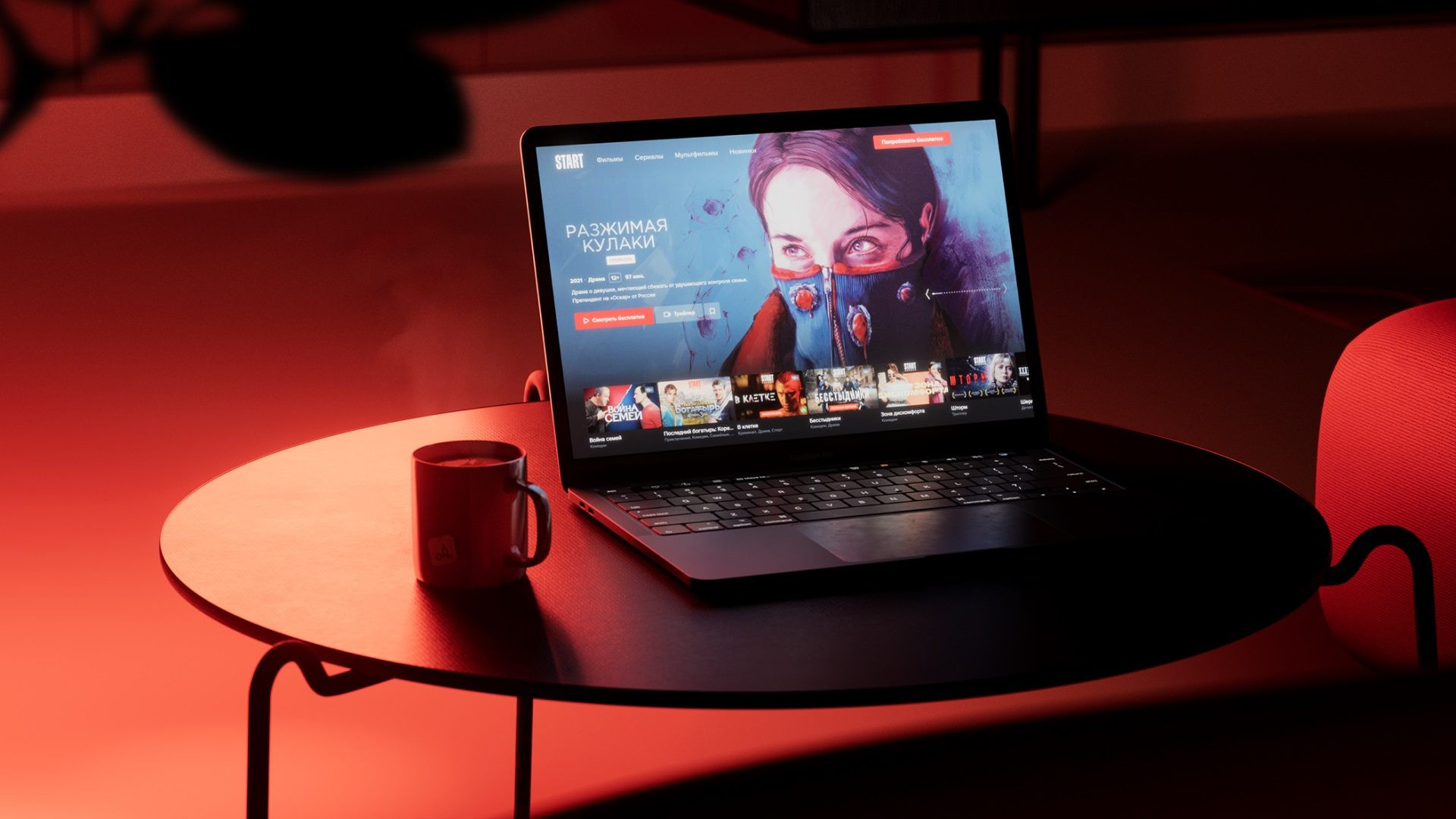
Visual focus is the core of the updated identity: a blur effect immerses audiences in its storytelling and hints that the most interesting is yet to come, while underscoring START’s multifaceted nature as a brand and content creator. The attributes of the category, including posters and advertisements for films, become digital and more dynamic using this approach. They organically integrate into any format today, from a site banner to social media announcements for premieres.
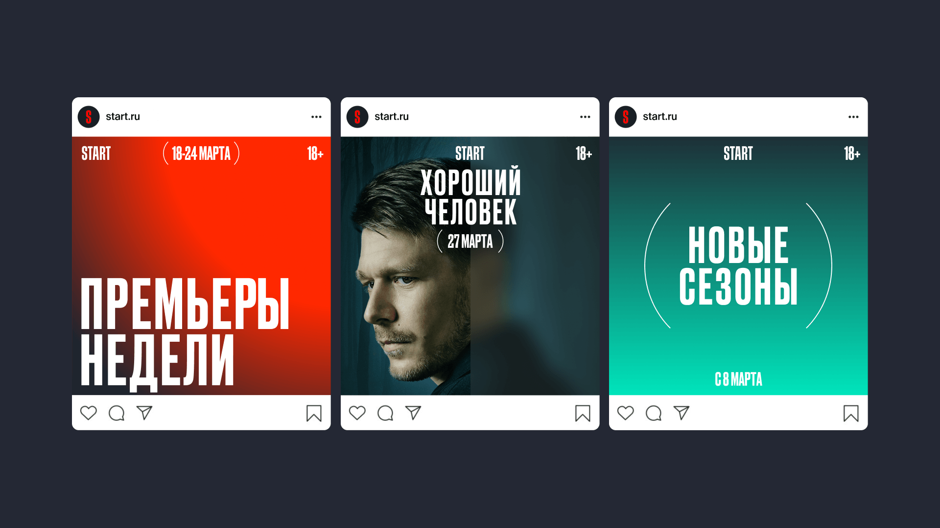
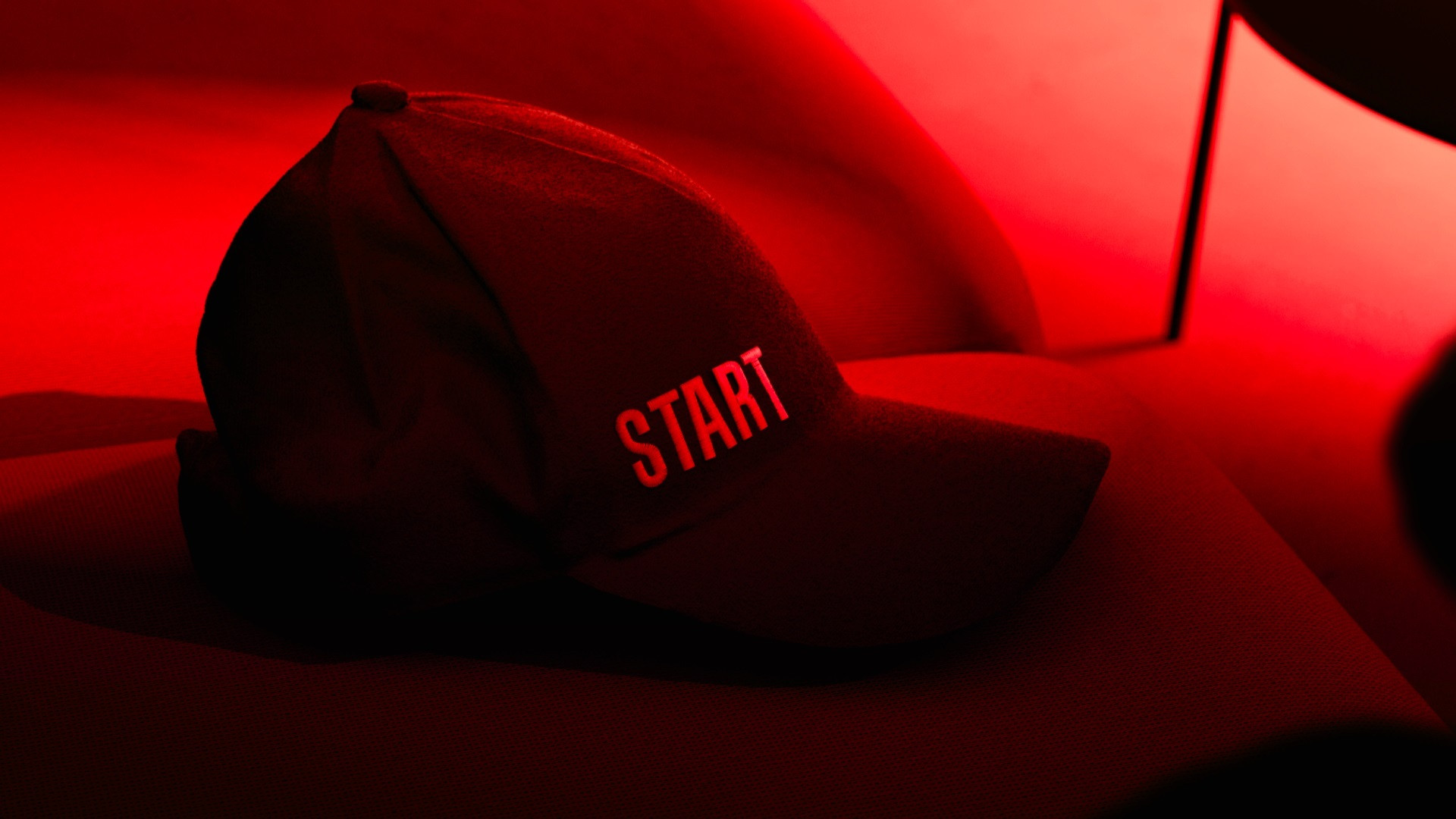
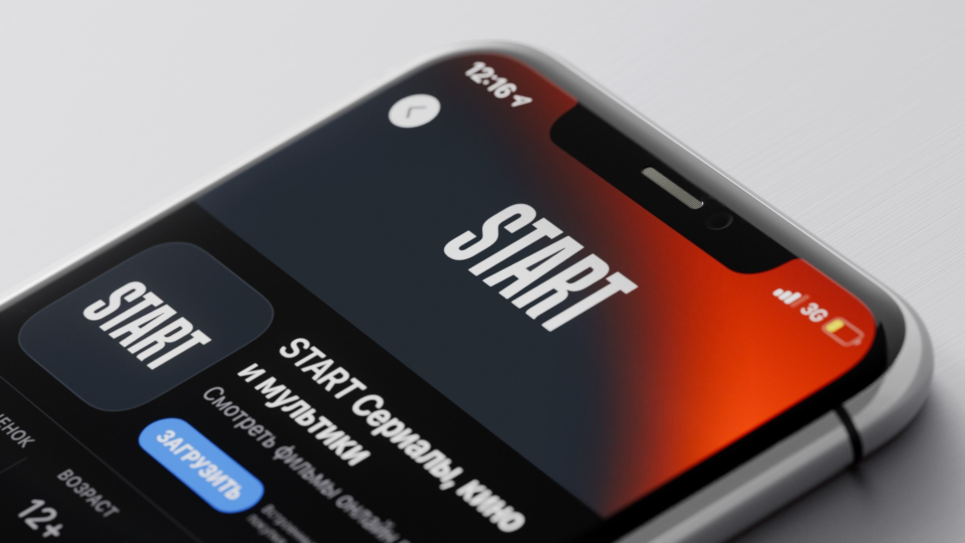
Content quality is START’s first priority. The parentheses in the style, echoing the laurel branches found in numerous prizes and awards, communicate the company’s values and help place necessary accents in layouts. For text blocks and the lines of the logo, we chose Druk, a font reminiscent of film posters and in line with their aesthetic. We made our visual language for START universal: it organically integrates into the design of all kinds of film and television show posters collected on the platform.
The logo wasn’t passed over, either: we freshened it up and added some nuance to the A and the R. More often than not, audiences see a film studio’s logo at the beginning of a screening—so the title card has to be memorable. We animated the START logo and developed a custom sound design that adds a striking effect to the video service’s new image.
The result of our work was a harmonious design system featuring new meanings, accents and promises, while the signature color scheme adds additional colors for experiments and development. We believe in the transformation of the image of Russian film, together with START.